Information Design - Project 1&2: Instructable Infographic Poster & Animated Infographic
1.3.2024 - 22.3.2024 (Week 4 - Week 7)
Vanessa Kei Kurniadi / 0360525
Bachelor
of Design (Hons) in Creative Media
Information Design - Project 1:
Instructable Infographic Poster & Animated Infographic

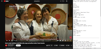
In this task we are instructed to make an instructable infographic poster of
one of the videos in a Youtube channel called "Pasta Grannies".


Mr Shamsul told me he liked the second idea better (the one that I
marked with a tick on the side). He liked the idea of putting the
labels and brief instruction next to the ingredients, and put some
more explanation below the steps.
 fig 1.4 making the assets' sketches on Clip Studio Paint

 fig 1.5 lineart and coloring process
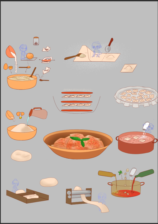


 fig 1.8 colored all the grannies
 fig 1.9 copy pasting the idle grannies to the final bowl
 fig 1.10 revision for the content of final look bowl

 fig 1.11 removing the background and export as PNG
After adding all the text I need, I proceeded to make the layout on a new file to avoid having a too big file that might crash my laptop.

I decided to make the instruction order vertically, because it looks
nice and neat in my opinion. I started to work on the rest of the
instruction but it seems like there are too many steps to put, so
the right side ended up to be some kind of a zig-zag pattern.
This is just a tiny detail but I have some tiny dots pattern on the
background to make it a bit prettier, plus it also adds some kind of
texture like a dotted piece of paper which I really like. In
addition to that, I made some jaggy strip that looks like the cut
ravioli to the top and bottom side of the poster with pasta color,
serving as a nice and simple decoration.
 fig 1.17 adding dotted pattern and jaggy strip into the
poster
fig 1.17 adding dotted pattern and jaggy strip into the
poster
I also added a grey shape to the bowl content before the final look, to make it more clear that this is the insides of a bowl instead of just some random lines.

 fig 1.19 First look attempt for instructable infographic poster


Final Look
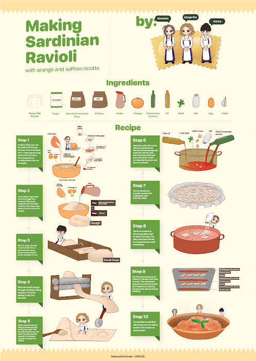
I scrolled through the channel to decide which video I want to make an
infographic of. After some scrolling, I decided to make an infographic
poster of "How to make Sardinian ravioli filled with orange and
saffron ricotta"
The first thing I had to do is to watch the video and write down some notes
on the recipe and cooking tutorial. I tried to catch every little detail
that I think is important for the infographic.
After I've finished making the note and watching the video, I already have a rough idea on what steps I need to illustrate, but first I want to look for some visual reference to help me decide on how I should do the overall layout on the infographic.
|
| fig 1.1 Watching the video while making some notes in notepad |
After I've finished making the note and watching the video, I already have a rough idea on what steps I need to illustrate, but first I want to look for some visual reference to help me decide on how I should do the overall layout on the infographic.
Visual References
fig 1.2 Visual Reference
Progress
After looking through some visual references, I started to work on
my sketch and try to make out the visualization that I want to
make. I sketched out every step while trying to make sure I
mentioned not too much nor too little details on the poster.
Mr Shamsul told me that the sketch he needed was for the whole
layout of the poster. So then I tried to sketch out what I think
would be a good layout for the infographic poster.
fig 1.3 sketches
I also suggested an idea to put little grannies on the steps as a
mini comic to help with the explanation. Mr Shamsul said I can try
that idea and see if it works.
At home, I then tried to remake the sketch in Clip Studio Paint. I
tried to fix the placement on the steps. I'm still not too sure on
how I should place them on the poster, but I thought that I could
tweak them later when I'm done instead of wasting too much time
meddling with the sketches and not making any significant progress.
Here is my digitization process:
fig 1.6 sketching and lineart for the grannies
fig 1.7 closeup look of the grannies' lineart
(The final ravioli is not the best looking ravioli, but I tried my
best T.T I'm not good at drawing food)
I changed the content of final bowl drawing to make it look simpler
and more straightforward for its purpose: explaining the content of
the final bowl.
When it's done, I removed the background so the assets have
transparent background, so I can work on them in Illustrator and
tweaked the composition again.
When the assets are ready, I added them to illustrator and added the
text I needed first. I didn't tweak anything nor separate the layers
yet. But I prepared all the texts and labels in advanced so I won't
forget or miss anything later when I work on it.
fig 1.12 preparing the necessary texts and labels
After adding all the text I need, I proceeded to make the layout on a new file to avoid having a too big file that might crash my laptop.
I was playing with the layouts for a long time until I finally
decided to use this layout
fig 1.13 layout progress 1
fig 1.14 layout progress 2
Since the left and right side looked a bit different, I decided to
give a vertical line as a border for it. It also helps to serve as
a guide so the reader knows where to read first.
While working on the title and grandmas, I also noticed the
grandmas were a bit plain, so I looked for a ravioli image from
freepik and traced it to put them behind the grandmas.


fig 1.15 tracing ravioli image
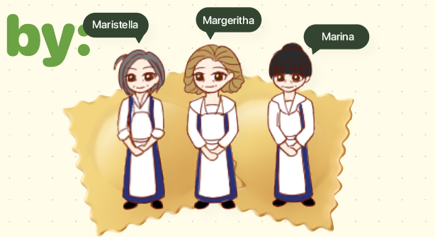
|
| fig 1.16 adding raviolis behind the chibi grandmas |
I also added a grey shape to the bowl content before the final look, to make it more clear that this is the insides of a bowl instead of just some random lines.
I also have given different hightlight to the ingredients.
Ingredients that are being added in that specific step is not
highlighted. Results and ingredients that have been added or
previously made are highlighted with a dark green box, while the
narrative text is given the light green text as you can see below.
fig 1.18 different colored highlight
Result 1

I was going to use this as my final submission but I feel like the way I
use a separating line and how different the left side and right side
looks, so I was trying to find a better way to do the layout.
After some thinking and blank stares into the layout, I finally have
this idea to just simply put the text and image side by side but in a
neater way like this:
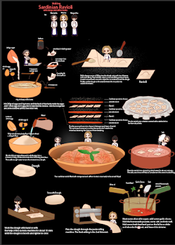
fig 1.20 new layout for the instructable infographic poster
I think this layout is not so bad, though the weakness of this poster
is that the text is small, so you need a good quality resolution and a
zoomed in view to properly see the text.
I also decided to give myself more work by adding the ingredients
section on top of the instruction after seeing some of my friends'
works.
So for this I need to make some more new assets to add into the
ingredients section, because obviously a bowl of flour and a bowl of
sugar isn't really distinctive for the viewer to see.
*some of the assets are taken from the animated infographic assets
because this poster is done after making the video.
So here is what I made in Clip Studio Paint:


The next thing I had to do was to place the new asset into Adobe
Illustrator. All the assets are on a single layer, so I just need to
make a shape with simple shapes or pen tool and cover the image, and use
clipping mask on them so only 1 object is visible.
fig 1.22 Using clipping mask on the assets to make individual
asset
Next I created some room for the ingredient section on the poster by
pushing down a bit the instruction part. Then I just added the
ingredients one by one and labeling them accordingly.
fig 1.23 adding the assets into the ingredient sections
Final Look

fig 1.25 Final look for Instructable Infographic Poster PDF

I thought that would be all, but no. When I tried to move the assets into
photoshop to import them into after effects, I also noticed some assets
had blurred lines which is a no good in my book. So I spent some more time
refining and fixing the lines and making sure the assets look presentable.

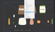
 fig 2.3 setting up the needed tools for the scene


While working on the text I also noticed the first composition, which is the filling making, is for some reason MUCH bigger than the rest of the steps. So I had to make a change and shrink the whole composition to make it smaller. Unfortunately, I also put the sub-heading on the composition, so I had to make an extra step to remove the sub heading from that composition and moved it somewhere else. In this case, I moved it to the intro part.


Of course, when I finally add the sounds into the video, some of the audio are not suitable, or the tempo isn't right, so I either try to change the song duration or look for something that might be more suitable, which is why you can see several same sound on the list. I also ended up using whatever random sound that might fit the action happening in the video. But if it works, it works lol.
Final Look
Project 2
The second project is making an animated infographic from the same recipe
used in the poster. Mr Shamsul said we are allowed to make new assets for
the animation. I knew at that moment that I'd make a LOT of new asset,
even if half of them are just me separating the available assets (ex. I
separated the ricotta from the bowl)
Not only I separated the already available assets, I had to make some new
ones for the sake of showing that particular animation. For example, the
egg yolk and whites separated, and one with both of them combined
together.
fig 2.1 making assets for the animation
fig 2.2 refining the linearts
One good example is the egg. They were so small in the original canvas
so they break in quality when I tried to enlarge them. I also know my
split egg from the asset canvas doesn't match each other's crack line.
thus I fixed them for the sake of the animation.
As you can see in the picture above, the spilling sugar is a bit blurry,
but I thought, sugar are very small and refined, so the blur makes a
special touch to it (but also mainly because I'm lazy and I spent far
too much time refining all these assets lol)
Animation Process:
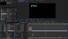
fig 2.4 making the animation on after effects
I'm not quite sure myself why I'm trying so hard to make the animation
look as good as possible even though that takes up so much more time
than I need to. I even went as far as making about 7 layers of ricotta
to play with the spoon to make it seem like the spoon is really
stirring. Not to mention the objects that go between them that somehow
made the egg disappear, so I also spent about 2 hours fixing on them
alone.
fig 2.5 layers and movement made for the stirring animation
I noticed that the duration for the "filling" tutorial already took
up almost 30 seconds, while the animation requirement stated on the
google classroom is "maximum 1 minute". So I had to text Mr Shamsul
to clarify, because I had 2 options: one is to rush the heck out of
the animation to fit the 1 minute limit, or get a time extention for
the animation. Mr Shamsul then gave me permission to do the latter.
So I tried to finish my animation with as short of time as possible
while making sure the audience get the point. Some animation that I
think doesn't need too good of an animation, I give about 2 or 3
frames while playing with opacity, like the one showed here while I
show the folding of the ravioli strip and the repeat of the serving
process
fig 2.6 playing with opacity to show simple instructions
When the overall animation was done (which was about 1:53 in
duration), I proceeded in adding brief text to aid with the
explanation of the instructions. Of course, I tried not to give
too much detail as that would overcrowd the screen too much.
Some text got briefly covered by the animation itself. I thought
about moving it a bit or putting it at the next batch of text, but
I also thought it is a cute touch on the video to make it look a
bit 3D.
fig 2.7 adding instruction texts into the video
While working on the text I also noticed the first composition, which is the filling making, is for some reason MUCH bigger than the rest of the steps. So I had to make a change and shrink the whole composition to make it smaller. Unfortunately, I also put the sub-heading on the composition, so I had to make an extra step to remove the sub heading from that composition and moved it somewhere else. In this case, I moved it to the intro part.
fig 2.9 shrinking the filling composition and moving the
text to the "pre-composition" composition which is the
intro
When the text is done, I proceeded to export the composition and
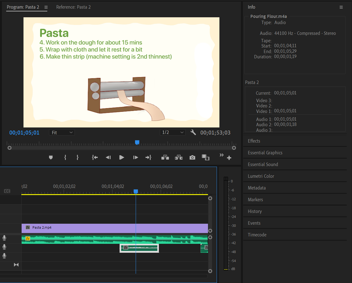
imported them to Premiere Pro to add the sound effects and
music. This is also a grinding process of hours and hours of
hunting for a suitable sound effects on YouTube and any free
platform I could find. I made a list on what sounds I might need
and I spent hours looking for the right sounds.
fig 2.10 list of sounds I downloaded
Of course, when I finally add the sounds into the video, some of the audio are not suitable, or the tempo isn't right, so I either try to change the song duration or look for something that might be more suitable, which is why you can see several same sound on the list. I also ended up using whatever random sound that might fit the action happening in the video. But if it works, it works lol.
fig 2.11 Used the flour sound to sound the pasta rolling
machine
After a lot of tweaking and matching songs here and there
along with it's tempo and duration, here is what I finally
made:
Final Look
fig 2.12 Final video for animated instructable infographic


Comments
Post a Comment