Information Design - Exercises
6.2.2024 - 18.2.2024 (Week 1 - Week 3)
Vanessa Kei Kurniadi / 0360525
Bachelor
of Design (Hons) in Creative Media
Information Design - Exercises

Exercise 1 - Quantify and Visualise Data
In this exercise we're required to quantify our chosen objects and arrange
them into a presentable layout or chart. The information must be presented as
is, and we need to arrange the objects with relevant indicators written out
with pens to help you visualize the quantity and data. The examples of objects
we can use are buttons, coins, lego pieces, M&Ms, and even survival kits
with what we have at home.
As an international student, the items I have in my place is very limited. I
have no spare buttons nor lego bricks, let alone survival kit. So I decided to
go with the object I have at the moment: coins.

|
| fig 1.1 my pile of coins |
I took all the coins I have in my wallet, and sorted out what coins I have in
there. My first step is to sort out the nominals first, which I kinda did while zoning out and thinking on the layout, and worked my way from there.

|
| fig 1.2 coins sorted out by nominals |
After the nominals were sorted, I divided the coins according to the most
obvious difference: their origin/currency. There's an obvious difference
between Malaysian coins, Indonesian coins, and laundry coins.
started to take a closer looks by dividing them into their design appearances.
I started to put them on paper and used a pencil to sketch out some
drafts.
While doing this, I noticed that there is an obvious difference between the
old and new batch of Indonesian coins regarding design. For example, the coin
design from year 2003 looks really different from the coin from 2016. But for
Malaysian coins, the same coin design actually came out from several different
batch release. For example, the 10 cents coin from 2009 until 2023 looks very
similar, if not the same.
The laundry coins don't have their release date stated on them, so it is hard
to know exactly when the coins were made, thus I left the release year empty.
From these datas, I have compiled them into these layouts.


fig 1.3 my visualisation sketches
Personally for me, the one on the right is a bit more accurate since coins of the same year are put horizontally to show their equality on release year. But Mr Shamsul told me that visually, the coins placement are not consistent, because some make a diagonal flow going down while some are put straight horizontally, making the overall layout look a bit weird.
So I decided to use the first layout, which is a consistent flow of zig-zag
line of coins. The years are still put in order, but the change in years are
not so clearly shown anymore.
I proceeded with making a rough sketch of lines to make the tables for this data visualization. The tables are divided into the origin/currency, nominals, designs, and release dates. At the bottom I've also given some space for the total of coins. This kind of layout flows nicely but it also has a weakness of taking up more space than I intended. So I had to try to put the coins as efficiently as possible, while also keeping some gaps between the coins vertically so I have some room to write the years later.

fig 1.4 sketch for the final layout
After I've decided how the sketch would be, I traced the lines with my colored
pens and wrote out the categories for the tables. I made a little change from
the draft. I added an extra row on the bottom parts for totaling all the coins
after totaling the columns. Here's how it turned out:

|
| fig 1.5 first result for data visualisation |
I looked at it and it seems I had sorted and categorize them as neat and as
thorough as I could. I had submitted this one as my work until I realised that
I missed something important: I forgot to mention about the single gold coin
among the other silver coins.
So I had to sort out all the coins on the paper all over again and added the
missed data. I don't have anymore room to make another row so I just wrote the
data under the cells, but I also changed the totals of each section to state
the totals by colors. The correction tape is kinda obvious which is a bit annoying, but it'll have to do since I didn't really have time to make a new table. So here's how it turned out in the end:

fig 1.6 final look of the data visualisation
fig 1.7 final look of the data visualisation PDF
Exercise 2 - L.A.T.C.H Principle
In this exercise we are instructed to create an infographic by following the
L.A.T.C.H Principle. Mr Shamsul gave us some suggestions on what topic we
want, but we can also use any topic we want, as long as we use at least 4 of 5
L.A.T.C.H elements.

|
| fig 2.1 exercise 2 instructions |
Attempt #1
Among the suggested topics, I decided to try making an infographics on Pokemon. Mr Shamsul told us to do decide what we're planning to do, make some sketches and show it to him.
Among the suggested topics, I decided to try making an infographics on Pokemon. Mr Shamsul told us to do decide what we're planning to do, make some sketches and show it to him.
It was an offline class and I only brought my laptop. I didn't expect that I
would need to sketch on paper for the class, so I tried to assemble my ideas
into Miro for now.
I took a long time thinking on what information I would like to put and how I
would put it into a good infographic. I never watched or play pokemon so some
of the information, for example Generations and Locations, are a bit hard to
put accurately, even though I feel like information accuracy isn't what's
important here. Nevertheless, it kinda bothers me and makes me distracted.
But with the limited time I have in class, I decided to at least try to get
some ideas first, and here's what I made.

|
| fig 2.2 my references and assets for L.A.T.C.H infographic |
Explanation:

|
| fig 2.3 visual references |
These are my visual references on the infographics that I am going to make.
I like the left one because of the calming color palette, simple layout, and
they also includes some fun facts about Pokemon.
The middle one has such a nice color palette. It gives off a "game" feeling
and the sorting of information is also really nice.
The last one is a visual reference in case I want to create some kind of 3D
map of the pokemon world. My plan was to make some kind of habitat
illustration in the layers inside the pokeball and give 1 or 2 examples of the
creatures along with their evolution phases, etc.

|
| fig 2.4 My L.A.T.C.H target |
Here is what I plan to do with my Infographic based on the L.A.T.C.H Principle.
- Location: I will sort the animals based on habitats, which are taken from the 18 categories of the pokemons. My plan for the habitats are
- Water
- Fire
- Ice
- Grass
- Ground
- Sky
- Alphabetical: This one is a bit rough and messy planning, but my plan is to sort whatever that doesn't have a sorting rule yet alphabetically
- Time: I will use this for the evolution phase for the Pokemon creatures, and their generations
- Category: I will use this by listing out the category of the pokemons. Examples:
- Raichu: Electricity, Psychic
- Venusaur: Grass, Poison (Grass is taken, so I'll add the additional category for the poison only)
- Hierarchy: I also have no clear plan for this yet, but the hierarchy will be mostly for the overall layout of the infographic, which is how I will display all the information well.
Of course, the fact that there are close to a thousand pokemon creatures, 18
categories (which I have to take some of them and make them into habitats),
and 9 generations makes it hard for me to fit them all into a single canvas
without making them look like a mess of information being slammed into a
blank paper.
(Later after seeing some of my friends I then learned that I don't have
to put them all into the page nor do I need to make them 100% accurate.
But I guess I was overwhelmed by the sheer amount of information I saw and
thus focused on the wrong thing)
I showed my limited ideas into Mr Shamsul and his feedback is that it's
better for me to bring a paper next time so I could be more free to express
my ideas without relying too much on the references, which I completely
agree with, and he also suggested some things:
- Try not to rely too much on the reference because it could limit myself on my design output.
- Instead of tables, maybe making the category into circles might be better, and for creatures that has more categories, I can put them into the area where the two circle have merged.
- Instead of alphabetical, I can try to do hierarchy, for example, from strongest to weakest.
I tried to apply these suggestions at home and tried to make the circles
like sir said. But again I was so lost because I don't know how to make
them look good on paper because there is 18 categories I need to make,
plus lets say I put 3 circles together, there is no creature that has more
than 2 categories as far as I know.
I also tried my initial ideas of making tables, but I was so confused on how
I should put 9 generations on only 6 habitat, which increases my
frustrations. Again, I was facing a dead end and didn't know what to do.

|
| fig 2.5 facing difficulties in executing my ideas into a proper design |
(Again, I focused too much on the completeness and accuracy if my design,
which hinders my thoughts too much, even though it should've been much
simpler.)
Then I remembered that one of my friends suggested for me to do Valorant
instead of pokemons, because I have far more knowledge about Valorant than I
have with Pokemons, combined with the fact that there are only a bit more
than 20 agents available, compared to almost 1000 pokemons. Considering
that, I decided to change my theme.
Attempt #2
In my second attempt, I decided to try to make an infographic about
Valorant. I was a bit hesitant because I don't know if this is even allowed,
because some instructions said I can do any topic, but another instruction
said about "sorting out the pokemon". But since I am stressed out with
pokemon I decided to take my chance and work on Valorant instead.
The first idea that came to mind is to focus my infographic about Valorant
agents. I tried to keep in mind that I shouldn't put too much information on
the page because it will only cause confusion and make it not nice to look
at.
So here is my first sketch on what I want to make


fig 2.6 My Design concept and sketch
My plan is to make tables just like my initial plan with the pokemon, except
with the Valorant agents as the content of information, and sort out the
agents based on their roles in the game (thus I displayed the old pokemon
infographic sketch to save time). And here is how I'm going to apply the
L.A.T.C.H Principle:
- Location: The origins of the agents
- Alphabetical: I will put the roles alphabetically
- Time: I will put the release dates of the agents
- Categories: Game roles
- Hierarchy: Sorting the agents based on their tiers
Like the photo above, I have listed out all the information I needed for
all the agents, starting from their origins, release date, role, and tier
level. This tier level is subjective depending on which website you get it
from, but I figure it doesn't really matter.
Making the design
So I started of by giving the page a title and adding some simple squares
and putting the categories on them, along with the symbols of the roles.
Thankfully there are a lot of Valorant assets on the internet which makes it
easier for me to use.

|
| fig 2.7 Making the boxes |
Then I started to put the agents in the boxes according to their roles. I
was planning to put their names horizontally on top and their information on the bottom, but then my friend told me a better way to display it, and
this is what I made:


fig 2.8 Putting the characters
I personally feel like changing the font orientation makes it unique and
different than my usual style, but I like how it looks like right now and
will probably do it in other projects in the future.
Then I feel like it's a good idea for me to change the colors of each
category to make every category even more distinguishable.
Lastly I had to do something for the background, so I looked into google and
found some 3D Valorant Agents from Behance. I took a model of Neon and then
took Omen model from Youtube. I then have an idea to change their colors
first using the gradient map that I learnt from DPI class, and put them into
the background.


fig 2.9 making the backgrounds

fig 2.10 layout of the infographic
Just when I thought they are done, I noticed that I forgot to sort them
properly. So I re-sort the positions of the roles category based on
alphabetical orders, and sort the agents based on their tier list.
Result

fig 2.11 Final look of the first attempt
I originally planned for this piece to be submission. But then I feel like
even though this might be a good infographics, it doesn't really follow the
L.A.T.C.H principles. The elements of L.A.T.C.H isn't the information you need
to put inside the work, but it's the way you sort all the existing information
according to Location, Alphabetical, Time, Category, and Hierarchy.
So I realised that this infographic might not be enough, and that I should
change or add something in this work.
After some time of thinking I have an idea that I think will work:
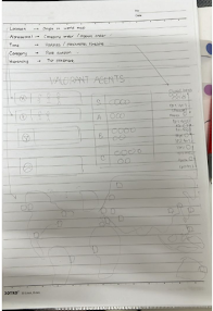
fig 2.12 my revised sketch
I thought it would be a good idea to breakdown all the information that I
have listed into a proper chart or visual to support the data.
I planned to make new table for the agents' tier list, a timeline for the
release dates, and a whole world map to show the agents' origin.

When I was about to make the revised design, I decided that it would be better
to keep the agents category and tiers list merged together. Not only it will
save some space, it also helps to not make the tables repetitive, especially
since both of them are put very close together.
So I started by putting the new assets. I made new squares and put a map under
the 2 boxes. Then I started to focus on the timeline. I started by listing the
release time of each agents in my notepad and then pasting them into
illustrator.
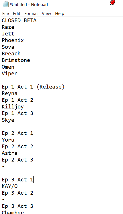
|
| fig 2.14 notes of Valorant agents release note |

|
| fig 2.15 making the timeline |
For the timeline, I need to put circle with a headshot picture of the agents inside it. I was gonna use the clipping mask tool on the full-body models, but I realized not all of them are facing the front. So instead, I looked to google and found their headshot photos, and use them with the clipping mask tool.


fig 2.16 using Valorant headshot pictures for the timeline
In the timeline, instead of using the dates, which is quite a lot, I decided to separate the dates into updates history. Instead of exact dates, I made the timeline based on episodes and acts. For this purpose I did some research and looked for the patch notes history.

|
| fig 2.17 Valorant patch notes |
Of course, the patch notes includes all the fixes, updates, map releases, mode releases, etc. But since I am focusing on the agents, I kept the timeline strictly for the agents' release only.
There are acts that doesn't have any agents release, so after some thinking, I
decided that I could make a symbol that means no agent got released on that
act. After a lot of tweaking, highlighting the episodes to distinguish them
from the acts, and copying agents' faces, here is what I made:

|
| fig 2.18 Valorant agent release timeline |
I actually quite liked how simple yet straight forward this is. I also put the
explanation beside the title on what the symbol mean. It's a bit small but I
think it's still readable and noticeable.
The last part I need to work on is the world map for the agents' origin. I
have a cheat sheet that I got from reddit, and I matched the placements into
my work.

|
| fig 2.19 Valorant Agent Origin Map Progress |
Some of the newer agents aren't there so I just did some research myself and
put them on their positions. I did notice Sova's placement is a bit off so I
just put him on a random area in Russia. Here is what I made:

|
| fig 2.20 Valorant Agents' Origin Map |
Again, I feel like doing this is a good idea. Rather than text, it's better
to visualise their origins into a map. Though it might be a bit hard for
them to know exactly where they are from, especially if they're bad at
geography (like me for example :D). But the full information is still in the Role Category tables,
so they can always peek there :)
Here is the overall look of the work:

|
| fig 2.21 My Infographic Workspace |

|
|
fig 2.22 My Valorant L.A.T.C.H Infographic Final Look 1240 x
1750px |
fig 2.23 My Valorant L.A.T.C.H Infographic Final Look High Resolution
PDF


Comments
Post a Comment