Design Principles - Exercise 1
Vanessa Kei Kurniadi
Bachelor of Design in Creative Media
Content:
1. Recap
2. Design Process
2.1 Visual references
2.2 Idea explorations
2.3 Final designs
2.4 Feedback given by lecturer
1. Recap
Recap on Chosen Principles
-Contrast
Contrast is a juxtaposition of strongly dissimilar elements. Without it, visual experience would be monotonous. It can help provide visual interest or emphasise a point and express content.
-Balance
Balance refers to the distribution of visual weight in a work of design. It is the visual equilibrium of the elements that cause the total image to appear balanced.
Symmetrical Balance:
- Has equal "equal" weight on equal sides of a centrally placed fulcrum.
- The equal arrangement of elements on either side of the central axis (horizontal or vertical) resulting in bilateral balance.
- Arranging elements equally around a central point results in radial balance.
- Approximate symmetry is when equivalent but not identical forms are arranged around the fulcrum line.
Week 1
The
first week was mostly dedicated for us to introducing ourselves and getting to know
each other. We were given some directions on where we could find the videos we
need, what we might need to do in the future, and what to expect.
We were also given a briefing on how our first project
(blog) would look like and some examples from our seniors. We saw some examples
of their blogs, and what made their art stands out, and what we need to pay
attention to when we make our projects.
In our first lecture, Mr Charles didn’t explain too much about
the design theory. Instead he focused on showing us how we should shape out
mindsets as design students. We were shown the points we need to focus on, and
that we need to explore our creativity and to find the best way to express our art
style.
Week 2
The second
week was focused more on a discussion. The students were given the chance to
show their artworks, and Mr Charles would help by giving his opinion about
their progress. Whether they already have their selected design principles in
their art, or if they misunderstood and failed to put them in their art. He also
gave some suggestions and directions to make the artwork look better.
2. My Design Process
2.1 Visual Reference
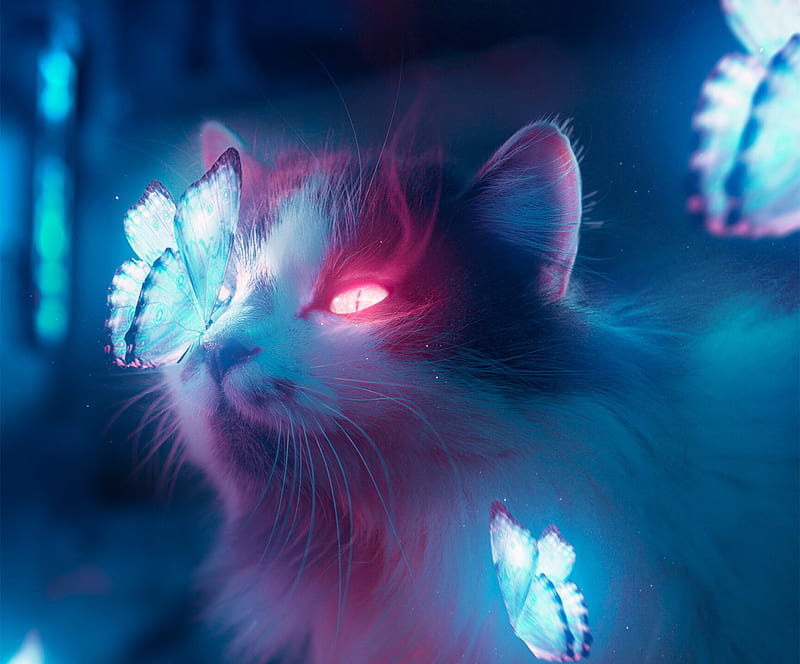
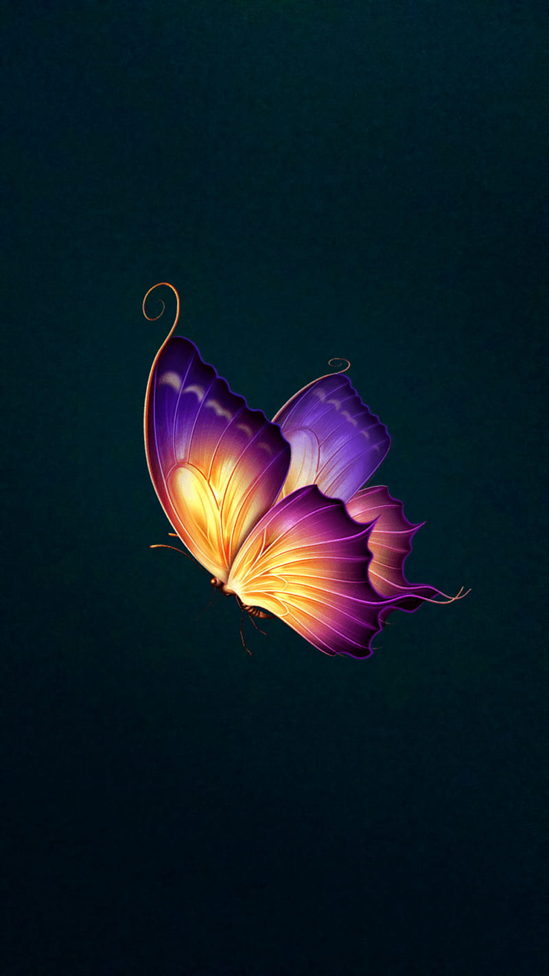
- Contrast -
All images were taken from Google
https://w0.peakpx.com/wallpaper/988/907/HD-wallpaper-fantasy-butterfly-neon-cat-pisici-pink-blue-luminos-hannans-sneakyarts-fluture.jpg
https://w0.peakpx.com/wallpaper/262/1013/HD-wallpaper-butterfly-fantasy-pink-pretty.jpg

-Balance-
All images were taken from Pinterest
https://id.pinterest.com/pin/420945896390410214/
https://id.pinterest.com/pin/32158584828595008/
https://id.pinterest.com/pin/906982812430870518/
2.2 Idea Explorations
-Contrast-
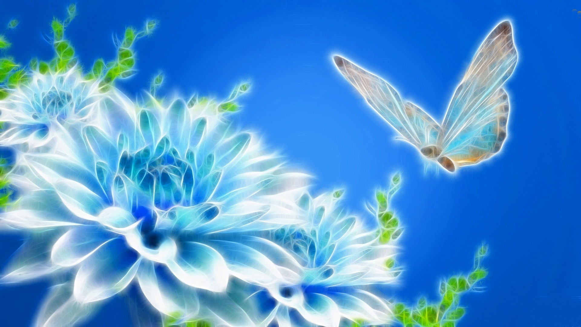
After seeing the design principle video, when I had to make a contrast themed artwork, the first idea that came into my mind is a drawing that pops out from the dark background. At the time I was also watching Avatar 2009 movie, and the glowing plants within the forest inspires me.
My original plan was to make an artwork of glowing flowers, but then I decided to also make glowing butterfly.
My first plan was to make some kind of vines with flowers on them, and to make them surround the whole drawing. And some magical butterflies would be sitting on the flowers.
But then I couldn't quite wrap my head on how I want it to be, and so I had to do some experiments on the flower's placement. I believe that as long as I know how to put the flowers, the butterfly part would be much easier, since they will be around those flowers.
After a few tries, I finally decided on positioning the flowers just as normal flowers. I then put them close to each other for the purpose to fill the empty space. Afterwards, I then added the butterflies one by one, while experimenting with their colours and their positions. The final touch would be to put some glow effects around them and to put the glittery pollen to add the magical effect.
-Balance-
For balance I didn't do much changes for my artwork. An example from the guide video given by lectures gave me an idea: A reflection.
The first sketch I made was a bit rough. I focused too much on the bridge that I forgot to draw the city. I also drew them all at the same layer, thus I had some difficulty adding the backgrounds.
Afterwards, things went on pretty easily. The sketch already has the points I need to pay attention to, and I only need to turn them into their finer forms. The rest are just finishing touches and adding some effects to make them look even more stunning.
2.3 Final Design
Fantasy has always been my favorite thing to think about. It is simply just because there is nearly zero chance that you can encounter them in real life. And the movie Avatar has brought me to an awe with how beautiful it looks. I always love the magical glow of things, and drawing with a dark background has been something I tend to do with my drawings, so I hope that this drawing could also give that sense of magic and fantasy, while also expressing my art style well.
I'm a big fan of the city lights at night, and I've seen somewhere of a highway bridge that goes across the sea with the city at one of its ends. That view is both relaxing and magical, and I want to be able to show that amazing feeling to my audience.
Feedback Given by Lecturer
Overall your ideas are wonderful. But it is important to understand the why and how did you arrive at your composition. Origins and inspiration. Love it when you are imaginative. Embrace your imaginative side and let your composition reflect your true freedom. Make sure when the audience views it, they see, feel, and perceive your intention.
- Mr Charles Sharma Naidu Achu Naidu-
Reflection
In this project, I got the chance to try out new things I never tried in my art before. I experimented on many things to achieve the optimal result I want in my artwork. I also learnt to do different angles and to try to work outside my comfort zone. But the most important thing of all, Mr Charles has taught me not to be bothered too much by the principles, but to also enjoy the process and to focus on what exactly it is that I want to show to people who see my artworks.
~~~~~~~~~~~~~~~~~~~~~~
Made in:
January 20th 2023


Comments
Post a Comment