Typography: Task 2 - Typographic Exploration & Communication
2.5.2023 - 28.5.2023 (Week 6 - Week 8)
Vanessa Kei Kurniadi / 0360525 / Bachelor or Design in Creative Media
Typography
Task 2 (Typographic Exploration & Communication)

Content:
- Lectures
- Task 2 / Typographic Exploration & Communication
- Final Compilation
- Feedback
- Reflection
- Further Reading
Lectures
Full Lecture summary in Task 1
Instructions
Task 2 / Typographic Exploration & Communication
In this task we were instructed to express typographically the content of 1 of the 3 provided text in a 2-page editorial spread (200mm x 200mm per page). No images are allowed. However, some very minor graphical elements, i.e. line, shade, etc. might be allowed.
___
After some thoughts on the 3 provided text, I decided to go with the text called "Follow the Code". I started doing my sketch to see what design and placement is suitable for it. Here was what I came up with:

Fig 1.1 Sketch on my design on Clip Studio Paint (6/5/2023)
I then started to work on the digitalisation process. I asked a friend on his opinion and he helped me to come up with what we thought might be a better design. After exchanging some opinion and editing, here's what the design looks like:

Fig 1.2 Digitalized design of my first attempt with grid (6/5/2023)

Fig 1.3 Digitalized design of my first attempt without grid (6/5/2023)
The next week, when Mr Vinods was giving his feedbacks on all work, it turns out I've been working with the wrong title all along. The title should've been "A Code to Build on and Live by" instead.
In my defense, though, I downloaded the 3 text options from the file section in the facebook group right after given the instruction to start working on task 2. So I think the file was not yet edited when I downloaded, and I worked on it without knowing that the title was wrong.
So, I started to work on the new title in class while also receiving feedback from Mr Vinods. I made a lot of title designs for the new title

Fig 2.1, My design attempts on making the new title, (9/5/2023)

Fig 2.2, My design outcome for new title (12/5/2023)

Fig 2.3, My design outcome for new title (12/5/2023)
I started to redo my title. I found out that I can distort the letters perspectively. Then I made the 3d shape with simple lines and made them simple. I also tried pushing all the text to the right side, but the left side seems empty and I personally don't like it, so I just try to make the shape as big as I can without making it look bad, while still keeping some of the text on the left page.
Here's what I made for my final design:

Fig 3.1, Some changes I made for my previous design (25/5/2023)

Fig 3.2, The final look of my Typography Exploration & Communication (25/5/2023)
Margins: 12,7 mm
Gutter: 7 mm
Head
Font: Futura Std
Body
Font: Serifa Std
Type Size: 10 pt
Leading: 10 pt
Paragraph spacing: 10 pt
Characters per-line: 54
Alignment: Align Left
Final Compilation

Fig 4.1, The final layout of my Typography Exploration & Communication with grid jpeg (25/5/2023)
Fig 4.2, The final layout of my Typography Exploration & Communication with grid pdf (25/5/2023)

Fig 4.3, The final layout of my Typography Exploration & Communication without grid jpeg (25/5/2023)
Fig 4.4, The final layout of my Typography Exploration & Communication without grid pdf (25/5/2023)
*I don't know why the headline in the jpeg without grids seem like they have brown colored lines. It's actually black, same as the one with grids.
Feedback
Week 6:
General Feedback: Make sure the headline can be seen clearly, and make the leading and letter point the same.
Specific Feedback:
- Wrong headline.
- Attempt 2: you already have a good idea there, just need to explore a bit with it. Try imagining a Jenga for it.
Week 7
General Feedback: The idea is fine, but some lines are unnecessary (too detailed)
Specific Feedback:
- There's no need to make the shape of every corner, a simple shape will do.
- There is a way to execute this in Illustrator without making them manually, and that's for you to figure out.
- You can make the shape bigger, occupy more space, and push the text to the other side, but that's just me.
- Can also do something with the line length too
Week 8
(Independent learning week. There is no class, and thus no feedback is given.)
Reflection
Experience
This project has been a fun challenge for me. I mainly have the most difficulty trying to express the title in the best way I could think of. Doing the revision during class is really helpful since I could get direct feedback from Mr Vinods and continue or revise it accordingly. I tried not to let my ideas get affected by previous works and samples and try to make one of my own. It is a bit harder than the previous task, but overall I enjoyed the process and am quite proud of my work.
Observations
During the feedback sessions, I always admire how people could come up with such different ideas. Some of them even make me think about why I didn't think of such concepts. Some get criticised for making their design too similar to the one in previous work and showing samples. Some others have difficulties on trying to express their word well. I don't think mine is also that original or the best design. That's why looking for references from my peer's work and listening to Mr Vinods' feedback helps me understand what works well and what doesn't
Findings
Through task 2 I learned how to think of uncommon ideas. I learned how to come up with concepts and designs that differ from previous works and keep that originality. I also found that there are many ways on making your layout look interesting, even though you can't use many bright colors or images. Just putting your creativity on the headline is enough to make it much more interesting. I also some new techniques that I was able to utilize in Adobe Illustrator for my task, so I can use them in the future if ever needed, which is a good thing to know.
Further Reading

Fig 5.1 A Type Primer by John Kane
I want to continue reading A Type Primer by John Kane. So far the content of this book contains some fun facts and informations that wasn't mentioned in Mr Vinods lecture, so I want to read some more.


Fig 5.2 Type and Color (page 80-87)
This part of the book explains how colour contrast affects the sense of depth of the letter. The example (left) shows that greater contrast between colours suggests greater distance from front to back, while less contrast(right) suggests proximity.
While we tend to think that colour helps to highlight things from the black-and-white environment, it actually weakens readability because it reduces the contrast to the white background.
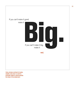
Fig 5.3 Type and Color (page 80-87)
Here is an example of how give a dramatic effect on a statement by using scale, weight, and color. We can see how they make the word "Big" big and bold to emphasize it. The "Red" word is made on the same size, but was made bold and red.

Fig 5.4 English is not Chinese (page 88)
Some text are not read left to right. Until recently, the Chinese are written vertically up to down. The thing is, Chinese characters have the same width, thus making reading them very simple. In the example, it is shown that the character descending the page makes natural and obvious columns.
English letterforms are different. In left to right reading, the difference in width presents no problem with readability. In vertical reading, however, all the type can do is create a shape. If we consider that the primary purpose of the type is to convey information with as little intrusion as possible and that letterforms exist as a response to lateral gestures of handwriting, it should be clear that setting type vertically is inherently anti-typographic.
When the composition calls for vertical type, we need to be mindful of the properties of the letterform and set the type accordingly.

Fig 5.5 Formatting Text (Page 94-95)
In this part there are 2 comparisons of type for the same text, which in this case is a wedding invitation.
The writer mentioned that when setting a field of type, keep in mind the typographer's first job- a clear, appropriate presentation of the author's message. If you see the type before you see the words, change the type.
There are also preconceptions about how something should look that often interfere with the effective, appropriate design of the message at hand. For example, the formality of a wedding invitation is not necessarily tied to centered type-nor to the script, for that matter.


Comments
Post a Comment