16.05.2023 - 06.06.2023 (Week 7 - Week 13)
Vanessa Kei Kurniadi /
0360525 / Bachelor or Design in Creative Media
Typography
Task 3
(Type Design & Communication)
Contents:
Lectures
Full lecture summary in
Task 1
Instructions
Task 2 / Typographic Exploration &
Communication
In this task we were instructed to design some letters. We need to deconstruct
a letter style we wanna go with and then created our own. We will first use a
traditional tool with 1 angle stroke to create the letter, then proceed to
digitalize it.
0. Letter Dissection/Diconstruction
Before
doing this task, I have to do some deconstruction of some letters to see the
details of each shape from the letters. I was instructed to choose 1 font from
the given 10 fonts, and one outside of it.
I am going to design just the uppercase letter, but I will also dissect
lowercase letter to study them.
From the 10 given fonts, I've chosen to do the deconstruction of Univers Lt
Std 55 Roman
Fig 0.1 Deconstruction of letters "p", "A", "R", "t" from Univers lt
std 55 roman (Week 7)
Outside the 10 given fonts, I decided to choose the font called
Quicksand from Fontshare. I used the semibold one, since I feel it would be the closest to my style.
Fig 0.2 Deconstruction of letters "P", "A", "r", "t" from Quicksand
Semibold (Week 7)
1. Making the Letters.
On the first week we
brought 5 different tools to write on paper. Some of them are tools that
aren't usually used for writing. I brought:
- A Zebra PM-1 Mild Highlighter
- Snowman Permanent Marker
- STA Metallic Brush
- Artline Drawing Pen
- Standard AE7 0.5 Ballpoint Pen
During class, we tried out hands-on making some letters using the tools
while maintaining the same angle every time to make the strokes consistent.
Here's what I made during the session (the order are as mentioned above):
 Fig 1.1 Letter design practice I did during class with the tools (Week
7)
Fig 1.1 Letter design practice I did during class with the tools (Week
7)
As expected, there's not much things I can do with the permanent marker, the
drawing pen, and the ballpoint pen. On the contrary, I had a lot of fun trying
out my hands on the strokes of the brush pen. Not only do I have to control
the angle of the brush, but I also have to control my movement and pressure to
create the desired results. The results themselves are far from perfect, but I
am proud of what I managed to make.
2. Practising the Letters
On week 8, it is
independent learning week. We are instructed to keep practising with the
tools. Mr Vinod also gave us homework to try out 5 methods on each of the 5
tools, then choose our favourite one from each tool.
I am unsatisfied with the limitation of what I can make with the drawing pen
and ballpoint pen. So I changed the tools and practice with them. the tools I
chose in the end were:
- A Zebra PM-1 Mild Highlighter (same as before)
- Artline Decorite Water-based Pigment Ink Brush
- STA Metallic Brush (Same as before)
- Snowman Permanent Marker (Same as before)
- 2.0 Mechanical Pencil
I tried to make 5 methods Here's what I made from them:
Fig 2.1 All 25 results from using different tools and angles to make the
letters (Week 8)
After some lettering and practicing, I decided that these 5 are my favorite:
Fig 2.2 My 5 Favorite Results (Week 8)
We submit it to Mr Vinod and he asked me which one is my favorite. I
personally like result no. 2,3, and 5. Mr Vinod then told me to go with no.2,
which is the Artline Decorite Water-based Pigment Ink Brush. Next we are
told to keep practicing, and then design the letters that we are going to
digitalize
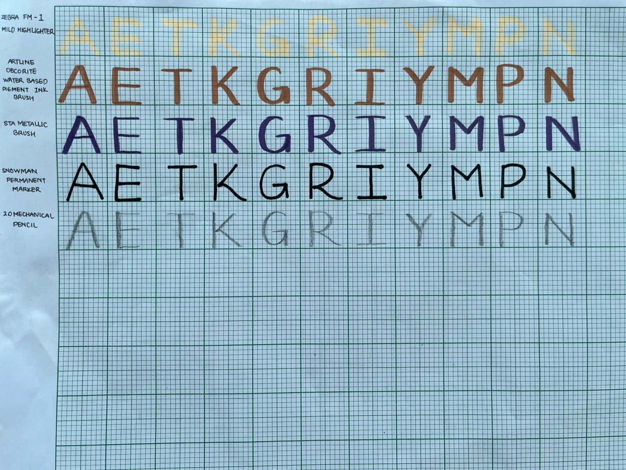
Fig 2.3My work for the letter A,E,T,G,R,I,Y,M,N (Week 9)
3. Digitalization
In the next class, we are shown how to make our digitalization process. We are
told to choose 1 particular design that we like, and then digitalize it in
Adobe Illustrator. I've chosen my letters based on how "neat" and "pretty"
they are. I personally really it when my writing is simple yet neat. So I
looked for the ones with the best controls and the one that looks the best in
my opinion. Here's what I chose:
Fig 1.5 The one with the "✓" symbol is the one I chose for the
digitalization process (Week 9)
Fig 3.1 My first attempt on the digitalisation process (Week 9)
Details:
X Height: 450 pt
Baseline: 0
Capheight: 538
As much as I tried to make it look finer, I want to keep it "original" and
make it feel like my own writing. I'm not sure if Mr Vinods will like it, but
I want to try to make a font that subtly says "you might not know this but
this is my handwriting". I wanna make it look like a casual imperfect font but
one of my own, thus I try to use the calligraphy brush on most if not all the
parts of the letters.
When we came to the next class, Mr Vinod told us that most, if not all of us
are imitating the sketch we made on the graph paper. We were supposed to
refine it and control every bit of the detail of the letters. Mine in
particular are inconsistent in the horizontal and vertical strokes, and said
to be "imitating the sketch too much".
I don't exactly know if this means "handwriting fonts" are not ideal, or
if we're supposed to tweak our sketches in a specific way to make them look
"finer" and maybe computer-like. I still have this question in my mind, but
since I am a bit scared to make another mistake and having to redo everything
again, I decided to use the middle ground.
I decided that it would be best to make it more refined. I redid the letters
and made the horizontal and vertical strokes consistent. I tried to make the
same thing with the horizontal lines, but they might not be in perfectly
same-sized strokes. The fonts I made seem like casual sans-serif fonts with
little handwriting traces. The only things that made it my own are the custom
width of the strokes, and the little bumpy end on some of the words. The bumps
are a bit inconsistent, though. I try to make them fit the letters well by
tweaking them with the pencil tool, but I figured this little part might be
allowed to be a bit different from each other to make each of them special in
their own way, though I might still need to consult about this to Mr Vinods.
But before that, I still need to put the letters into FontsLab first.
Fig 3.2 My second attempt on the digitalisation process (Week 10)
Details:
x- height: 450 pt
Baseline: 0
Cap height: 538
Ascenders: 556
Descenders: -21
FontsLab
In our facebook group, Mr Vinod asked us to put our letters into FontsLab, but
besides the specified letters, he also asked us to put in some punctuations: .
, ! # So I have to make them before I can continue to FontsLab
Fig 3.3 My final design (merged into 1 shape) plus the required punctuation
in Illustrator (Week 10)
Since I made the symbols/punctuations pretty much on a whim, for, and # I
copied them and used Pathfinder to merge the shapes on the copied one. These
are just some countermeasures just in case I have to redo something.
I copied and pasted them into FontsLab according to the tutorials in the
lecture youtube playlist that Mr Vinod gave us, and here's how they look:
Fig 3.4 My second attempt on the digitalisation process in Fontslab (Week
10)
During feedback session I was told that if I am to put the little bumpy
ends, they should all face the same direction, so I made some more edits to
my letters.
Fig 3.5 My Illustrator file for this task - Every step is done in a
different artboard(Week 11)
Fig 3.6 Revised Final Font (Week 11)
Fig 3.7 Revised Final Font in Fontslab 8 (Week 11)
Fig 3.8 Final fonts in metric tab (Week 11)
I exported it and named it Horibrus, which is taken from "Horizontal Brush".
In the end this font is called Horibrus Regular.
Final Look: Type Design & Communication
Fig 4.1 Horibrus final font screenshot in metrics tab (Week 11)
Fig 4.2 Horibrus final font looks JPEG (Week 11)
Fig 4.3 Horibrus final font looks PDF (Week 11)
Fig 4.4 Horibrus Poster (Week 11)
Fig 4.5 Horibrus Poster PDF (Week 11)
Font Preview
Feedbacks
Week 7
No Feedback - The project just started.
Week 8
Go with design No. 2 and keep practising.
Week 9
General Feedback: Digitalized the letters you've made with the tools
you've chosen. use the x-height of 500 pt. For capital letters, you can't
really tell so you can only guess
Specific Feedback: Your letters are consistent, go ahead with the
digitalization; 1st attempt: the letter is too big, make it smaller. It's ok
if it's not exactly 500pt, but keep it around that.
Week 10
General Feedback: Most of you are imitating what you made in the
sketch process with your hand. You were supposed to refine it during the
digitalization. Pay attention to every detail.
Specific Feedback: Keep the strokes consistent between the vertical
and horizontal lines, refrain from imitating the sketch and keep exploring.
Week 11
General Feedback: Overall better and the font is consistent.
Specific Feedback: If you want to do
the little bumps at the end of the letters make sure they are facing the
same direction and make a certain angle. The punctuation are still wrong.
The angle of the hashtag is too extreme.
Week 12
General Feedback: Make sure you're already using all the given
letters on the poster.
Specific feedback: You can explore on putting the small font name
word by word here and there on the poster. You can also try to put a
texture on the poster.
Experience
This task has given me a whole different challenge. Not only I have never ever
touched a font-making app in my life, nor designed one, but I also never
really care about the details of the font. So this task has been an
eye-opener. During the whole task, I realized just how many things we need to
pay attention to. While the rules of making the letters might apply for
certain font styles such as this one, the amount of details I have to focus on
makes this work much harder and took more time than I expected. Even so, after
I started to get the hang of things, I'm starting to enjoy more and more of
the process. This font might not be my best work yet, nor a type of font that
I would use on a daily basis, but I'm proud to say I did as best as I could to
make this font and to tweak them to my liking.
When Mr Vinod told me twice that my letters are consistent, for some reason I
was pretty happy. Maybe because I felt like I did well with the sketch and the
digitalisation process, or maybe because it gives some resemblance to my
character(?). I'm not sure myself, but I am proud and happy when I heard his
feedback.
Observation
Seeing my peers work, I was kinda surprised and they somewhat gave me some
inspiration, even though mostly I can't apply it to my current work. The
other's letters are so different one to another, and I'm genuinely excited to
see so many beautiful fonts created by such simple tools. Some has very
curly/twirly feel to it, and some rigid. Some strokes are similar (like mine),
and some has extreme difference. It's really interesting to see.
Findings
I never thought that creating a typeface is this complicated. As someone who
likes comics and cute art, I've seen people turn their handwriting into sfx,
make cute doodles of letters, etc. This is probably why I tried to make my
letters as "handwriting-like" as possible during my first digitalization
process. But I found out that there's a detailed process of thorough
refinement, where I have to pay attention to a lot of details, and take
control of most if not all, parts of every single letter. While it's a
time-consuming experience that feels like grinding on a game, I also
unexpectedly don't hate the process. It's clearly not my favourite, but I
don't hate it either. On the contrary, I found myself quite enjoying it.
Of course, I also finally know how to do the steps of making a font. It felt
like a long but short journey, but I'm proud and happy with what I managed to
make.
Fig 5.1 Type Primer 2nd Edition by John Kane
For further reading, I wanted to continue to read A Type Primer 2nd Edition
by John Kane. Not only because I hate not finishing a book I am reading, but
also because the content has been informative to me.
Fig 5.2 Texture (page 96-98)
It is important to know about the unique characteristic and history of each
typeface, and to understand how each typeface feels. A good typographer has
to know which typeface suits the message at hand. We also need to consider
the difference in texture, such as the different x height size and the
heaviness of the strokes that affects the mass on the page.
Fig 5.3 Typing is Not typesetting (page 99)
A typographer should be able to recognize the difference between typing
and typesetting. For example, for now, the courier is still the best
expression of intimate, informal voice - direct address. Imitating the
formalities of typesetting in a letter is inappropriate because it
suggests an undeserved permanence - the end of a discussion, not its
continuation.
Fig 5.4 Leading and Line lenght (page 100 -105)
This part of the book shows us what the difference in leading makes. The
goal in setting text type is to allow easy, prolonged reading. At the
same time, a field of type should occupy the page as much as a
photograph does.
Text that is set too tightly encourages vertical eye movement; a reader
can easily loses their place. A type that is set too loose creates
striped patterns that distract the reader from the material at hand.
Fig 5.5 Kinds of proportions (page 106-113)
This part of the book shows kinds of page proportions. A designer's
first consideration is the size and shape of the page. Although
practical limitation often limits our options, it is useful to
understand how the proportions we work with has evolved, and then to
test your own responses against the received wisdom.
This book also showed us examples such as The golden section and
Fibonacci sequence. It also tells us about different paper sizes.
Fig 5.6 Components of Text Page (Page 114-115)
This part of the books shows us the components that makes a text page: recto,
verso, text page, margins, follos/headers, running heads, running shoulders,
and running feet.


Comments
Post a Comment