Digital Photography and Imaging - Week 1
06.04.2023 (Week 1)
Vanessa Kei Kurniadi / 0360525 / Bachelor or Design in Creative Media
Digital Photography and Imaging
Week 1 - 3 Favorite Designs
WEEK 1
In our first class, we spent the session getting familiar with each
other. Mr Fauzi gave me a really nice impression. He seems really chill
and kind. We also changed our class time to 8.45 because the traffic in
the morning is terrible.
LECTURES
Mr Fauzi gave us some introduction on the module and told us what to
expect in this semester. He told us that we will begin our first task, the
collage, pretty soon. He also showed us what we will do at the end of the
semester: making a moving poster in Adobe After Effects.
TUTORIAL
Mr Fauzi told us one important thing we need to learn: file sorting. Mr
Fauzi told us how extremely important it is to have a neat field of work,
especially if you're gonna work in groups in the future, since being messy
would make it harder and consume more time for your colleagues.
For this, It is better to sort out your files in your (or anyone's)
computer, and to name your layers in photoshop, and to also sort your
files in the drive. That's why Mr Fauzi taught us the Google Drive folder
system.
Lastly he told us what we need to bring and what to do with our next
week's project: Physical Collage. For that we need to bring a magazine or
newspaper, but if we don't we can print something and bring them to the
class. A scissor is necessary but a glue is not yet needed, since we need
approval before glueing the composition together. I also asked Mr Fauzi
and you're allowed to use stickers or any decoration to decorate the
composition. We can make it as pretty as we want.
PRACTICAL
Mr Fauzi attached for us on how we're supposed to do our e-portfolio, which
as far as I know, is a must for every design subjects. Since I've done this
on the previous semester and for every other design subject for this semester,
I roughly already know what to do.
For this week, we got an assignment to look into Pinterest and pick our 3
favourite graphic designs, and why we like them.
Some of my favourite graphic designs:
I really like this design in many ways. Firstly, because of its
simplicity. It didn't fail to capture my interest even without needing
to use strong colours. The way it is placed in the centre also adds to
its aesthetic feeling.
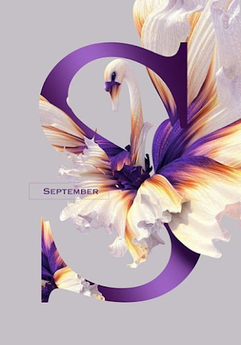
Fig 1.2 Pinterest
This design will definitely always stay as one of favorites. The way
the designer merges the flower, the letter, and the swan is amazingly
done so that it looks majestic and beautiful. The design looks so
simple yet filled with many pretty details.
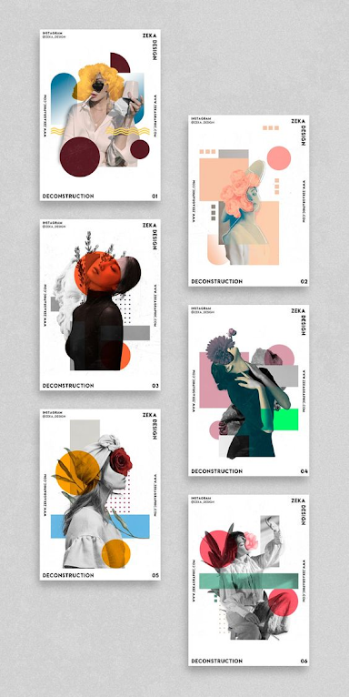
These designs have something in common: the way it plays with the colors
and the composition of flowers, which the designer has done a really
great job with. There are not a lot of details, but the play with colors
and the shapes added to them play a big role making it seem "complete".
The words are placed at the edges making it look like a frame. I love it
when the artist knows when to stop adding things, so everything is not
too overwhelming.


Comments
Post a Comment