Advanced Typography - Task 1: Exercises

30.8.2023 - 20.9.2023 (Week 1 - Week 4)
Vanessa Kei Kurniadi / 0360525
Bachelor of Design (Hons) in Creative Media
Advanced Typography - Task 1: Exercises - Typographic system & Finding Type


Jumplinks:


LECTURE SUMMARY

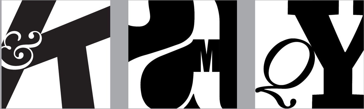
AdTypo_1_Typographic Systems

“All design is based on a structural system”
According to Elam, 2007, there are 8 major variations with an infinite number of permutations:

Axial: all elements are organized to the left or right of a single axis. The axial axis doesn’t necessarily have to be straight. It can be bent. You can even use multiple axis.


fig 1.1 Axial system


-        Radial: all elements are extended from a point of focus.

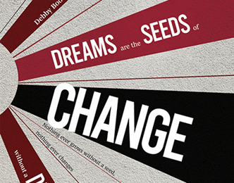
fig 1.2 Radial system


-        Dilatational: all elements expand from a central point in a circular manner

fig 1.3 Dilatational typography system 


-        Random: elements appear to have no specific pattern or relationship


fig 1.4 Random typographic system


-        Grid: a system of vertical and horizontal division

fig 1.5 Grid typographic system


-        Transitional: An informal system of layered banding

fig 1.6 Transitional typographic system


-        Modular: A series of non-objective elements that are constructed in as standardized units

fig 1.7 Modular typographic system


-        Bilateral: All text is arranged symmetrically on a single axis

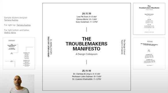
fig 1.8 Bilateral typographic system


The typographical organisation is complex because the elements depend on communication to function. Additional criteria such as hierarchy, order of reading, legibility, and contrast also come into play.

The typographic systems are akin to what architects call shape grammars. The typographic system has unique rules that provide a sense of purpose that focuses and directs the decision-making.

Student designers may initially find the system awkward, but as work develops and understanding of the system emerges, its creative potential (in terms of its permutations or combined uses) is realized.

Many designers focus primarily on the grid system for design and are unaware of the potential that other systems hold. The different systems are one of many possibilities that affords some level of distinctiveness from the grid systems in certain situations.

Understanding the systems organisation process allows the designer to break free from “the rigid horizontal and vertical grid systems of letterpress” (Elam, 2007).

“Typography is the use of type to advocate, communicate, celebrate, educate, elaborate, illuminate, and disseminate. Along the way, the words and pages become art.” – James Felici, the Complete Manual of Typography


AdTypo_2_Typographic Composition

2 aspects of Typography:

Typography pertains to the creation of letters, the arrangement of large amount of text within given space.

The rule of thirds

The rule of thirds is a photographic guide to composition, it basically suggest that a frame (space) can be divided into 3 columns and 3 rows. The intersecting lines are used as a guide to place the points of interest, within the given space.

Realistically no one would ever use the rule of thirds when there are other more favorable options

fig 2.1 Rule of Thirds 

From the 8 mentioned system, the most pragmatic and most used system is the Grid system (or Raster Systeme), which is derived from the grided compositional structure of Letter Pressing printing.

It was further enhanced by what is now called the Swiss (Modernist) style of typography, with its foremost proponents being Josep Muller Brockmann, Jan Tschichold, Max Bill and such.

While it may seem to be old and rigid, the versatility of the system and it’s (to some degree) modular nature tends to allow an infinite number of adaptations. Thus it continues to remain popular.

Fig 2.2 Grid system examples

In reaction to this very ordered approach to the typography of the modernist era, a group of younger designers began to question and challenge this notion of order. There was a method to their madness. Order was replaced with apparent chaos but this chaos was exciting and ‘new’ for a generation that was being exposed to Punk anti-establishment thought and music. As such the asymmetry, random, repetition, dilatational and radial systems began to take root in the lexicon of designers.

Other models/ Systems

Environmental Grid

This system is based on exploring an existing structure or combining numerous structures. An extraction of crucial lines both curved and straight is formed. The designer then organizes his information around this super-structure, which includes non-objective elements to create a unique and exciting mixture of texture and visual stimuli.

It is an interesting manner of exploration and provides context to the forms developed in the designs, due to the fact that the system/structures were developed around key features of an environment associated with the communicators of the message.

fig 2.3 Environmental Grid system examples


The image above showed the process of the environmental grid. First, take an image and reduce them until only the key elements and shapes remain, and use them as the base for the letter placement and composition.

Form and Movement

This system is based on the exploration of an existing Grid System. Developed to help students to explore; the multitude of options the grid offer; dispel the seriousness surrounding the application of the grid system; and see the turning of the pages in a book as a slowed-down animation in the form that constitutes the placement of image, text, and color.

The placement of a form (irrespective of what it is) on a page, over many pages, creates movement. Whether the page is paper or screen is irrelevant.

fig 2.4 static versions of the form placed on spread (grids were hidden). Care was taken to ensure visual connections and surprises on every page. The forms could represent images, text or color.


fig 2.5 the level of complexity increases as newer elements are introduced in a incremental fashion: addition of one color, then image, then dummy text and so on.


AdTypo_3_Context & Creativity
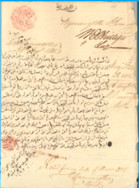
Handwriting

We study handwriting because the first mechanically produced letterforms were designed to directly imitate handwriting. Handwriting would become the basis or standard for form, spacing, and conventions that mechanical type would try and mimic.

The shape and line of hand-drawn letterforms are influenced by the tools and materials used to make them: sharpened bones, charcoal sticks, plant stems, brushes, feathers and steel pens all contributed to the unique characteristics of the letterform.

Another factor included the material upon which the forms were written: clay, papyrus, palm leaf, animal skins (vellum and parchment) and paper.

Fig 3.1 the evolution of Latin alphabets


Cuneiform (c.3000 B.C.E)

The earliest system of actual writing. Was used In a number of languages between the 34C. B.C.E through the 1st century C.E. Its distinctive wedge form was the result of pressing the blunt end of a reed stylus into wet clay tablets. The Cuneiform characters evolved from pictograms. It is read from left to right.

Fig 3.2 Cuneiform

Hieroglyphics 2613-2160 B.C.E

The Egyptian writing system is fused with the art of relief carving. The system was a mixture of both rebus and phonetic characters – the first link to future hieroglyphic images has the potential to be used in three different ways:

1.      As ideograms, to represent the things they actually depict.

2.      As determination to show that the sign preceding are meant as phonograms and to indicate the general idea of the word.

3.      As phonograms to represent sounds that “spell out” individual words

Early Greek / 5th C. B.C.E

Built on the Egyptian logo consonantal system, the Phoenicians developed a phonetic alphabet consisting 22 letters, which then was adopted by the Greeks who added the necessary vowels.

·        Was comprised of only capital letters, written between 2 guidelines organized into horizontal rows.

·        Direction of reading was not yet fixed. Was often read in a format known as boustrophedon or “as the ox ploughs”

·        Were drawn freehand, not constructed with compasses and rule, and they had no serifs

In time the strokes of the letter grew thicker, the aperture lessened, and serifs appeared. The new forms, used for inscriptions throughout the Greek empire, served as models for formal lettering in imperial Rome.

Those Roman inscriptional letters – written with a flat brush, held at an angle like a broad nib pen, then carved into the stone with mallet and chisel – have served in their turn as models for calligraphers and type designers for the past 2000 years


fig 3.3 Early Greek

Roman Uncials / 4th century

By the 4th century Roman letters were becoming more rounded, the curved form allowed for less strokes and could be written faster.

fig 3.4 Roman Uncials

English Half Uncials, 8th C.

In England the uncials evoved into a more slanted and condensed form. While English and Irish uncials evolved, writing on the European continent developed considerably and needed a reformer. Luckily it came in the Carolingian Handwriting Reform.

fig 3.5 English half uncials

Emperor Charlemagne 8 C.CE

After the fall of the Roman Empire, the end of a central advanced culture resulted in general illiteracy and the breakdown of handwriting into diverse regional styles. For 300 years the knowledge of writing was kept alive mainly in the remote outposts of religious cloisters and retreats.

Fig 3.6 Emperor Charlemagne

Carolingian Minuscule

A court school was established under the direction of Alcuin of York. During Charlemagne’s patronage book production increased and language was standardized – pronunciation and spelling as well as writing conventions – capitals at the start of a sentence, spaces between words and punctuation. A new script emerged: the Carolingian minuscule. It was used for all legal and literary works to unify communication between the various regions of the expanding European empire.

Carolingian minuscule was as important a development as the standard Roman capital – this style became the pattern for the Humanistic writing of the fifteenth century; this latter, in turn, was the basis of our lowercase Roman type.


Fig 3.7 Carolingian Minuscule


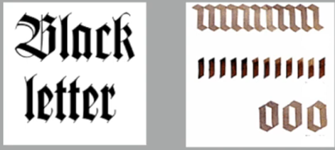
Black Letter 12-15 C.CE

Gothic was the culminating artistic expression of the Middle Ages, occurring roughly from 1200-1500. The term Gothic originated with the Italians who used it to refer to rude or barbaric cultures north of the Italian Alps.

The vertical supplanted horizontals as the dominant line in architecture; the pointed arch of the Romans; the almond shape, or mandorla, was preferred. Gothic writing forms reflected this aesthetic. Blackletter is characterized by tight spacing and condensed lettering. Evenly spaced verticals dominated the letterforms.


fig 3.8 Black Letter

The Italian Renaissance

As the Gothic spirit reached its apex in other areas of Western Europe, Humanist scholars in Italy were slowly reviving the culture of antiquity. The Renaissance embrace of ancient Greek and Roman culture spurred a creative wave through Italian art, architecture, literature and letter form design.

The Humanist admired the Carolingian script, which had clear open handwriting. Humanists named the newly rediscovered letterforms Antica. The Renaissance analysis of form that was being applied to art and architecture was directed toward letterform – resulting in a more perfect or rationalized letter.


fig 3.9 The Italian Renaissance

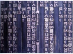
Movable Type / 11 C. – 14 C.

Printing (wood block) had already been practiced in China, Korea, and Japan (Dharani Sutra, AD 750). Earliest known printed book (AD 868) is the Diamond Sutra: 16’ scroll with the world’s first printed illustration.

China had attempted to use movable type for printing but was unsuccessful due in part to the number of characters and material used (clay).

In late 14 C. several decades before the earliest printing in Europe, the Koreans established a foundry to cast movable type in bronze – allowing the dismantling and resetting of text. With the creation of their new script Hangul, the Koreans would succeed where the Chinese failed. To conclude, the introduction of moveable type was introduced in the 1000 – 1100 CE. This innovation was pioneered in China but achieved in Korea (Diamond Sutra). In the late 1300- 1399 CE. Several decades before the earliest printing in Europe (Guttenberg’s bible 1439), the Korean established a foundry to cast movable type in bronze.


fig 3.10 Movable type

The reason why we talked about Greek influence on Rome, but not Egyptian or Near Eastern influence on Greece, is because in the 19th century and the rise of the modern British Empire, it became out of style to credit Africa or Africans with anything of value, and therefore Greece and rome were elevated over much older, much more influential civilization, specifically Ancient Egypt, but also less extensive or old civilizations like Mesopotamia, the Indus Valley, China, etc.

Evolution of Middle Eastern Alphabets


fig 3.11 evolution of middle eastern alphabets

It is important to note that while the Phoenician letter marks a turning point in written language – use of sound represented in letters – the script itself has been possibly influenced by the Egyptian Hieroglyphic and Hieratic Script.


The Evolution of the Chinese Scripts


fig 3.12 evolution of Chinese script: from the oracle bone to seal script to clerical script, traditional and simplified scripts

Indus Valley Civilization (IVC) / 3500-2000 BCE

The oldest writing found in the Indian subcontinent the IVC is as yet undeciphered and seems to have been somewhat logo-syllabic in nature. “Some believe that these symbols are non linguistic, while other argue that they represent Dravidian languages because they are very similar to some of the southern Indian proto scripts that were in the southern Indian geography.


fig 3.13 Indus Script Seals

The Brahmi Script / 450 – 350 BCE

The Brahmi script is the earliest writing system developed in India after the Indus script. It is one of the most influential writing systems; all modern Indian scripts and several hundred scripts found in Southeast and East Asia are derived from Brahmi.

The origin of the script is still much debated, with most scholars stating that it was derived or at least influenced by one or more contemporary Semitic scripts Semitic, while others favour the idea of indigenous origin or connection to the much older and as yet undeciphered Indus script.

fig 3.14 The Brahmi Script

Handwriting

The oldest writing systems present in Southeast Asia were Indian scripts. There were a few, but the most important would be Pallava (or Pallawa in malay), a South Idian script originally used fro writing Sanskrit and Tamil.

Pallava was highly influential, becoming the basis for writing systems across Southeast Asia. But Pallava wasn’t the only Indian script in use in the Malay Archipelago. Another was Pra-nagari, an early form of the Nagari script, used in India for writing Sanskrit.


fig 3.15 Left: kedukan bukit inscription from Sumatra, written in old malay using Pallavas script. Right: Pra-nagari, an early from of the Nagari script, used in India for writing Sanskrit. It can be seen today in the Blanjong inscription of Bali

Does this mean Nusantara never had writing systems of its own? Were they all just borrowed from India?

This is where we get to what is perhaps Indonesia’s most important historical script: Kawi. Based on Nagari, but indigenous to Java. The word Kawi comes from the Sanskrit term kavya meaning poet. The interesting thing about Kawi is that is was the script used for contact with other kingdoms. Because it was so widespread, Kawi became the basis of other scripts in both Indonesia and the Philippines.

This means that ancient kingdoms of the Malay Peninsula would have used Indian scripts and Kawi to write old Malay language.

fig 3.16 Laguna Copperplate Inscription, written in Kawi

Indonesia has a great number of historical writing systems.

Scholars have theorized the existence of an ancient Gujerati-derived Proto-Sumatran writing system which was the basis of medieval scripts on the Island.”

fig 3.17 Incung from Kerinci, South Sumatra

fig 3.18 a related script to the rancho grouping rejang script also known from south Sumatra

fig 3.19 a page from the Batak handbook on magic divination.

fig 3.20 a Bugis script called Lontara

Fig 3.21 Javanese script is a medieval descendant of Kawi

Jawi, the Arabic- based alphabet. We know Jawi was introduced along with Islam. But how this happened is more interesting than “we converted and adopted the Arabic alphabet”

Ancient Hindu societies in both South and Southeast Asia were classist and often caste-based. The lower classes were generally illiterate. Obviously, Islam didn’t change this completely, but it did encourage teaching for the sake of proselytization.

When those traders engaged in missionary work, they would have taught Jawi to people that might otherwise not have learned to read and write. This allowed it to spread among the upper and middle-class in the trading ports. However it took a while for Jawi to supplant other scripts, and in some areas never did so completely.


fig 3.22 Record of sale for a female Batak slave to a British resident.

In modern Malaysia, jawi is of greater importance because it’s the script used for all our famous works of literature. Every hikayat and Malay charm book is written in Jawi. Unlike Indonesia, we don’t have a huge wealth of pre-Jawi inscriptions and writings – this is part of the reason why we tend to ignorantly claim that Jawi is “tulisan asal Melayu” which is of course untrue.

All systems of writing have some form of influence. To claim complete originality is inaccurate and some would say ignorant. History gives us context but it also gives designers the opportunity to design, research, or help codify to communicate and understand better our collective heritage.

Fig 3.23 Demak was a Muslim Javanese Kingdom, yet here’s a manuscript from the 19th century which still uses the traditional Javanese


So why is handwriting important in the study of type/typography?

We study handwriting because the first mechanically produced letterforms were designed to directly imitate handwriting. Handwriting would become the basis or standard that for form, spacing, and conventions mechanical type would try and mimic.

For decades, Asia/East has neglected much of its written heritage, and by adapting western printing technologies (letterpress, linotype. Unicode), it was difficult to create much of the old text in printed form because it would take know-how, much time, effort, and money.

However with a mild renaissance in the East, with the advent of computer programmers in large numbers, we are starting to see the proliferation of indigenous scripts on phones, tablets, and computers.

Programmers and type Design

More vernacular scripts are being produced by software giants (Google): in their employment a great many Asian programmers and designers. More and more vernacular and multi-script typefaces – a term coined by Muthu Nedumaran – are being produced to cater to situations where the written matter is communicated in the vernacular script or vernacular and Latin scripts.


fig 3.24 Baloo: a perfect blend of pointy paws in a coat of fur, Baloo is an affable display typeface by Ek Type.


Local Movements and Individuals

In Malaysia, murasu.com was spear-headed by programmer and typographer Muthu Neduraman. The programming language needed to encode the different types of vernacular writing systems was cracked by Muthu. The system is now used in mobile phones and desktops.

Huruf a local group of graphic designers interested in the localized lettering of latin and vernacular letters painted or inscribed on walls and signages are amongst the more prominent organizations digitizing and revitalizing typefaces in Malaysia.

Ek Type and Indian Type Foundry are organizations that have done ground breaking work with the development or vernacular typefaces in India.

In South East Asia, the movement has not organized and coordinated itself well enough. But with increasing awareness and examples from larger neighbours like India with their large talent pool and resource, the knowledge behind methods used and approaches taken are more accessible geographically speaking.

Creativity and originality are properties that are most often intertwined. It is important for young designers to look inward and examine their histories, civilization, culture and communities to bring these past developments into the future and develop on them instead of blindly appropriating cultures and developments that have no context, relatability or relevance.

Creativity inspiration should begin by observing our surroundings and exploration of our collective histories.

AdTypo_4_Designing Type

Why design another typeface? Xavier Dupre (2007) in the introduction of his typeface Malaga suggested 2 reasons for designing a typeface:

-        Type design carries a social responsibility so one must continue to improve its legibility.

-        Type design is a form of artistic expression.

Here are some purpose and limitations behind the following typeface:

·        Frutiger is a sans serif typeface designed by the Swiss type designer Adrian Frutiger in 1968 specifically for the newly built Charles de Gaulle International Airport in France.

o   Purpose: to create a clean, distinctive and legible typeface that is easy to see from both close up and far away. Extremely functional

o   Consideration/limitation: letterforms needed to be recognized even in poor light conditions or when the reader was moving quickly past the sign. He tested with unfocused letter to see which letterforms could still be identified.

fig 4.1 Frutiger font found in airports

·        Verdana (1996) for Microsoft was made by Matthew Carter. Many of his fonts were created to address specific technical challenges, for example, those posed by early computers.

o   Purpose: the font was tuned to be extremely legible even at very small sizes on the screen due in part to the popularity of the internet and electronic devices.

o   Consideration/limitations: The font exhibits characteristics derived from the pixel rather than the pen, the brush of a chisel. Commonly confused characters, such as lowercase “i”, “j”, and “l”.

Fig 4.3 Verdana Font

·       Bell Centennial was created by Matthew Carter. The sole purpose of this font is to be used in telephone directories. Back when the company used Bell Gothic as their font, the ink often bled off the letters, causing some visual problems. Bell Centennial was made by making a specific corner on the intersection, so when it’s printed, it will come out like normal fonts. The name Bell Centennial was made in honour of the company’s 100th anniversary.


fig 4,3 bell Centennial

·       Edward Johnston was the creator of the hugely influential London “Underground” typeface, which would later come to be known as “Johnston Sans” (1916). He was asked to create a typeface with “bold simplicity” that was truly modern yet rooted in tradition. Johnston‘s design, completed in 1916, combined classical Roman proportions with humanist warmth.

  • Purpose: As a new typeface for posters and signage at London's Underground Railway.
  • Consideration / Limitation: Johnston's remit was to unite the London Underground Group, the different companies all using the same rails and tunnels.
*Eric Gill admitted that his typeface, the Gill Sans, is heavily based on Johnston's work.

fig 4.4 Underground typeface

General Process of Type Design:
  1. Research
  2. Sketching
  3. Digitization
  4. Testing
  5. Deploy
Research:
We should understand type history, anatomy, and conventions when creating type. We should also know terminologies, side bearing, metrics, hinting, etc.

It is then important to determine the type's purpose or what it would be used for, what different applications it will be used in such as whether the typeface is for school busses or airport signages, etc.

We should also examine existing fonts that are presently used for inspiration/ideas/reference/context/ usage pattern/etc.

fig 4.5 in traps were created to solve the ink bleeding out when printed.

Sketching
Some designers sketch their typeface using the traditional toolset (brushes/pens, ink and paper) and scan them for digitization because they are more confident with their hands and have better control using it.

Some designers sketch their typeface using digital tool sets, such as Wacom directly into a font design software (much quicker, persistent, and consistent) but this can sometimes impede the natural movement of hand strokes.

fig 4.6 Sketch of Johnston Sans, designed by Edward Johnston, sketch by Eiichi Kono

Digitization
There are professional software that are used in the digitization of typefaces, amongst the leading software are: FontLab and Glyphs App. Some designers also use Adobe Illustrator to design or craft the letterforms and then introduce them to specialized font apps. This, however, is frowned upon by the purist.

Attention should not only be given to the whole form at this stage but also to the counterform. The readability of the typeface is heavily dependent on it.

fig 4.7 App to make font: Glyphs and Fontlab

Testing
Testing is an important component in the design thinking process. The result of the testing is part of the process of refining and correcting aspects of the typeface. Prototyping is also part of the testing process and leads to important feedback.

Depending on the typeface category (display type/text type) the readability and legibility of the typeface become an important consideration. However, it is not as crucial if the typeface is a display type, where expression of form takes a little more precedence.

fig 4.8 Prototype Stencil (Stenz) developed and designed by Vinod J. Nair

Deploy
Even after deploying a completed typeface there are always teething problems that did not come to the fore during the prototyping and testing phases. Thus, the task of revision doesn't end upon deployment.

The rigour of the testing is important in so that the teething issue remain minor.

fig 4.9 Prototype number plate typeface (Car license registration) Myno & Nomy designed by Vinod J Nair 2018

Typeface Construction
Roman Capital: The grid consists of a square, and inside it a circle that just touches the line of the square in four places. Within the square, there is also a rectangle. This rectangle is three-quarters the size of the square and is positioned in the centre of the square.

Thus using the grid (with circular forms) can facilitate the construction of letterforms and is a possible method to build/create/design your letterform.

fig 4. 10 Construction grid for the Roman capital using 8x8 cells.

fig 4.11 Classification according to form and construction

Depending on their form and construction, the 26 characters of the alphabet can be arranged into groups, whereby a distinction is made between a group for the capitals and a group for lowercase letters.

Many different forms and constructions must be taken into account when designing a new type. An important visual correction is the extrusion of curved (and protruding) forms past the baseline and cap line. This also applies to vertical alignment between curved and straight forms.

A visual correction is also needed for the distance between letters. It is not possible to simply place letters next to each other with equal spacing between them. The letters must be altered to a uniform 'visual' whita space. This means that the white space between the letters should appear the same. This is called fitting the type.

fig 4.12 Fitting on shapes

Most Typeface come about due to a need or demand. The need/ motivation can be intrinsic and extrinsic.

Intrinsic: 
  • Designer has an inexplicable need driven by interest to design a typeface, and seek out a form that comes close to fulfilling a desire. 
  • Designer indentifies a gap/ problem and thus endeavors to solve it through the design of the typeface.

Extrinsic:
  • The designer has been commissioned or the student-designer has a task to complete that involves designing a typeface.

For the design to be successful the designer needs to be invested in the idea and understand the requirement/limitation/use/stakeholder.

Designing a typeface is a labour of love. only the brave and foolish walk this path for the reward pales in comparison to the work.

AdTypo_5_Perception and Organisation

Perception in typography deals with the visual navigation and interpretation of the reader via contrast, form, and organisation of the content. Content can be textual, visual, graphical or in the form of colour. However our focus today is in typography.

fig 5.1 Several methods in typography to create contrast by Rudi Ruegg

Carl Dair adds 2 more principles to the one mentioned above: texture and direction "to make the design work and meaning pop out - clearly and unambiguously, and with flair." via the use of contrast in typography.

Dair posits 7 kinds of contrast:
  1. size
  2. weight
  3. contrast of form
  4. contrast of structure
  5. contrast of texture
  6. contrast of colour
  7. contrast of direction
fig 5.2 "5 Types Graphic Contrast" by Carl Dair

CONTRAST

Size
A contrast of size provides a point to which the reader's attention is drawn. For example if you have a big letter and a small letter you will obviously see the big letter first before the small. The most common use of size is in making a title or heading noticeably bigger than the body text.


fig 5.3 Contrast in size

Weight 
Weight describes how bold type can stand out in the middle of the lighter type of the same style. Other than using bold, using rules, spots, and squares also provide a “heavy area” for a powerful point of visual attraction or emphasis, therefore not only types of varying weight.

fig 5.4 Contrast in weight

Form
The contrast of form is the distinction between a capital letter and its lowercase equivalent, or a roman letter and its italic variant, condensed and expanded versionsthe  of typeface are also included under the contrast of form.
fig 5.5 Contrast in form

Structure
Structure means the different letterforms of different kinds of typefaces. For example, a monoline sans serif  and a traditional serif, or an italic and a blackletter.

fig 5.6 Contrast in structure

Texture
By putting together the contrasts of size, weight, form, and structure, and applying them to a block of text on a page, you come to the contrast of texture. Texture refers to the way the lines of type look as a whole up close and from a distance. This depends partly on the letterforms themselves and partly on how they’re arranged. 

fig 5.7 Contrast in Texture

Direction
Contrast of direction is the opposition between vertical and horizontal, and the angles in between. Turning one word on its side can have a dramatic effect on a layout. Text blocks also have their vertical or horizontal aspects of direction. Mixing wide blocks of long lines with tall columns of short line can also create a contrast.

fig 5.8 Contrast in direction


Colour
The use of color is suggested that a second color is often less emphatic in values than plain black on white. Therefore it is important to give thought to which element needs to be emphasized and to pay attention to the tonal values  of the colors that are used.

fig 5,9 Contrast in colour


Form refers to the overall look and feel of the elements that make up the typographic composition. It is the part that plays a role in visual impact and first impressions. A good form in typography tends to be visually intriguing to the eye; it leads the eye from point to point, it entertains the mind and is most often memorable. 
fig 5.10 examples of how form come into play into a composition

Originating from the Greek words “typos” (form) and “graphis” (writing), typography means to write in accordance with form. Typography can be seen as having two functions: 
  • to represent a concept
  • to do so in a visual form.

Displaying type as a form provides a sense of letterforms’ unique characteristics and abstract presentation.

The interplay of meaning and form brings a balanced harmony both in terms of function and expression.

When a typeface is perceived as a form, it no longer reads as a letter because it has been manipulated by distortion, texture, and enlargement, and has been extruded into a space.

fig 5.11 Examples of play of forms by letterforms


ORGANISATION

Gestalt
Gestalt is a German word meaning the way a thing has been “placed” or “put together”. Gestalt Psychology is an attempt to understand the laws behind the ability to acquire and maintain meaningful perceptions.

The Gestalt psychologists, especially Max Wertheimer, developed a number of “laws” that predict how perceptual grouping occurs under a variety of circumstances (Wertheimer, 1923/1938). Technically, in sciences, laws are predictions that are true. In reality, these laws are better classified as principles

Gestalt theory emphasizes that the whole of anything is greater than its parts—this is based on the idea that we experience things as unified whole: Instead of breaking down thoughts and behavior to their smallest elements, the gestalt psychologists believed that you must look at the whole of experience.

Therefore in design (read: typographic layouts), the components/ elements that make up the design is only as good as its overall visual form. While each component may be functional at an elemental level, the sum of its parts is not greater than the whole or the overall form.

Gestalt: Perceptual Organisation / Groupings:
  • Law of Similarity
  • Law of Proximity
  • Law of Closure
  • Law of Continuation
  • Law of Symmetry
  • Law of Simplicity (Praganz)

fig 5.12 Gestalt principle of grouping


The Law of Similarity is the gestalt grouping law that states that elements that are similar to each other tend to be perceived as a unified group. Similarity can refer to any number of features, including colour, orientation, size, or indeed motion.

The Law of Proximity is the gestalt grouping law that states elements that are close together tend to be perceived as a unified group. This straightforward law states that items close to each other tend to be grouped together, whereas items further apart are less likely to be grouped together.


fig 5.13 The Star suspends 2 top editors over controversial May 27 front page, depicting a picture of Muslims performing terawih prayer sandwiched between the headline “Malaysian terrorist leader” and a spa advertisement

The Law of Closure refers to the mind’s tendency to see complete figures or forms even if a picture is incomplete, partially hidden by other objects, or if part of the information needed to make a complete picture in our minds is missing

The law of (Good) Continuation holds that humans tend to perceive each of two or more objects as different, singular, and uninterrupted object even when they intersect. The alignment of the objects or forms plays a major role in this principle to take effect. For more.

fig 5.14 Examples of closure in logo design


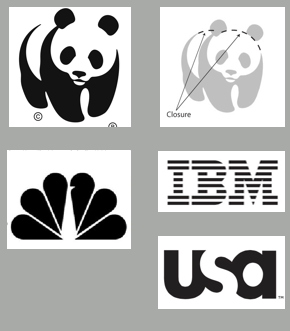
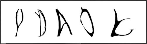
fig 5.15 difference in concept of continuation and closure


INSTRUCTION


Exercise 1: Typographic Systems
In this task, we are instructed to explore 8 design systems: axial, radial, dilatational, grid, modular, transitional, and bilateral.

We are to use the following text:

The Design School,
Taylor’s University

All Ripped Up: Punk Influences on Design 
or 
The ABCs of Bauhaus Design Theory 
or 
Russian Constructivism and Graphic Design 
Open Public Lectures:

June 24, 2021
Lew Pik Svonn, 9AM-10AM
Ezrena Mohd., 10AM-11AM
Suzy Sulaiman, 11AM-12PM

June 25, 2021
Lim Whay Yin, 9AM-10AM
Fahmi Reza, 10AM-11AM
Manish Acharia, 11AM-12PM

Lecture Theatre 12

The exercise task is to be done using Adobe InDesign only.
Size 200 x 200 mm. In addition to black, we can use one other 
colour. Graphical elements (line, dot, etc.) can be used but 
limitedly.


Exercise 1: Typographic Systems

Axial
In class, Mr Vinod told us to start working on the axial typographic system during class. I have watched the lecture video in advance so I have a rough idea on what I need to do, but still, working on a blank canvas to create a design from square one is always challenging because I have to decide on what angle I want it to be, what direction, etc.

I made some lines in several angle and tried to picture in my head what it could potentially become.

fig 6.1 One of the random attempts on the axial typographic system

Most of the time I ended up scratching the design because I was not satisfied and found it too hard to move on from there. So in the end I tried to make an axial system from a straight vertical line. From there I just did whatever came to mind. I put text on any blank areas and work my way from there.

I had an idea to place the headline in a "step-like" formation. I like how it turned out. It keeps the design not too symmetrical and it somehow looks catchy for me. I put the "Open public lecture" text vertically along the lines. It keeps it distinguishable since they're the only vertical text in the design, and it also gives some aesthetic feeling in its own way.

fig 6.2 First result of the axial typographic system

Mr Vinod saw my work and said that it's not bad. It's already correct and you can clearly see the axis in the middle. He also commends the hierarchy of the design. Even if I put the "Open public lecture" separately, you can tell they are connected with the way I put it. However afterwards, he told me that it's better to use sans serif fonts. In my case, I used Serifa in this design. In addition, he also said that the design is okay, but there's still room for improvement.

At home, I looked at the design again and saw if there were any changescouldcan make. I still felt happy and satisfied with my work and I didn't want to change anything. Though I noticed that I left the last text: "Lecture Theatre 12" because it was on another page in the MIB. I ended up adding the left text and adjusting my design accordingly. 
I also wanted to make it more pretty by adding some colour. I had thought of using red background , but I wanted to see if I could use a subtle colour and design. I thus tried to use a reddish-orange for the design by putting them in some of the text here and there, and I think it turned out well. 


fig 6.3 Revised axial system


Bilateral
Bilateral is probably one of the easiest. I just slammed the text on the canvas and make sure they are centred. To create a hierarchy, I put colour on the headline and make the important parts bold.

fig 6.4 Bilateral System


Dilatational
Dilatational requires me to learn a new technique on how I could even make the circular pattern on text. After finding out the type on the path feature, I then started to figure out how I should make the dilatational pattern. All I did was put one text and let the other text follow along on the pattern, while also moving them left or right according to what I thought would look nice. For the date and names, I created another circular pattern following the end of the latest pattern and did the same thing as the first pattern.

fig 6.5 Dilatational System


Grid
Grid is also quite easy to make. I just have to create some grids as guides on the canvas and put some text according to the available boxes. The challenge is about how I could make them neat and balanced, and this is what I made.

fig 6.6 Grid System


Modular
For modular I am trying out whatever comes to mind while also making it a bit creative. Modular is a bit different but also much similar with the grid system. First I made all the text horizontal and put the headline in the center. It looked fine for me but I feel like I could also try a more interesting method.

I looked through previous works by my seniors and decided to create blocks here and there, and then put the text inside the boxes. I also turned the headline 90 degrees and added some lines beneath the text to make it look more catchy. Personally, I just played and tried some placements and let my aesthetic instinct play its role. The result turned out simple but also quite satisfactory.

fig 6.7 Modular System First Attempt


fig 6.8 Modular System Second Attempt


Radial
Radial is more challenging for me. But when I scrolled through the internet I saw a particularly interesting design that caught my eye.


I noticed how the play of the lines and circles create such a simple yet beautiful composition in the page. I decided to try and explore the radial system inspired by this design.

The initial placement was hard for me. I was looking for a space where the text placement won't be too extreme, and there should be enough space for the texts I need to put on the page.

After many experimenting, this is what I came up with:


fig 6.10 Radial System first attempt

Mr Vinod commended my choice of design, but he did note that the blocks of texts at the bottom right shouldn't be that way. All text should follow the axis that we created. So I made some revision and this is how it looks now.

fig 6.11 Radial System Revised


Random
Random is actually one that I enjoyed making even though it was challenging in the beginning. I looked through some references from the internet and I just dived into the design. 

My technique is quite simple: I typed the necessary texts first, and copy and pasted them everywhere to create some kind of overlapping text field. I kept in mind that the shape should be nice and neat. I also tried changing the opacity of some of the texts. I kept some in almost black colour, some grey, and some in even lighter grey. They create a sense of depth which unexpected made the design so pretty in my opinion.

Lastly, I made sure that each one of the given text has at least one in black color, so it's readable to whoever that cares enough to look closer. It's not really ideal since you don't know when and who's gonna be giving the talk, but I guess I can ignore it in random typographic systems, since it's literally called random.

fig 6.12 Random System


Transitional
I had to look for references before making a transitional typographic systems. Apparetransitional typographic systemsntly it's just a text that is put in such a flowing manner that is creates a transition.

I feel like it's not that hard to make, so I just slapped some text into the screen and tried to make a flow. I made the text look like they're falling down slowly one by one, and the one in the bottom makes another batch of "falling text".

fig 6.13 Transitional System

Apparently I didn't make the bottom one look enough like the first one (which now I think is due to the block of text which I should've separated into individual rows, but I guess the angle of the text is also not following the flow)

So in the end I played it safe and just put the text horizontally straight and put them like stairs steps going down. Here's how it looks like in the end

fig 6.14 Transitional System Revised


FINAL LOOK


fig 7.1 Typography Designs Compilation

fig 7.2 Axial Typographic Design

fig 7.3 Bilateral Typographic Design


fig 7.4 Dilatational Typographic Design


fig 7.5 Grid Typographic Design


fig 7.6 Modular Typographic Design


fig 7.6 Radial Typographic Design
 

fig 7.7 Random Typographic Design


fig 7.8 Transitional Typographic Design


fig 7.9 Typographic Systems Final Looks with Grid PDF

fig 7.10 Typographic Systems Final Looks without Grid PDF


Exercise 2: Type and Play
Finding type – Students will be asked to select an image of a man-made object (chair, glass, etc.) or structures (buildings), or something from nature (Human, landscape, leaf, plant, bush, clouds, hill, river, etc.). 

Students will analyse, dissect and identify potential letterformswithin the dissected image. The forms would be explored and ultimately digitized. It is expected that through a process of iteration, the forms would go from crude representation to a more refined celebration that would reflect to a degree its origins. 

Extraction
Mr Vinod's examples in class are plants and objects, so for some reason I felt like challenging myself a little bit by looking for buildings to pick from. I initially was gonna pick a photo of the nightlife of a particular area in a city, but then I remembered the photos are not supposed to have too many elements.

So I looked some more, and I stumbled upon an image of a weird-looking building which might have been built digitally or even by AI. But the patterns are quite interesting and I could see some letters in there.

fig 8.1 image taken from internet to extract from


I decided to use this photo in the end and extracted 5 letters from it: D,Y,A,K,O

fig 8.2 extracted letters from the image.

Digitization
fig 8.3 extracted letters from the image put in Illustrator


Next, I started to look for references on how I should make them. I took some time to scroll through Fontshare, Font Space, and Google. I tried looking for an abstract font at first, then spooky font (because the raw extraction seems really good for a spooky title of a movie) but to no avail.

I then changed my strategy. I saw that my extraction is rather narrow, except for the K letter. I looked for a narrow font to serve as a guide to the width and maybe as the major shape of my messed up letters.

After looking some more, I got my eyes on the Pramukh Rounded font. It's narrow but rounded in nature. I'm not sure what I'll make of the infusion of both letters but I'm interested in trying this font.


After putting both the reference and the extraction letters on Illustrator, I put them together and began to take a good stare at them. I had a long thought on how I should proceed with this, and after some time I decided that I should start by adjusting the width of the extracted letters.

That was the original plan, but while rotating some letters so they stand straight, and squeezing them to achieve the wanted width, I found myself starting to adjust the shapes here and there. It wasn't that hard but also not that easy. Adjusting the width and angle is fine, but I was also thinking about how I could refine the shape so they don't look as messy.

The one thing I kept in mind was how much I'm in love with the extraction. They look kind wild but also have a strong character to them. I want to keep as much as I could while also making them look more like a proper fine-looking font. Refining them too much is the last thing I wanna do.

fig 8.5 First refinement


Now I think they are finally looking like a nice uniformed font. But the shapes are still too messy. The crooked shape are giving character, but I think I should lessen them a bit. I also want to try to use the thickness of the Pramukh Rounded as a benchmark for the font thickness.

I spent some more time thinking and refining the font. I tried making the thickness changes more subtle while keeping some of the bumps here and there, since they are basically their feature.

The most difficult letter to refine is K. The original shape is so wild so I had to try to make it somehow more elegant looking. I spent a good amount of time refining the K letter and tweaking it here and there. I want to keep its original shape as much as I can, but the shape alone is really far from the K in Pramukh Rounded that I used for the guide. So after so many hours of thinking and refining, here's the result of my font: Dyako

fig 8.6 Final Form


When it was the feedback session, Mr Vinod took a look at my font for a good minute before saying that he didn't have any problem with this, and moved on to another student's typeface. It took me by surprise because not only did my font pass, but he also didn't give me any points to revise. I was really happy when I realized I did a good job after working on the letters for a good amount of hours.

Poster
When it was done, I finally moved on to the last part: Making a poster out of it.

I am so sure this font is suitable for a horror theme. So I was planning to make it into a horror haunted house movie poster.


fig 8.7 Poster First Attempt


When I consulted with Mr. Vinod apparently I was supposed to use a background that is related to the subject image that I used for the extraction process. Plus the image needs to be 1024x1024px, with only black and white color.

It was really hard to look for a building with similar characteristics to the one I chose, so I ended up going back to my extracted image and creating a horror poster out of it.

My theme is about a futuristic house that turns out to be a house of horror. I made some fold creases on it to make it look like a physical flyer. I made it seem like 2 flyers are put together, to show a different side of the house.

Final Look

fig 8.8 Poster Final Look


fig 8.9 Poster Final Looks PDF


FEEDBACK
Week 3
General Feedback - You have to ensure that the extraction resembles the image you take. Don't just take a tiny piece out of a huge image. You also need to make sure to use the right reference that is relevant to the extraction you get. Don't just take anything.
Specific Feedback - Looks good to me, I have no problem with this

Week 2
General Feedback - You need to understand the typographic systems, otherwise you'll suffer on task 2 and task 3. If you still do not understand you can watch the second lecture video
Specific Feedback -
Transitional: The bottom half doesn't follow the flow from the top half. The font is also too big. Recommended size: 8-12.
Radial: OK, but the box of text needs to be fixed, make them follow the same centre.  

Week 1 
General Feedback - Watch the lecture videos to understand how to do the typographic systems
Specific Feedback - (None)


FURTHER READING

fig 9.1 typographic Systems by Kimberly Elam


For further reading, I am exploring more on typographic systems using the book called Typographic Systems by Kimberly Elam.

fig 9.2 Project Element and Process (page 7-9)

This part of the book shows us some examples of the typographic systems.

There are 8 design systems: Axial, Radial, Dilational, Grid, Transitional, Modular, Random, and Bilateral systems. This part gave us a simple explanation and some examples on the systems.


fig 9.3 The Circle and Composition (12-13)

This part of the book shows how the placement of something as simple as a circle can play a big part in a composition. It could act as emphasis, pivot point, tension, etc.

fig 9.3 Typographic systems (17-155)

From this point on until the end, the book gave us a really detailed and in-depth explanation of the systems and lots of variations of examples that are given for each of the typographic systems. It's a great book to learn from if you wanna learn more about each detail of the systems.


Comments

Popular posts from this blog

Advanced Typography - Task 3: Type Exploration and Application

Video and Sound Production - Exercises & Project 1

Information Design - Exercises