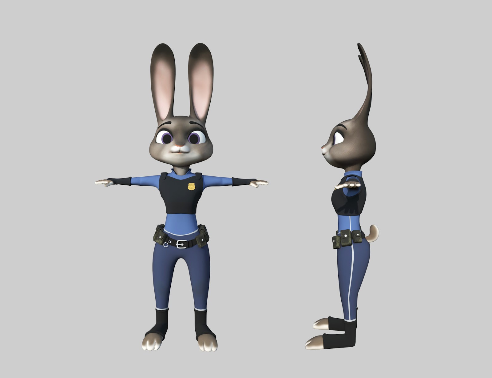
3D Modeling - Character Modeling
13.11.2023 - 27.11.2023 (Week 12 - Week 14)
Vanessa Kei Kurniadi /
0360525
Bachelor of Design (Hons) in Creative Media
3D Modeling -
Character Modeling
INSTRUCTION
In this task, we were instructed to make a character model based on what we've
learned this semester. We can take the pose blueprints/character models sheet
from the internet and use it to create our own modelling.
Mr Kamal noted that we shouldn't make characters that are too simple for this
task if we want to get a good mark. He suggested that we pick something that
would be a bit challenging for our skills. So I try to look for a character
that won't be too easy but isn't too difficult for me to make. After some
thinking I decided to make the model of Judy Hopps from Zootopia.
fig 1.1 Judy Hopps from Zootopia
So first off, I tried to look for a good blueprint that I could use to work with, and I found this one.
fig 1.2 Character model from Google
I put the images as a reference in the background and started by making the
torso of the character. I used the level 1 smoothened cube as the base and
worked my way from there.
fig 1.3 Making the torso
After I'm done with the torso I start to make the limbs and head by using the
same methods with cubes. I actually spent quite a long time making the details
of the shape and making sure the smoothened shape wouldn't be washed out. I
spent a long time tweaking vertices so they won't make odd dents in the
smoothed version, and used the proportional editing feature to make some
curves on some parts like the ears.
I planned to make the gloves as an extension of the hand's shape, but the
shape always comes out really bad, so I just made the hand, and created the
gloves as a separate object, and then put it around the hands.
I don't actually use the quad view mode but since this task requires me to
look at different angles to make sure the shape is correct I'm really grateful
Blender has this feature. I just wish I could also use the quad view to see
the opposite sides.
I was sceptical about my decision to make only half the body so I could mirror
it later, but after seeing how many tweaks I had to make in the face alone I
felt grateful that I did.
fig 1.4 Making the limbs
As for the best, I thought it would be easier to create a new object and then
put it on the body instead of extending some shapes from the body. I also used
the mirror technique for the vest, but it also gave me some difficulty to make
sure weird dents weren't visible on them when smoothened out. The pants are
really easy though, I just created some new loop cuts and pulled it outward
for a bit and pulled it up a bit to create volumes.
The next step is making the eyes and brows for the face. I decided I won't
stick a flat-eye shape into the bunny. Instead, I created a round shape and
did some (a lot actually) tweaking until it looked nice and a bit close to the
reference. Looking at the eyes for so long actually made me a bit creeped out
by my own work lol. But I'm glad all those hours of tweaking the face shape
actually resulted in a nice-looking result.
I also made the eyebrow, but it's quite simple. I just make the basic shape
with cubes, then when the jaggy rough shape is done, smooth it out and tweak
the parts that need some changes and you're done!
fig 1.6 Making the eyes and eyebrows
fig 1.7 making the belt (apparently when I made the screenshot it bugged
a bit)
Here is what it looks like afterwards:
fig 1.8 Full version
This version is actually my submission at first. But after looking at it for a while, I feel like to make it truly like Judy Hopps, I should add some eyelashes to the model and make it more "girly"
Just like the eyebrow, I made the eyelashes from cubes that got deformed into weirdly shaped triangles, but if it works, it works :D
fig 2.1 Judy Hopps Final look without wireframe
fig 2.2 Judy Hopps Final Look with wireframe
REFLECTION
Experience
Making the model of Judy Hopps has been a fun yet challenging experience. I feel really satisfied whenever the jagged rough model turns into the shape that I want. There were some difficulties along the way, where the smoothed shape and colour turned out to be a mess. But I was hell-bent on making sure it at least resembled a bit of how I wanted it to look, so I spent hours and hours tweaking vertices here and there and made sure the smoothed version was how it should be.
Observation
I didn't see others' work on this task, so I can't really say anything about it.
Findings
I found out that my work was displayed on the class projector but I was too focused on my screen to notice. But a friend told me that she and her friends are amazed by my work. I felt like my work is simple and still lacking some things, but I felt really proud after hearing that and I am really grateful for her kind words.


Comments
Post a Comment