Interactive Design - Exercices
24.4.2024 - 14.5.2024 (Week 1 - Week 4)
Vanessa Kei Kurniadi / 0360525
Bachelor of Design (Hons) in Creative Media
Interactive Design - Exercises


Purpose


Konpo's Studio has a very fast load time, starting from the home
page, to the specific pages and the hire us section. It is also a
very responsive website. During my several time trying to open and
close the site, it never fails to load properly. The fact that it
comes with a nice loading screen also helps to entertain the already
short wait time.

Purpose


The site loads much better on my iPad Pro, but even that still gives me a
bit of load time on the loading screen before entering the home page, which
is not a good sign.


Now that the method to obtain the logos and picture is found, all that is left is for me is to arrange the images and add the text.


 fig 3.1.6 progress pictures on Bandit website replication

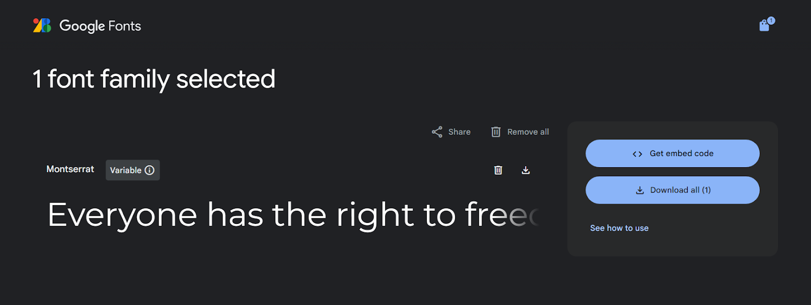
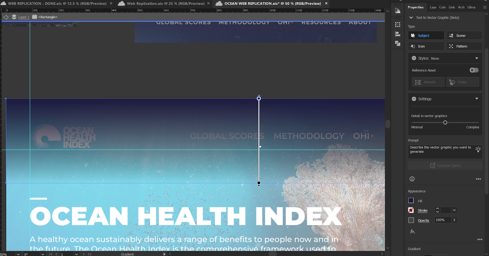


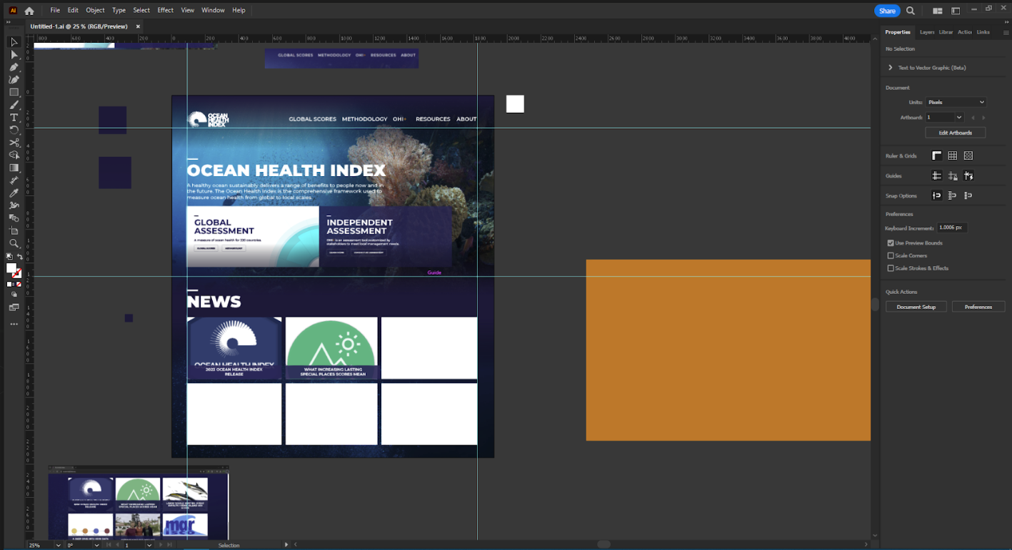 fig 3.2.3 Ocean Health Index replication progress
pictures
fig 3.2.3 Ocean Health Index replication progress
pictures
 fig 3.2.4 My Ocean Health Index web replication work
file
fig 3.2.4 My Ocean Health Index web replication work
file


 fig 4.3.2 Recipe Card Exercise visual References, week 8
(9.6.2024)
fig 4.3.2 Recipe Card Exercise visual References, week 8
(9.6.2024)
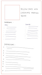


 fig 4.3.8 My style.css sheet, week 8 (10.6.2024)


Vanessa Kei Kurniadi / 0360525
Bachelor of Design (Hons) in Creative Media
Interactive Design - Exercises
INSTRUCTION
Exercise 1: Web Analysis
For our first week, we were given an exercise of doing a web analysis from the
given website award sites.
fig 0.1.1 Exercise 1 instruction, week 1 (24,4,2024)
These are what we have to analyse from the websites:
- Is purpose of the website communicated properly?
- Visual Design and Layout
(Color, typography, imagery)
- Website's functionality and usability
(navigation, forms, and interactive elements)
- Quality and relevance of the website's content
(accuracy, clarity, organization)
- Performance
(Load times, responsiveness, compatibility with different devices and
browsers)
After some time looking through the nominated websites, I found 2 that I
like.
1. Konpo Studio
The first one is
Konpo Studio
fig 1.1.1 Konpo Studio
Purpose
fig 1.1.2 Konpo's website purpose
Konpo Studio
is a software design team specialized in branding, websites, products and
systems from 0 → 1. This website is used to show what their company is about,
their work's characteristics and specialties, past works, and even the link to
hire them.
The purpose of the website is very clear. It is to show the potential clients
their works, specialties, and reviews, which is shown along the home page. The
website also clearly shows the way to hire the company for a project, which is
the black button that stands out at the header.
Visual Design and Layout
Visual
fig 1.2.1 Konpo's color palette
Konpo Studio mainly
uses a color palette of black, greyish white, and purple. I also noticed they
like to use dots as a background, icons, and even a dot on the mouse cursor.
The website also seem to give a minimalist feeling to the overall designs, but
all the animation and scrolling to different areas or direction also gives
away some kind of an abstract feeling to it.
Typography

The font that is used in this site is the
Neue Haas Grotesk Display Pro.
The website seem to strictly use the align left for all their texts. It is
hard to know for the short texts or buttons, but all the paragraphs, no matter
if they are located at the left, center, or right, they always use the left
alignment.
All their text have a nice gap between each character, making them very easy
and comfortable to read. They also have a consistent left and right border,
excluding the ones that have their own area and purposes, making everything
look pretty neat.
Imagery
fig 1.2.3 Konpo Studio's Imagery
Konpo uses mainly 2 graphics for their site. One is realistic imagery,
starting from showcase of their works using mockups, and even photos of
realistic people, and the second being icons with dot matrix style.
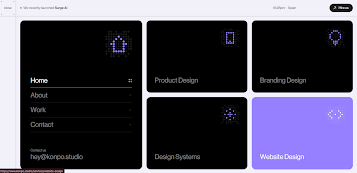
Overall Layout
fig 1.3.1 Konpo's header
Konpo Studio has a sticky header on the top of the page, so you can access it
anywhere in the web. The header consist of the menu, link to their newest site
"Surge", Spain's time, and a button to hire the company's service.
fig 1.3.2 Konpo's layout: headings and text, scroll indicator
We will then see a big headings with text on the side explaining what their
website is about. Under it is also mentioned on the award they've gotten.
I also noticed that on the left side of the page there is a scroll indicator
made of a straight line and a circle. The circle will start at the top of the
line, and it will go down as we scroll along the page.
fig 1.3.3 Konpo's layout: promotional video and explanation
Going down they will show their promotional video and some explanation right
underneath regarding their way of working or characteristic.
fig 1.3.4 Konpo's layout: services
Then we are shown all the services they offer in the page. They offer
branding, website, products, and design systems.
fig 1.3.5 Konpo's layout: past works
Next are rows of their past works. We can click on one of them to see more
about the works.
fig 1.3.6 Konpo's layout: previous partnerships
Next is their list of previous work partnerships with various companies.
fig 1.3.7 Konpo's layout: reviews
They also showcased some of their reviews from their clients.
fig 1.3.8 Konpo's layout: list of the awards nomination, reviews,
and socials
Towards the end they made a list of the awards nomination they've
received, their client's reviews, and their socials.
fig 1.3.9 Konpo's layout: footer
For the footer section, they put in their establishment year,
credentials, T&C, and Privacy policy.
Website's functionality and usability
The site is very simple on their navigation. There is a menu at the
top left where you can access everything. But even without it, they
are already shown in the home page, and you can use the link in there
to also access the same things.
The "hire us" button at the top right also pops out from the page,
making it quite easy to find. After we click the button, there will be
mini questionaire to determine what kind of project we need their help
with.
On the home page, we can scroll down to see the overall content that
the company provides, which is very convenient if we just want to take
a quick look.
Every button seems to be working well, from the menus, the links to
the sites, QnAs, and even the hiring and they're very easy to
see. There are also times where the dot on the cursor will enlarge to
let you know that you can press it. However, the scroll indication at
the left doesn't seem to be doing anything other than letting you know
how far you've scrolled down.
When you scroll down, there are lots of animation given on the site.
For example, there are changing images showing their works in form of
mockups, their services in from of cards sliding in and out, stacking
on top of each other, etc.
One that might bother us a little bit is the horizontal scrolling,
which is used in the individual sections of the designs (product
design, website design, etc). Let's say we are taking a thorough look
from top to bottom. The horizontal scrolling would be unusually cool.
But then when we want to quickly scroll up again, we would have to
scroll slowly through the horizontal scrolling until it's done and we
can continue scrolling up. Another option is to use the scrolling bar,
but some people, me included, might prefer it more if they can just
scroll it normally.
Overall, the website isn’t too complicated. I only needed a little bit
of time to get used to all the features and animations, but after that
is a smooth experience.
Quality and relevance of the website's content
As far as I can understand with my current knowledge, the website
organize their content neatly. Every related content is properly
distributed in their respective category.
Every content inside the respective category also gives a good
clarification and showcasing of what the company has to offer.
Making it very helpful and easy to understand.
On each service category, Konpo studio always gives some elaboration
on what they do in that particular services, so the potential
clients know what to expect, plus the site content will help to
answer most, if not all, general questions that the client have
before they decide to hire the company's service.
fig 1.4.1 Konpo Studio's main benefit points of the website
design service
fig 1.4.2 Konpo Studio's main benefit points of the product
design service
fig 1.4.3 Konpo Studio's main benefit points of the
branding design service
fig 1.4.4 Konpo Studio's main benefit points of the design
system service
Performance
I checked with several gadgets: phone, ipad, and laptop. The 3
devices doesn't seem to give any noticable problem, which is very
nice. In the case of phone, the limited space makes the videos and
imageries fill the whole page, going under the sticky header. The
clash of colors are very beautiful in my opinion.
Strengths and Weaknesses
Here are what I think are the strength and weaknesses of this
website according to my analysis:
Strength
- Purpose is very clear.
- Fast load time.
- Very interesting loading screen and good transition between pages.
- The page flows very nicely, making it intriguing. Each section has a nice animation, very interesting, and they also work nicely on mobile phones.
- Clear tabs with individual purposes.
- Very clear headings, sub headings, etc.
Weakness
- The horizontally scrolling will be annoying when you want to scroll up or down quickly. It might be more convenient to use the scroll bar.
- The train of past collaborations with companies and enterprises would be better to be static in 1 or more rows.
- The page scroll length at the left is kind of useless since it can't be used to drag the screen to certain part, especially since the scroll bar is still visible. The feature itself isn't too visible, which means it will easily be missed if people are just taking a very quick look.
- So many animation makes the site feel a bit messy and confusing, though fortunately it doesn't take too much time to process and understand the flow of the website.
- The circle cursor is a nice touch, but it keeps on lagging behind. Not sure if it's on purpose or not.
- The sticky header is nice, but after scrolling it might be covered with the content. It might be better if they use glass morphism or floating header effect.
- The changing image doesn't have the right and left arrow to skip or go back to the previous image. So if you want to look at a picture, you need to wait a long time to see it again.
2. Neocultural Couture
The second website that I'm gonna analyze is the
Neocultural Couture
fig 2.1.1 Neoculture Couture

fig 2.2.1 Neocultural Couture’s purpose
The Neocultural Couture purpose is to gather people of similar interest
which is the neocultural couture. Neocuktural couture is s fashion trend
where traditional clothing are fused with modern technology.
I am wondering of why they didn’t put the “submit creation” at the top.
At first I thought this is a showcase or a gallery of tehir own
collection of the theme. But my guess is that they want to show the
audience how fascinating the theme is first, before asking them to
contribute to the collection. Because thinking about it, some people
would refuse to volunteer when they are suddenly given a task they are
uninterested at.
Visual


fig 2.2.2 Neocultural Couture color palette
Neocultural Couture’s website uses a dark background throughout the
page. Other than that, it uses purple as it’s main color, as it is used
in the 3D spinning logo and the end, behind the word “UNITE”.
The website itself gives off a fantasy, tribal, modern sci-fi vibes. The
first word that came into my mind when I looked into the home page is
that it’s a very cool looking page.
Typography
The font used in this site is Parabole for the headings, Suissenintl
Fraktion for the texts. I think the Parabole Text is a font that is
suitable in this particular theme, giving off a simple yet futuristic
feeling to the page.
The Neocultural Couture seem to be using mostly align left text and
sometimes align right, but never use the center alignment
Imagery


fig 2.2.3 Neocultural Couture imagery
As a page dedicated to making a fashion gallery of the Neocultural
couture, most of the images are of the characters wearing amazing tribak
futuristic clothes. But one visual image that particukarly stands out
from the other is the purple metalic object at the center of the page.
Layout
The first thing you see after you load into the main page would be a big
image with headings and some text on it. On there you could also see a
very smooth DNA looking rotation animation.
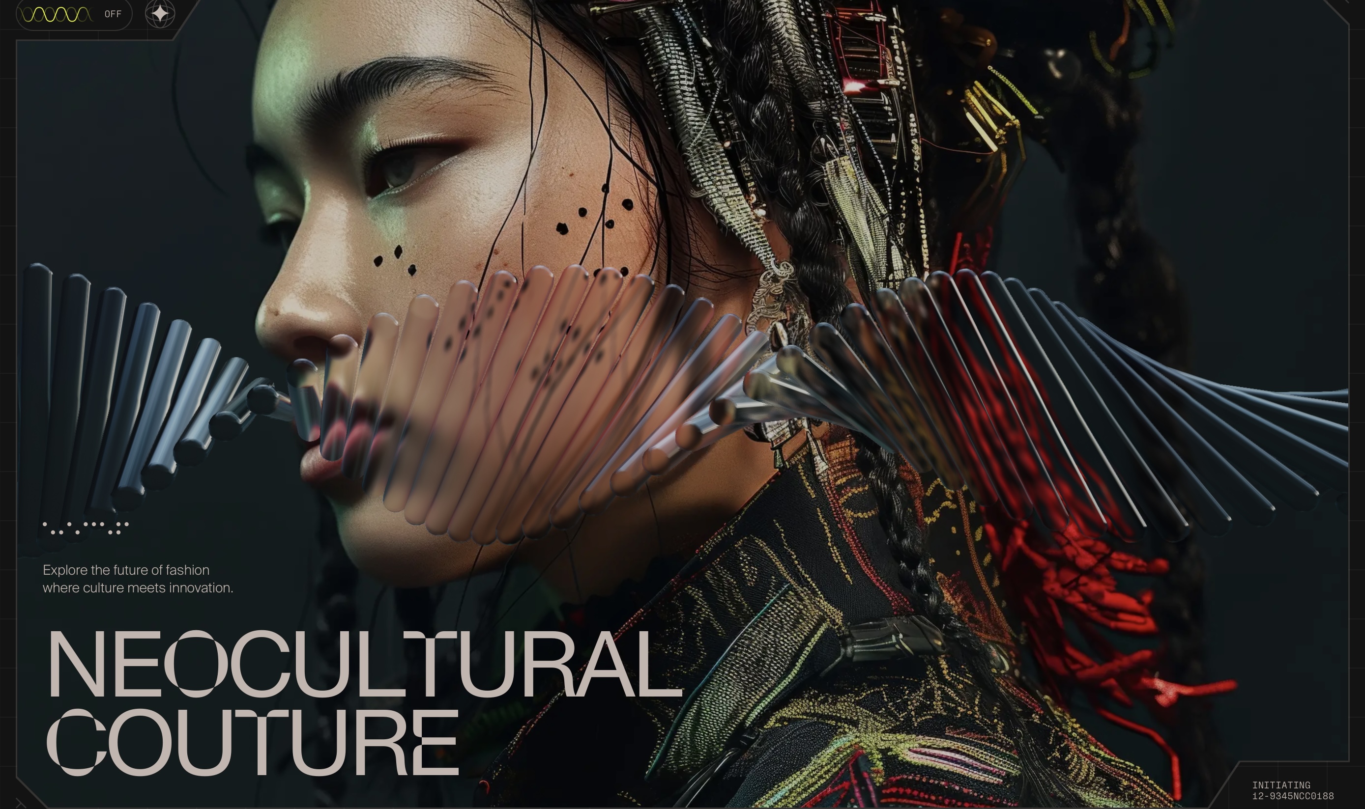
fig 2.2.4 Neocultural Couture main image
Next you will some some text with a very catchy and cool animations
where they are appearing letter by letter. This part also gives some
explanation on what the website is about.

fig 2.2.5 Purple ornament object
Next you will see the huge 3D big purple ornament object on the center
of the page. It served no specific use but it might just be what it is,
a decoration. Though this thing might also be the main reason why the
load time is very bad.


fig 2.2.6 Sceneric images and their content
Still able to see the purple objects, if you keep scrolling you will
start to see some kind of sceneric/background images rolling in. When
you hover over them, you can see that these background images are
actually a button to bring you to another page, where you see the
collections of the respective themes.

fig 2.2.7 Moving images of artworks
After that you are presented with a bunch of moving images of artworks
made by the communities. They are apparently AI generated images based
on the theme, but each of them look very nice, which can be referenced
for drawing or even themed fashion in real life.

fig 2.2.8 Unite section + footer
Lastly, at the bottom of the page, you will see the big word read
“UNITE”. This section is the literal invitation by the site maker(s) for
us to join the communities and make amazing Neocultural couture artworks
together. On the bottom left there is a button for us to submit our own
creation as an addition into their collection.
Also, on the bottom right of the page, you can see the local time,
credits, and the legal year, which is something that is usually put as
the footer. But that placement is also not bad. It even looks pretty
neat and space efficient in my opinion.
Website’s Functionality and Usability
There isn’t many varieties buttons and that we can interact with in this
site. The site is pretty much only meant to give some showcases of the
Neocultural Couture and to invite people to join their community. But
the buttons are very obvious to see and all are working properly towards
their respective contents, thus is very easy to use and user friendly.
Quality and relevance of the Website’s Content
Since this page is basically a fanart of a certain fashion theme, it is
difficult to determine which one is right and wrong on the concept
visualisation, which makes the accuracy and clarity of the content a bit
hard to be measured. But as for the organisation of the images, I think
the website made a really good job. You can choose a theme on one of the
sceneric images, you can see several submission on that particular
specific theme within the Neocultural couture.
Performance
The load time of this website is one major problem. When you try to load
this page for the first time, if your computer isn’t strong enough, it
will freeze for some time until the site finishes loading its assets.
Even on my laptop it took some time for the loading to finish. And then
even after you enter the website, my laptop has a terrible frame rate,
where I can’t even move my cursor the way as wanted. The delay was so
bad it had to move slowly on the mouse to click the spot I want.
One more thing I noted is that one of the text display got messed up so
badly on my phone. Apparently this only happens to certain devices, which
might be the reason why it passed the different device check.
fig 2.2.9 The messed up text on my phone
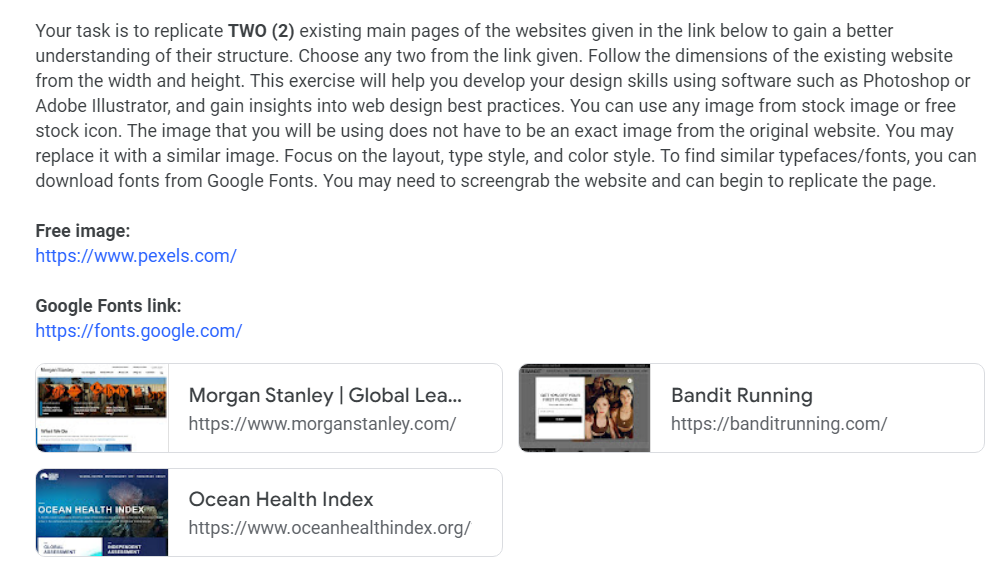
Exercise 2: Web Replication
Our next exercise is to replicate 2 webs’ main page on Adobe Illustrator. This
exercise will help us to learn about the structure of the web.
We were given 3 options by Mr Shamsul, and we are to replicate 2 of them.
fig 3.1.0 Instruction by Mr Shamsul
From the 3 options, I decided to replicate Bandit Running and Ocean Health
Index.
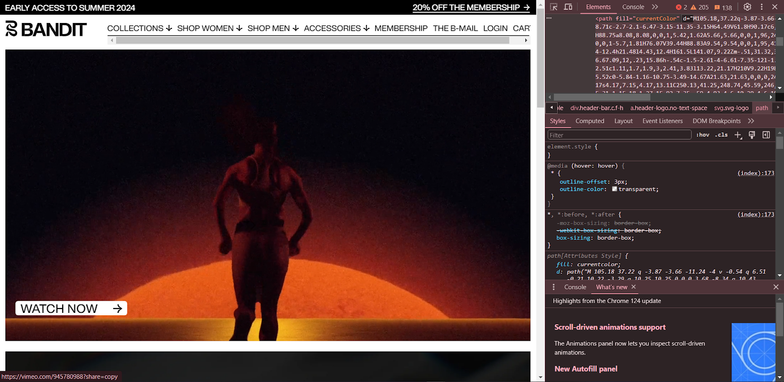
1. Bandit Running
During class time, I started to work on the replication.
fig 3.1.1 Bandit web replication progress 1
When I wanted to continue at home, a friend of mine that is familiar with
UI/UX gave me some very good tips. He said that there is an easy way to
obtain the assets and images from the web.
First off is the logo. I was taught how to get the logo from the web
itself. All I need is to press F12 or inspect the page, and use the select
element to select the bandit logo. Then I can just hover and click on the
logo.
The page inspection will then move to the codes for the logo. We can click
on the arrow besides the code line to see the complete code and svg path,
and double click on the svg path code and copy it.
fig 3.1.2 opening the inspection page and copy the svg path
The next step is to go to the
Svg Path Editor web. On the top left is a bunch of letters and number which is the svg path
for the sword, which is the logo of the site. All we need to do is to
delete the existing path and pasted the path we've copied from the
original web.
I could use this technique for the Bandit's logo and the arrow icon.
fig 3.1.3 getting the logo and arrow icon from svg path editor
When we've obtained the logo, we can download it by clicking on the
download logo at the top right. Then we can easily drag the downloaded
logo into illustrator, and put the logo into our replication sheet.
Another tip is how to get the images from the site. For this we can use
a site called
extract.pics.
Extract pics is a site where you can put the link of a site and extract
every image within the link's website. In this site we could extract the
images from the Bandit's website.
fig 3.1.4 extracting Bandit's images with extract.pic
Now that the method to obtain the logos and picture is found, all that is left is for me is to arrange the images and add the text.
For the text, I downloaded the Helvetica font from Google and use them for
the replication.

fig 3.1.7 my work file view, left: original screenshot,
right: replication
2. Ocean Health Index
The second web is the Ocean Health Index. For this web I could
just repeat the process and method I did with Bandit Running
site. Some addition that I did is that I have to download a new
family of font, which is the Montserrat font. One other thing is
I gave a gradient to the header of the web, because for some
reason the image doesn't have the blue gradient effect on it.
fig 3.2.1
Montserrat font download
fig 3.2.2 Adding gradient to the header
Exercise 3: Recipe Card
In this task, we were instructed to create a recipe card on a web. We can make
an HTML file for all the content and texts, and we can make a CSS file for all
the modification and beautification.
fig 4.3.1 Recipe Card Exercise instructions
Visual Reference
Here are some of my visual references for the recipe card. Of course, I
don't expect myself to be able to imitate the style completely,
considering my very limited knowledge of Adobe Dreamweaver. But I can try
to take inspiration of the use of color palettes, and the minimalistic
style.
Link:
Sketches
For this exercise, I've prepared 3 sketches. I try to think on what to
improvise on each sketch before doing the next one, and here's what I
come up with.

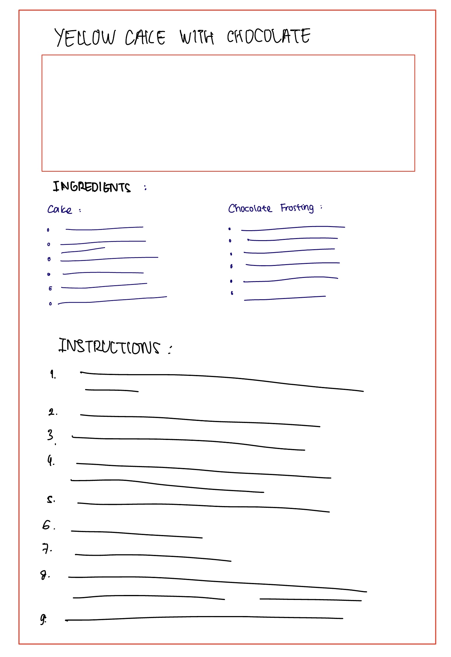

fig 4.3.3 My sketches, week 8 (9.6.2024)
I decided to stick with my 3rd sketch, because I should know how to do all
of the elements that I will add into the recipe card. For the other
sketches, I don't think I know how to split the page into 2 columns, so I
don't think I should do it for now. (Of course, I tried to ask chatgpt on
how to do it, but it's still a bit confusing for me, so I will try it next
time.)
I then proceeded to go into Adobe Dreamweaver to make my HTML and CSS
codes.
I used my practice code sheet from class sessions as my cheat sheet,
because when I'm faced with an empty code, I'm still confused and unsure
where to start or sometimes what to do next.
See my HTML lesson site here: https://aboutvanessakei.netlify.app/
HTML
First off, on the <head> part, I pasted the font that I also used on
my HTML Lesson, because I really like the font. It's simple but quite
elegant.
fig 4.3.4 Applying the font from google font, week 8
(10.6.2024)
For <body> part, I started to insert the header of the recipe
card and added an image of the yellow cake from a site called
Delish. I took the image into Photoshop, and use AI to generate the
longer version of the picture.
fig 4.3.5 Adding cake picture from Delish Site; left: original; right: edited, week 8 (10.6.2024)
I also used the table method for the ingredients. I divide the
information into 4 sections: the item/product name, the amount,
unit, and remarks (whatever note given by the recipe maker).
fig 4.3.6 Adding title, image, and tables, week 8
(10.6.2024)
Lastly, I used the <ol> and <li> to list out the
instructions in an ordered manner. Ordered list is more suitable for
this scenario because obviously cooking instruction is not to be done
in a random order. The numbers will help the reader to keep track with
how far they've go on with the steps.
fig 4.3.7 Adding ordered list for instructions section, week 8
(10.6.2024)
CSS
For the styles, I mostly just copied the styles from my HTML lesson
code. There wasn't much changes, but I did make some modification and
some additions:
- I made a more specific size on the cake image.
- I gave some bottom margin for the tables to create a gap between them.
- I switched out the "bgdark" and "bglight" class cuz apparently they were switched on my lesson code lol. The "bgdark" was apparently the lighter color and the "bglight" was apparently the darker one.
There are quite a lot of styles that I added, but it's definitely
still shorter than the HTML file.
Final Result:
fig 4.3.9 Yellow Cake with Chocolate Frosting Recipe Card Web, week 8 (11.6.2024)
FEEDBACK
Week 1
- Download adobe Dreamweaver.
- Sign up into Netlify.
- An HTML file MUST be named index, otherwise it won't run properly.
Week 2
(No class, public holiday)
Week 3
- You can use webs such as Freepik to get free icons for the replication.
- For the gradient word, you can use the metallic gradient to achieve the look
Week 7
- Try to make the text "hug" the images on the left and right. You will need a long text to make it clearer.
- You can give some margin so the text won't be very close to the image
- Sometimes buttons aren't too clear since the color might be different, so you can use the pointer cursor to indicate that it is a button that could be pressed.
- You don't need to give pointer cursor to a hyperlink. It is already automatically given the pointer cursor by the web.
Week 8
- No Feedback (Independent Learning Week)
REFLECTION
Experience
I took quite a long time working on this exercises considering I don't really
have much interest in this field of work. But it is a nice experience for me
to gain some knowledge about all the little details that goes into making the
structure of a web, which is often taken for granted and missed by the
reader/audience. I had to recollect my motivation several times to actually
focus and pay attention to all the details inside the web.
The coding exercise was also one heck of an experience. I have always been
someone that is not much interested in coding, but I had to push my knowledge
limit and try to do something I never did. It was confusing at first and I had
to look through my class exercises a lot, and I never dared to do things I
wasn't taught, because if I mess up, I won't be able to fix it.
It was quite the hard and long journey, but I'm glad that I got it over with
and also managed to learn a lot of things from this exercises.
Observation
During the process of me working on this exercise, I noticed that the field of
UI/UX is not as small as I thought it would. It appears that it is a very
important aspect and component inside the making of a web. There are even
several site-nomination sites where all kinds of cool websites are displayed,
voted for nomination, and awarded as best websites.
There are all kinds of visuals for a website, from a minimalistic looking
sites to a fancy looking one, from a simple site to one with so many cool
animations, and from classic loading screen to interactive ones.
Findings
I learned about how much meticulous consideration and thinking goes into each
part of a web, like how they should be placed and structured, how the sections
are placed to be user-friendly and easy to navigate, how a play of color and
imagery could have a huge impact on the visual and attraction on the website
itself.
FURTHER READING
For the further reading, I'm gonna check out a site recommended by Mr Shamsul
called The Anatomy of A Web Page: 14 Basic Elements
fig 5.1.1 The Anatomy of a Web Page: 14 Basic Elements
The site gave a detailed explanation on each part of a web page, but I made
some summary for some of the parts:
Header
- The top part of the web page
- The area people see in their first seconds on the website
- Expected to provide the core navigation around he website
- Could include:
- Basic element of brand identity
- Call to action button
- Links to basic category of website content
- Links to social networks
- Basic contact info
- Language options
- etc
Some popular design for web headers:
- Hamburger menu
- Sticky menu
- Two-layer navigation
Call to Action Button
- Element to UI aimed to encourage user to take certain action
- Presents a conversion for particular page of screen
- Turns passive user to an active one
- Can be ANY type of button
- Usually differs from all the other buttons so it's more appealing and more engaging
- Example: "learn more", "buy now", "search"
Hero Section
- Pre-scroll area of the web page containing the element that presents the strong visual hook
- Image, slider, catchy piece of typography, video, or anything else attracting visitors’ attention and transfers a needed message to them
Footer
- Lower bottom part of the page, usually marking the end of the page
- Provides additional field for useful links and date user
- Can include:
- Brand identity signs (name or logo)
- Link to user support sections
- Credits to website creators
- Contact forms and information
- Links to company or product accounts in social networks
- etc
- For most users, the footer is a common place to search for contact information, credits, and sitemaps, so playing on this pattern can be beneficial.


Comments
Post a Comment