Interactive Design - Final Project: Single Page Website
19.6.2024 - 29.6.2024 (Week 9 - Week 10)
Vanessa Kei Kurniadi /
0360525
Bachelor of Design (Hons) in Creative Media
Interactive
Design - Final Project: Single Page Website
INSTRUCTION
fig 1.1 Instructions
Visual References
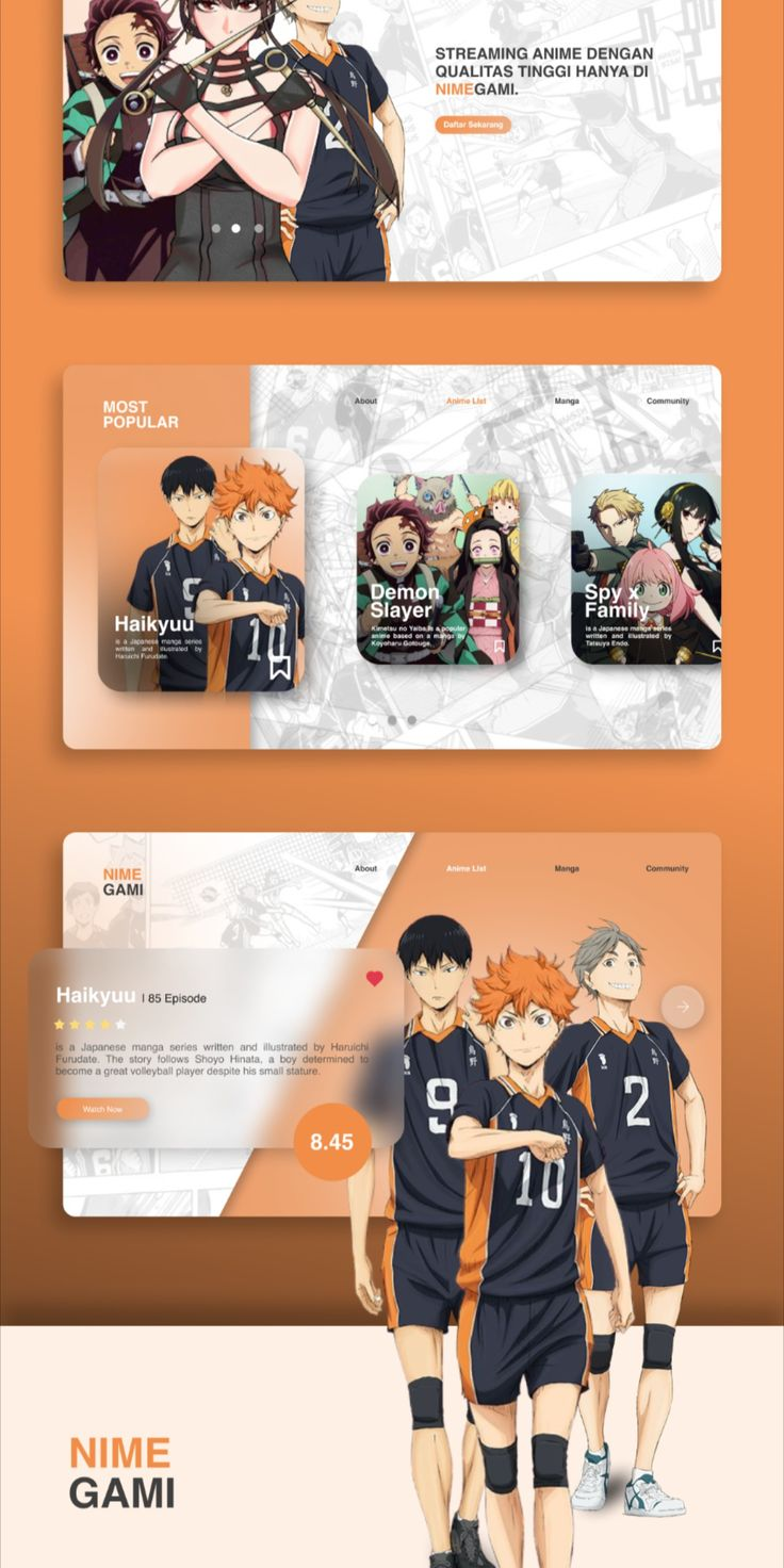
When I looked for the visual references, I first tried to look into
some anime info sites and some streaming platform, to see how they
use the color and appearance for their page.
After I found what kind of content that I would like to add into the
web, I started to look into more details on how I should use the
visuals and imagery. I already have some pictures on how I want the
web to look like and the atmosphere it brought.
Sketches
fig 1.3 My 5 sketches for the final project web, week 11 (3.7.2024)
Here are the sketches that I came up with for the rough layout of
the web. Upon Mr Shamsul's feedback, I was given a few notes:
- I put too much content, and we're tight on time, so keep it at maximum of 5 sections.
- No need to put the forum portal, because it's gonna give me unnecessary hard time.
- For the trailer, we can embed a YouTube video on the web.
After given the feedback, I decided to use my last sketch and
removed 2 sections from the web, which is the songs and the comments
section.
Wireframe
fig 1.4 My final project wireframe, week 12 (10.7.2024)
Here is my result for the wireframe of the web according to the
feedback I received the previous week. I'm trying to make it simple
and easy to look at and navigate.
Prototype
After the wireframe is completed, I proceeded to make the
prototype for the web using Figma. Some tiny adjustments and
changes are made here and there to ensure that the whole web looks
pleasing to the eye.
fig 1.5 Making the prototype in Figma, week 12 (10.7.2024)
fig 1.6 My prototypes. left: desktop view; right: phone view, week
12 (10.7.2024)
Here is some of the list of I want to apply in the web on top of all the text content:
- Sticky header for navigation
- Sticky background
- Action button would be the "Watch Now" button that will link to Netflix.
- Embed a trailer video from YouTube.
- The "Main Team" 's section will be an image slider.
- Footer will be a simple single line text only.
I also removed the Youtube logo from the stream section after seeing that there is no proper and complete video of the series.
After the prototype for both views are completed, I then started to
export every needed asset and then start working on the codes in
Dreamweaver.
fig 1.7 Exporting all assets from Figma, week 12 (10.7.2024)
Coding in Adobe Dreamweaver
For the coding part, since there are quite a lot of things I need to add plus the responsiveness, I had to make sure that I do individual adjustments to every part using the class attribute.
The good side of this method is that there is less chance that I'll mess
up other sections when working on one, and I'm getting more freedom to
move the objects and contents around. But the weakness of this method is
that your CSS code will be much longer because you're adjusting
everything one by one.
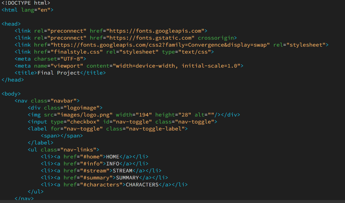
fig 1.8 Putting every components into their individual class for
styling, week 12 (10.7.2024)
I worked on the web by doing one section at a time and working on the
phone view as well, so I can more easily find if there are any codes
that mess something up. I took the time to slowly but surely progress
through the coding process.
Also, Mr Shamsul suggested to me that it'll be nicer to not have the
underline on every section. But when I tried it out, it just seemed
weird to me, like it's hard to see the respective area for each section. So I
decided to let it stay like the initial design.
The major change that I did with the web it the image slider.
Apparently the design that I made for the image slider on the
prototype is a bit too hard for my level of coding. But it might also
be because I need a Javascript code to make the code run properly.
So after several tries and hours of headache, I finally managed to get
a simple image slider code from chatgpt that I can work on.
I copied the code from there and adjusted it to my needs. Here is how
it looked like:
Here is how it turned out so far: https://vanessa-final1.netlify.app/
fig 1.11 First attempt in making the responsive final project web,
week 13 (19.07.2024)
For the first attempt, almost everything works okay, but there is one major problem on this website: the sticky header is not working.
It took me another few hours to figure out why it won't work even with
the sticky attribute added to the .navbar. After hours of futile
effort to ask chatgpt for answers and even remaking the navigation bar
from zero with the help of chatgpt, I finally found an answer on the
internet, saying that the sticky attribute clashes with "overflow:
hidden".
As soon as I removed the "overflow: hidden", the sticky header finally
worked like never before. (I tried this on the first attempt's code
but it doesn't seem to work for some reason, but at least for the
current code it is working perfectly)
The only downside of this is just the fact that for some reason, we
are able to scroll horizontally through the web, even though nothing
is even there. But I guess that is a slight inconvenience compared to
before, plus, there seem to be no horizontal scrolling on the phone
view.
It would be amazing if I can figure out a way to remove it, but I just
can't seem to find the solution for now, so the only thing I can do it
to let it be until I somehow found the method coincidentally. I am
quite happy that aside from the horizontal scroll, everything seemed
to be working flawlessly.
Update July 24th:
Today I'm supposed to go for consultation with Mr Shamsul regarding my work. I was gonna ask about the error, but suddenly I have this lightbulb moment on how I can check for the reason for the horizontal scrolling.
I checked on everything in the CSS and found that apparently .row3 was the one that messed up the width. I failed to find it because to hover to it, you need to check on the middle area, not the side area. So I changed the margin from "margin: 0 33%;" to "margin-left: 35%" and poof, the horizontal scrolling is gone.
I was also having trouble to activate the favicon, and I was asking my friends for help to fix it.
I tried for hours, my friend tried for a bit, and we still couldn't fix it. I sent the same code to my other friend who's doing IT, in hope that he can fix it. But guess what, it fixed itself and my friend didnt even do anything :/. I tried to make sure and deployed it to netlify and see if it worked, and now it also worked for me!
I genuinely was speechless and had no idea what the heck happened. Our best guess is that the code was faulty, or even our pc is faulty? :') Anyways, it works now so best choice is to not touch anything else.
Final Look
Netlify Link: https://final-haikyuu.netlify.app/
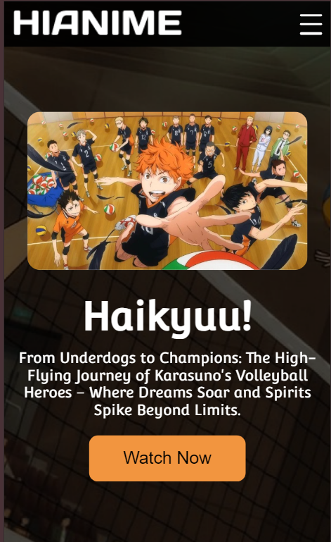
fig 1.11 Final Outcome for final project web, week 14 (21.07.2024)
FEEDBACK
Week 11
- U put too much content, and we're tight on time, so keep it at maximum of 5 sections.
- No need to put the forum portal, because it's gonna create unnecessary difficulties.
- For the trailer, we can embed a YouTube video on the web.
- Be careful when working on the sticky background, and make sure everything is working properly.
Week 12
- You don't need to put the lines after the sections title, so it won't be too crowded
- Make sure that the imagery is consistent. All of them should have border radius or none of them has it.
- Don't forget the footer
Week 13
- - (No feedback. I was absent because I wasn't feeling well)
Week 14
- - (No class, only consultation session if needed)
REFLECTION
Experience
This project was quite the long one. I had to work from 0 to create everything. From the idea, concept, wireframe, prototype, the coding, and even the responsiveness. This project was a very brain-tiring one because I have to think a lot on the modifications and the html, but doing them slowly but surely one by one was actually not that bad of an experience.
Of course, when there was an error that I couldn't solve after so long trying, it gets me so frustrated because I can't seem to understand what is off. I still got the moments where I just want to slam my table and close the laptop and call it a day, but I just know that I will have to get back to it sooner and later.
When everything is going smoothly, I can do so much progress is 2 hours, but when I'm stuck, I can spend hours trying to fix a single problem and still not find it. Without me knowing, I've spent days working on it, with approximately 6 to 9 hours of working on the code in one sitting. It was such a crazy experience if I think about it again lol.
Observation
I'm so glad that the world of coding has been so helpful in my time of doing this project. Starting from relying so much on chatgpt to looking into some coding sites and forums to seek answer from people who knows better than me, has been a life-saver throughout this project. The fact that there are forums for fellow coders helping other coders with their problem instead of safe-keeping their knowledge just gave me a refreshed view of the society.
I'm so thankful to the internet and it's power to be able to help me so much on my troubles, even though chatgpt can be utterly annoying and useless sometimes too.
Findings
From this project I found quite a lot of new methods on making a feature, such as the hamburger menu and the image slider, even though they also gave me quite the trouble off fixing when something didn't go my way. I also found out new sites that had helped me throughout this project.
Self-improvements wise, I feel like I found myself being more comfortable with how to code my own designs. It could very well just be me being cautious in what I put inside my prototype to make sure I don't torture myself for the coding part, but also because I've learnt a lot of things since I started this course. I'm very proud of myself for being able to improve this far in this short amount of time.






.png)




Comments
Post a Comment