Motion Graphics and Compositing - Week 3
9.10.2024 (Week 3)
Vanessa Kei Kurniadi / 0360525
Bachelor of Design
(Hons) in Creative Media
Motion Graphics and Compositing - Week 3
INSTRUCTIONS
Week 3
This week we had an online class with Mr Fauzi. In the class, we had a progress check for our Project 1 task 1. Most of us haven't started yet, but he said it is okay since he purposefully assigned the task to us a week early so we can have more time to work on it.
He did note that for next week we are expected to be finished with part 1 and have already gone halfway through part 2. For this, he also gave us another demo on how we should work on part 2 of the project.
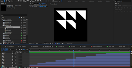
fig 1.1 Demo for Part 2 of Project 1
Although this week I haven't started on Part 1 of the project, I took some time to learn how to make the principles that were given by Mr Fauzi. It isn't necessarily to learn about the principle, but rather it is for me to learn how to make each one of them in Adobe After Effects. I made a simple note on it with my iPad.
Here is what I learnt:
fig 1.2 My notes after studying the principles of form and design.
1. Movement
There are 4 squares and 4 rectangles being played. The first 2 appeared, and then the 4 rectangles appeared from within the square area and stretched to the other corners, with each square spreading out 2 rectangles for each available side.
Then 2 the 4 rectangles are pulled back, but this time towards the new corners that were reached out by the initial 2 squares, and after the 2 rectangles are gone, the other 2 move a little bit to stick to the initial square and also disappear. The overall motion makes it as if 2 new squares are made from the stretching rectangles and the excess part goes back to the initial square.
(A bit complicated to explain, but if you see the whole motion, you'll get it lol)
Anyways, these squares and rectangles just appear and disappear with the play of opacity, but the rectangle movement can be done manually by stretching or shrinking the shapes, as well as some minor location changes.
2. Hierarchy
Hierarchy mostly uses the same method as movement, it's just the direction, the are being zig-zagged, and the location plays a more active role than the stretching.
3. Balance
Balance is fairly a simple motion to be made. As far as I know, the triangle just needs to stay put, while the thin board can be tilted using rotation.
4. Direction
The direction seems to also be quite simple. It can be gained by making a triangle and putting a masking layer on top of it to make it appear slowly, and then just duplicating that same process to all the triangles.
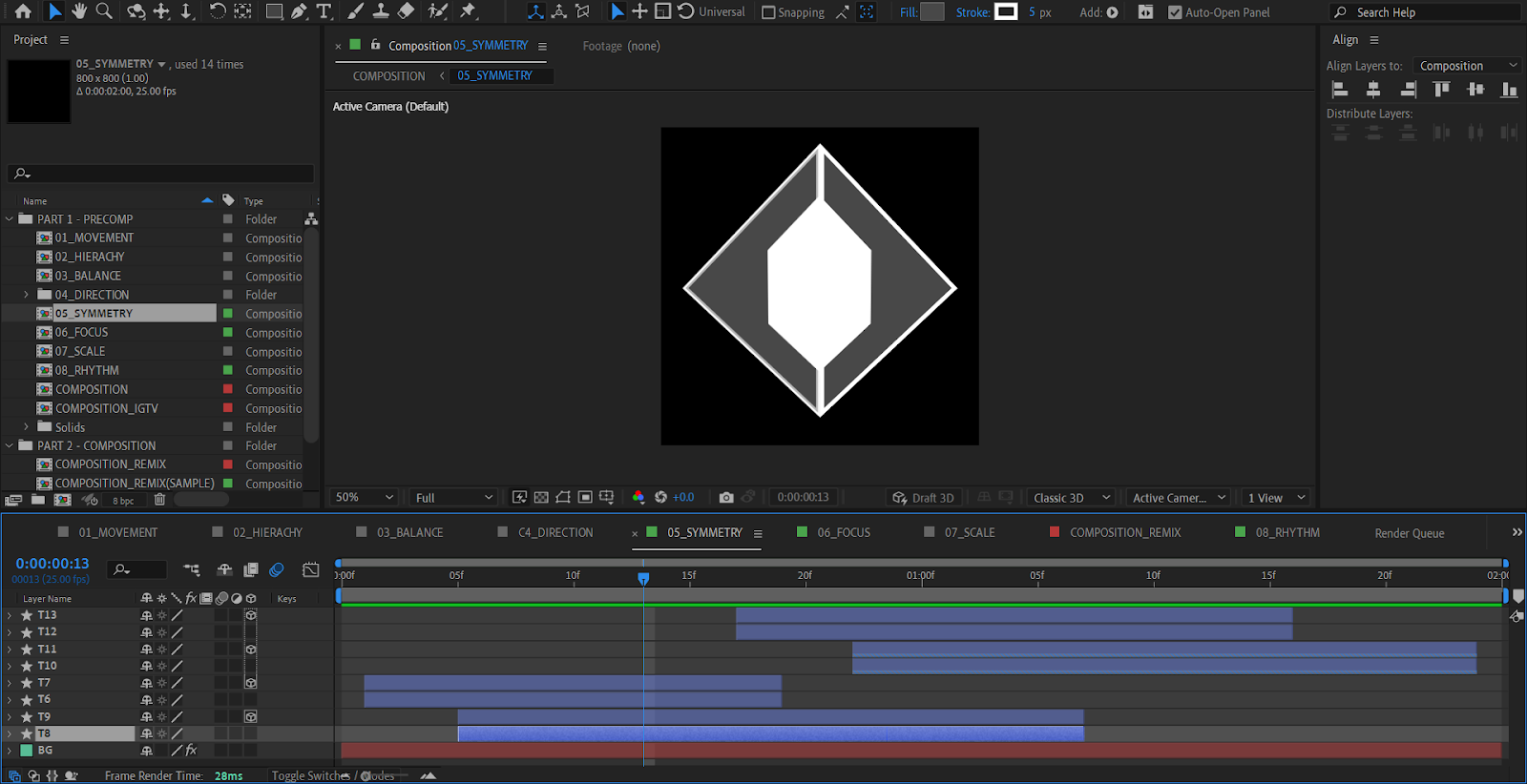
5. Symmetry
For Symmetry, there are 2 sets of diamonds made of 2 triangles. The masked inner triangles appear, and a little later, the outer triangle appears and towards the end of this part the inner triangle starts to disappear again. The inner triangle then appears and disappears the second time, before the outer triangle also disappears.
But after a closer look, I noticed there was another set of triangles, both the inner and outer triangles. The inner triangles are made to have the same motion as their former ones, but the outer ones are made to replace each other in the middle. So if you try to close one of the outer triangles at the time, you can see that one of them disappears in a blink, and the other one appears in a blink.
Another thing I noticed is the fact that the triangles are not made by rotating them or by making another one in another direction. Instead, the other half is made to be a 3D element, so the mirror version can pretty much be an element that was flipped 3-dimensionally, like how you would flip a paper. Considering the fact that you could probably easily flip the shape horizontally with the transform tool, this is quite a unique approach.
6. Focus
The focus principle started with a big circle at the centre, which is then shrunk, and then 4 lines stretched in from the top, bottom, left, and right. The lines then shorten towards the centre, before it go on the reverse and stretch outwards, shrink on the outer area, and then disappear and the circle enlarges again towards its original size.
Again, this is mostly shape manipulation and scale modification.
7. Scale
The scale is basically a play of 2 squares of different sizes. They shrink and enlarge randomly while keeping their corners attached to each other. So other than a play of scale, location modification is also done to make the squares enlarge towards the right direction.
8. Rhythm
For rhythm, everything should be a play of location modification. The board will go up and down in different directions, while the ball will be moved in a way that looks like they are bouncing off the blocks while the blocks "try" to make the ball not touch the edge of the frame. The ball will be made to move a bit faster sometimes.


Comments
Post a Comment