Motion Graphics and Compositing - Project 1
25.9.2024 - 30.10.2024 (Week 1 - Week 6)
Vanessa Kei Kurniadi /
0360525
Bachelor of Design (Hons) in Creative Media
Motion Graphics
and Compositing - Project 1
INSTRUCTIONS
Project 1: Basic Principles of Form and Design
Part 1
For this project, we are required to create a simple composition using our
version of the principles of form and design.
Mr Fauzi provided us with 8 principles: movement, Hierarchy, Balance,
Direction, Symmetry, Focus, Scale, and Rhythm. Our job is to remake the 4
principles on the bottom row into our own version of the version.
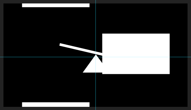
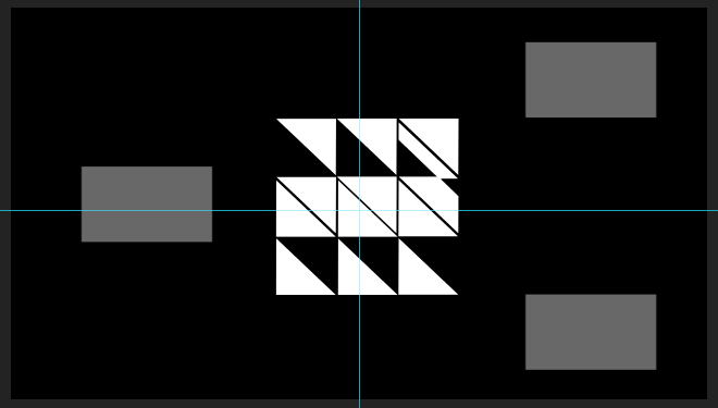
We can make our changes at the given separate composition for each principle,
and then it will automatically update the main display of the principles.
fig 1.1 Screenshots from the demo video. left: individual composition for
the principle, right: the main display of the principles
Studying the Principles
Before I started on the project, I decided it would be a good idea to check
how exactly were all of these default principles made. It isn't necessarily to
learn about the principle, but rather it is for me to learn how to make each
one of them in Adobe After Effects. I made a simple note on it with my iPad.
Here is what I learnt:
fig 1.2 My notes after studying the principles of form and design.
1. Movement
There are 4 squares and 4 rectangles being played. The first 2 appeared, and
then the 4 rectangles appeared from within the square area and stretched to
the other corners, with each square spreading out 2 rectangles for each
available side.
Then 2 the 4 rectangles are pulled back, but this time towards the new corners
that were reached out by the initial 2 squares, and after the 2 rectangles are
gone, the other 2 move a little bit to stick to the initial square and also
disappear. The overall motion makes it as if 2 new squares are made from the
stretching rectangles and the excess part goes back to the initial square.
(A bit complicated to explain, but if you see the whole motion, you'll get it
lol)
Anyways, these squares and rectangles just appear and disappear with the play
of opacity, but the rectangle movement can be done manually by stretching or
shrinking the shapes, as well as some minor location changes.
2. Hierarchy
Hierarchy mostly uses the same method as movement, it's just the direction,
the are being zig-zagged, and the location plays a more active role than the
stretching.
3. Balance
Balance is fairly a simple motion to be made. As far as I know, the triangle
just needs to stay put, while the thin board can be tilted using rotation.
4. Direction
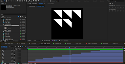
The direction seems to also be quite simple. It can be gained by making a
triangle and putting a masking layer on top of it to make it appear slowly,
and then just duplicating that same process to all the triangles.
5. Symmetry
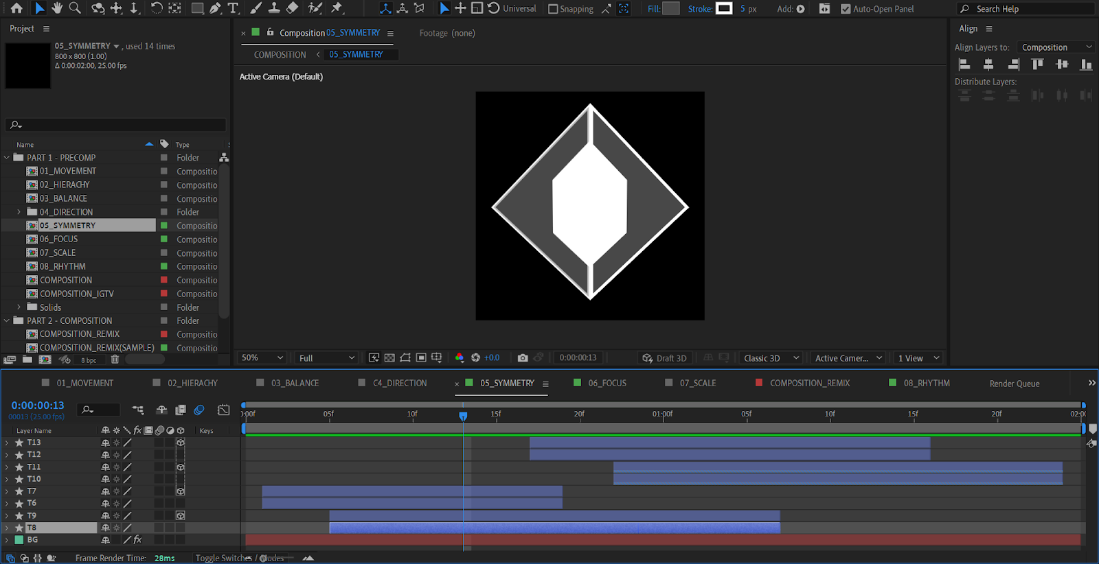
For Symmetry, there are 2 sets of diamonds made of 2 triangles. The masked
inner triangles appear, and a little later, the outer triangle appears and
towards the end of this part the inner triangle starts to disappear again. The
inner triangle then appears and disappears the second time, before the outer
triangle also disappears.
But after a closer look, I noticed there was another set of triangles, both
the inner and outer triangles. The inner triangles are made to have the same
motion as their former ones, but the outer ones are made to replace each other
in the middle. So if you try to close one of the outer triangles at the time,
you can see that one of them disappears in a blink, and the other one appears
in a blink.
Another thing I noticed is the fact that the triangles are not made by
rotating them or by making another one in another direction. Instead, the
other half is made to be a 3D element, so the mirror version can pretty much
be an element that was flipped 3-dimensionally, like how you would flip a
paper. Considering the fact that you could probably easily flip the shape
horizontally with the transform tool, this is quite a unique approach.
6. Focus
The focus principle started with a big circle at the centre, which is then
shrunk, and then 4 lines stretched in from the top, bottom, left, and right.
The lines then shorten towards the centre, before it go on the reverse and
stretch outwards, shrink on the outer area, and then disappear and the circle
enlarges again towards its original size.
Again, this is mostly shape manipulation and scale modification.
7. Scale
The scale is basically a play of 2 squares of different sizes. They shrink and
enlarge randomly while keeping their corners attached to each other. So other
than a play of scale, location modification is also done to make the squares
enlarge towards the right direction.
8. Rhythm
For rhythm, everything should be a play of location modification. The board
will go up and down in different directions, while the ball will be moved in a
way that looks like they are bouncing off the blocks while the blocks "try" to
make the ball not touch the edge of the frame. The ball will be made to move a
bit faster sometimes.
Remaking My Own Principles
Now that I'm done studying how to make individual principles, I will have to
start to work on my versions of the 4 principles.
1. Symmetry
For "symmetry", I looked at a lot of references on Pinterest on what shape
and motion I should go with.
fig 2.1 Symmetry motion graphic reference on Pinterest
I made a couple squares and tried to place them at the centre (I took some
time to snap them to the centre, and for some reason, they like to move
around), and then I tried to play with the scale and rotation to see if
anything comes to mind.
For some reason, the play of square and diamond shapes makes a pretty decent
shape. I put every square or diamond at the outer edge of the smaller
shapes, making some kind of catchy pattern.
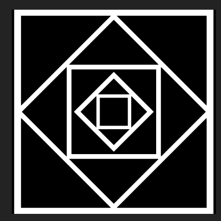
fig 2.2 Making the main shape of my version of symmetry
When I thought it was enough and looked symmetrical, I made the motions
and the keyframes. My idea is to make each of the individual squares
appear one by one and make them turn a little bit before they stop at
their assigned position.
But while I was doing the motion, there seemed to be a little mistake in
the scale that I put in, because the outer line changed into a smaller
size and intersected with the second biggest square. But I consider this a
good accident because I liked the final shape much more.
fig 2.3 The final look of the main shape of my version of symmetry
after the little error
2. Focus
For the focus principle, I also began my work by looking through references
on Pinterest.
fig 2.4 Pinterest reference for focus principle
There isn't much clear reference on how I should do my focus, but what I understand is that I need to try to move the viewer's eye to the item or area that I want them to focus on.
So after some thought, I decided to just go with a circle. I have this idea
to make a reverse droplet effect, which I think is quite effective in
redirecting the viewer's eyes towards the centre.
My original plan was to make use of the white circle that was used in the
original version, but after some thought, I decided it would be better to
remove it altogether. I just feel like it fits the overall feeling that I
want to convey and makes the reverse droplet effect "deeper" in a sense. Not
to mention, I don't have to bother thinking about what I should do with the
white circle for the overall motion.
fig 2.5 Making my version of the focus principle. left: with the
white circle, right: without the white circle
3. Scale
To be frank, I'm kind of confused about how to make a good scale
principle. I've looked through some Pinterest references but couldn't find
something that I like or something that I can do with my current ability
and knowledge of After Effects.
fig 2.6 References for scale principle
After some thought, I decided to just try to make a simple shape on After Effect and then work my way from there.
As soon as I made a single shape, I suddenly had this random idea of how to
make a simple scale principle. It definitely isn't the best idea I have, but
this is enough to do the job at the moment.
fig 2.7 Making the shapes for the scale principle
The motion that I'm going to do is very similar to the original version.
I'm just gonna manipulate the sizes of these shapes while the other shrink
or enlarge accordingly as if being pushed and pull by the adjacent shape.
Here is basically all the main position and scale of the motion. The
shapes' location and size are modified to follow the other changed shapes.
The main keyframes look like these:


fig 2.8 Main keyframes' looks
4. Rhythm
Among the many interesting references, there is actually a single
clip of motion graphics that caught my eye, but for some reason,
when I tried to look into it again, it disappeared and I couldn't
find it even after trying it out several times over several days.
The video shows how to make a loop using 4 balls and 4 rotating small
boards. The balls are located in the centre of each board, and the
boards will then rotate at the same time, throwing the ball to the
board next to them, and then repeating after a couple of seconds,
creating a simple loop.
I was able to make a very similar copy of the work, but when I
realized I forgot to add it to my Pinterest board, it already
disappeared.
Here is what it looks like:
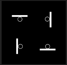

Although it is a simple animation, it is quite catchy which I think is
because a lot of small elements are moving uniformly. The quick motion
that is caught by the eye is also quite interesting to see.
Here is my final look at the first part of the project:
fig 2.10 Final look of Project 1 Part 1
In the feedback session, Mr Fauzi told me that my versions are quite good, and he especially liked the symmetry that I made. He also told me that I could export this work and start to work on the second part of the project.
The second part of the project is to create a simple remix using the 8
available principles. Mr Fauzi also demonstrated the task and recorded it so
we can review it for future reference.
fig 3.1 Demo for Project 1 Part 2
In this task, we can use our creativity and combine the different
principles into an interesting remix video. We are allowed to use the
principles multiple times as needed and put them into a 16-second duration
motion graphic video however we like.
When I started working on the project, there wasn't really any solid plan
for what I was going to do. All I did was just go along with whatever I
had in mind at that moment and try to apply it to the remix. The only
thing that I try to keep in mind is to include all 8 principles in the
remix.
Here are some simple explanations of my ideas:
fig 3.2 Remix progress 1
Firstly, I use the balance as the main focus for the first seconds of
the video. To do that, I utilise the focus principle to bring the
viewer's attention to the centre area.
fig 3.3 Remix Progress 2
Next, I used the hierarchy principle as a transition to make the
see-saw disappear. It's just a random idea I got after seeing the demo
video and some of my peer's work. I just feel like it's very suitable
for this use.
fig 3.4 Remix Progress 3
Once again I used the hierarchy for a nice effect of the motion, but
this time its purpose is more of a space-filler, which is also the
reason why I reduce the opacity so we can see the symmetry principle
underneath. This part of the remix looks "busy" but not too cramped,
which works really good in my opinion.
fig 3.5 Remix Progress 4
While the hierarchy and symmetry disappear, 3 sets of rhythm
principles appear with the one in the centre bigger than the one in
the corners, and the corner ones are flipped so the board will
rotate the other way. This will make the overall look not too
uniform with just a subtle modification.
A little bit after that, 3 sets of focus principles also appeared to
complement the rhythm principle by filling the empty spaces. This
one also makes the space look a bit more busy and crowded, but with
smaller elements, so it won't feel like the elements are constantly
overwhelming the viewer's eyes. Not to mention, the thin lines that
make the focus principle seem to complement the thicker lines from
the rhythm principle.
I noticed that I used opacity modification a lot, but I also feel
that it is one of the simple yet great ways to make a transition
from one object to another.
fig 3.6 Remix Progress 5
This one is just a random idea that came to mind when I was
figuring out a good way to use the movement and direction
principles.
fig 3.7 Remix Progress 6
This one is also a random idea that I used since I wasn't sure
what to put in the middle. So I decided to make the direction
and its inverse copy fill each other's empty spaces while still
leaving just a tiny gap to make it look "fancier". Plus, I also
added another hierarchy to make it less empty.
fig 3.8 Remix Progress 7
After that, I arranged the scale principles into a
flower-shaped arrangement and put the focus on it to fill the
empty space once more (maybe I just love the focus principle a
lot lol)
fig 3.9 Remix Progress 8
Last but not least, I just put the symmetry principle on the
reverse as a way to properly "end" the remix.
Here is what the finished remix looks like:
fig 3.10 Final look of the remix without music
Upon the next class meeting, Mr Fauzi told me that the
animation was already good, but he recommended that I add
some music because audio is also part of the markings. So I
looked through some energetic songs that I think is suitable
for the video, and I found music called Upbeat Vlog and Event Music by Infraction
I took the starting part of the music and put it into my video using Premiere Pro. Since the song will end a bit abruptly, I went ahead and sped up the song just a tiny bit so it fits the 16-second video properly. I also lowered the volume because it is kinda loud in its default volume.
Final Look
Part 1:
fig 4.1 Final look for Project 1 Part 1
Part 2:
fig
4.2 Final look for Project 1 Part 2
FEEDBACK
Week 4
- Good work, I also like how you did the symmetry.
- After you're done, you can export it to YouTube and start part 2 of the project.
Week 5
- Good animation. For Part 2, you may insert some audio effects for extra marks.
Week 6
- All is good. Thanks for your submission.
REFLECTION
Experience
Working on this project was quite an easy and fun experience. It required me to combine my creativity with the already provided assets and template into something original and different for each student. The time that it took for me to work on the tasks was not too long yet it is a valuable experience.
Observation
During working on this project, I have seen some of the work done by my peers. All of them made different and unique versions of the principles of form and design, which makes it interesting to see. Of course, that makes the final output even more different, even though some of the assets are literally the same.
Findings
In this task, I have figured out some more tools that I can use in Adobe After Effects, as well as how to navigate through the app itself. Considering the many features that are provided in this app, it's very u useful for me to be able to learn how to do certain things slowly through the process of making my work.








Comments
Post a Comment