Motion Graphics and Compositing - Week 4
16.10.2024 (Week 4)
Vanessa Kei Kurniadi / 0360525
Bachelor of
Design (Hons) in Creative Media
Motion Graphics and Compositing - Week 4
INSTRUCTION
Week 4
This week I am finishing all of my own versions of the 4 principles. I'm planning to finish it before class time so I can ask for feedback if there is anything that I need to change.
1. Symmetry
For "symmetry", I looked at a lot of references on Pinterest on what shape and motion I should go with.
fig 1.1 Symmetry motion graphic reference on Pinterest
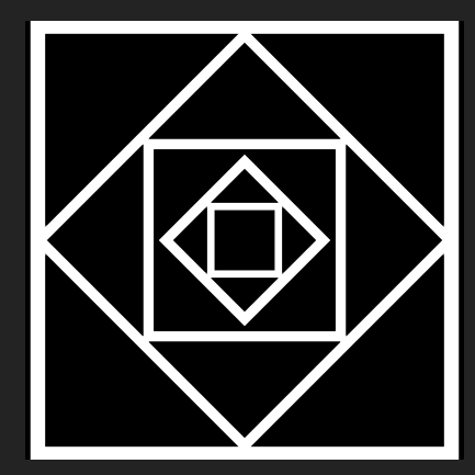
I made a couple squares and tried to place them at the centre (I took some time to snap them to the centre, and for some reason, they like to move around), and then I tried to play with the scale and rotation to see if anything comes to mind.
For some reason, the play of square and diamond shapes makes a pretty decent shape. I put every square or diamond at the outer edge of the smaller shapes, making some kind of catchy pattern.

fig 1.2 Making the main shape of my version of symmetry
When I thought it was enough and looked symmetrical, I made the motions and the keyframes. My idea is to make each of the individual squares appear one by one and make them turn a little bit before they stop at their assigned position.
But while I was doing the motion, there seemed to be a little mistake in the scale that I put in, because the outer line changed into a smaller size and intersected with the second biggest square. But I consider this a good accident because I liked the final shape much more.
fig 1.3 The final look of the main shape of my version of symmetry after the little error
2. Focus
For the focus principle, I also began my work by looking through references on Pinterest.
fig 1.4 Pinterest reference for focus principle
There isn't much clear reference on how I should do my focus, but what I understand is that I need to try to move the viewer's eye to the item or area that I want them to focus on.
So after some thought, I decided to just go with a circle. I have this idea to make a reverse droplet effect, which I think is quite effective in redirecting the viewer's eyes towards the centre.
My original plan was to make use of the white circle that was used in the original version, but after some thought, I decided it would be better to remove it altogether. I just feel like it fits the overall feeling that I want to convey and makes the reverse droplet effect "deeper" in a sense. Not to mention, I don't have to bother thinking about what I should do with the white circle for the overall motion.
fig 1.5 Making my version of the focus principle. left: with the white circle, right: without the white circle
3. Scale
To be frank, I'm kind of confused about how to make a good scale principle. I've looked through some Pinterest references but couldn't find something that I like or something that I can do with my current ability and knowledge of After Effects.
fig 1.6 References for scale principle
After some thought, I decided to just try to make a simple shape on After Effect and then work my way from there.
As soon as I made a single shape, I suddenly had this random idea of how to make a simple scale principle. It definitely isn't the best idea I have, but this is enough to do the job at the moment.
fig 1.7 Making the shapes for the scale principle
The motion that I'm going to do is very similar to the original version. I'm just gonna manipulate the sizes of these shapes while the other shrink or enlarge accordingly as if being pushed and pull by the adjacent shape.
Here is basically all the main position and scale of the motion. The shapes' location and size are modified to follow the other changed shapes.
The main keyframes look like these:


fig 1.8 Main keyframes' looks
4. Rhythm
Among the many interesting references, there is actually a single clip of motion graphics that caught my eye, but for some reason, when I tried to look into it again, it disappeared and I couldn't find it even after trying it out several times over several days.
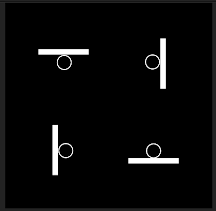
The video shows how to make a loop using 4 balls and 4 rotating small boards. The balls are located in the centre of each board, and the boards will then rotate at the same time, throwing the ball to the board next to them, and then repeating after a couple of seconds, creating a simple loop.
I was able to make a very similar copy of the work, but when I realized I forgot to add it to my Pinterest board, it already disappeared.
Here is what it looks like:


Although it is a simple animation, it is quite catchy which I think is because a lot of small elements are moving uniformly. The quick motion that is caught by the eye is also quite interesting to see.
Here is my final look at the first part of the project:
fig 1.10 Final look of Project 1 Part 1
In the feedback session, Mr Fauzi told me that my versions are quite good, and he especially liked the symmetry that I made. He also told me that I could export this work and start to work on the second part of the project.


Comments
Post a Comment