Motion Graphics and Compositing - Week 5
23.10.2024 (Week 5)
Vanessa Kei Kurniadi / 0360525
Bachelor of Design (Hons) in Creative Media
Motion Graphics and Compositing - Week 5
INSTRUCTION
Week 5
In the fifth week, I am finishing part 2 of the project before the class time so I can ask Mr Fauzi for another feedback if there is anything that I need to change.
The second part of the project is to create a simple remix using the 8 available principles. Mr Fauzi also demonstrated the task and recorded it so we can review it for future reference.
fig 1.1 Demo for Project 1 Part 2
In this task, we can use our creativity and combine the different principles into an interesting remix video. We are allowed to use the principles multiple times as needed and put them into a 16-second duration motion graphic video however we like.
When I started working on the project, there wasn't really any solid plan for what I was going to do. All I did was just go along with whatever I had in mind at that moment and try to apply it to the remix. The only thing that I try to keep in mind is to include all 8 principles in the remix.
Here are some simple explanations of my ideas:
fig 1.2 Remix progress 1
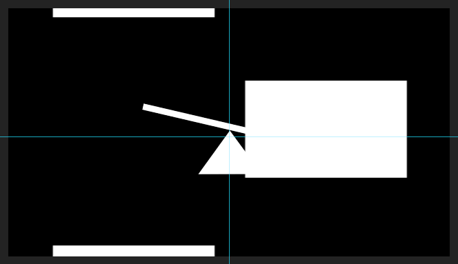
Firstly, I use the balance as the main focus for the first seconds of the video. To do that, I utilise the focus principle to bring the viewer's attention to the centre area.
fig 1.3 Remix Progress 2
Next, I used the hierarchy principle as a transition to make the see-saw disappear. It's just a random idea I got after seeing the demo video and some of my peer's work. I just feel like it's very suitable for this use.
fig 1.4 Remix Progress 3
Once again I used the hierarchy for a nice effect of the motion, but this time its purpose is more of a space-filler, which is also the reason why I reduce the opacity so we can see the symmetry principle underneath. This part of the remix looks "busy" but not too cramped, which works really good in my opinion.
fig 1.5 Remix Progress 4
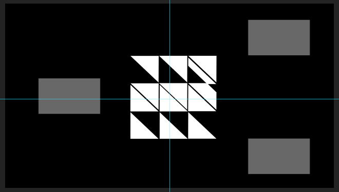
While the hierarchy and symmetry disappear, 3 sets of rhythm principles appear with the one in the centre bigger than the one in the corners, and the corner ones are flipped so the board will rotate the other way. This will make the overall look not too uniform with just a subtle modification.
A little bit after that, 3 sets of focus principles also appeared to complement the rhythm principle by filling the empty spaces. This one also makes the space look a bit more busy and crowded, but with smaller elements, so it won't feel like the elements are constantly overwhelming the viewer's eyes. Not to mention, the thin lines that make the focus principle seem to complement the thicker lines from the rhythm principle.
I noticed that I used opacity modification a lot, but I also feel that it is one of the simple yet great ways to make a transition from one object to another.
fig 1.6 Remix Progress 5
This one is just a random idea that came to mind when I was figuring out a good way to use the movement and direction principles.
fig 1.7 Remix Progress 6
This one is also a random idea that I used since I wasn't sure what to put in the middle. So I decided to make the direction and its inverse copy fill each other's empty spaces while still leaving just a tiny gap to make it look "fancier". Plus, I also added another hierarchy to make it less empty.
fig 1.8 Remix Progress 7
After that, I arranged the scale principles into a flower-shaped arrangement and put the focus on it to fill the empty space once more (maybe I just love the focus principle a lot lol)
fig 1.9 Remix Progress 8
Last but not least, I just put the symmetry principle on the reverse as a way to properly "end" the remix.
Here is what the finished remix looks like:
fig 1.10 Final look of the remix without music
Upon the next class meeting, Mr Fauzi told me that the animation was already good, but he recommended that I add some music because audio is also part of the markings.
Also, during class time, Mr Fauzi gave us a new demo video about advanced layering. He's giving us a non-compulsory assignment that we can do for extra marks.
fig 2.1 Demo video for the advanced layers and keyframing


Comments
Post a Comment