Motion Graphics and Compositing - Project 3
20.11.2024 - 4.12.2024 (Week 9 - Week 11)
Vanessa Kei Kurniadi /
0360525
Bachelor of Design (Hons) in Creative Media
Motion Graphics
and Compositing - Project 3
INSTRUCTIONS
Project 3: Channel Ident
In this task, we will synthesise the knowledge gained in
Tasks 1 and 2 for application in Task 3.
we are to continue with the previously chosen channel in Task 2 to create a
channel ident motion graphic video.
My channel bumper is about Valorant and its agents, divided into 4 categories:
Duelists, Sentinels, Initiators, and Controllers.
Since I had covered most of the things I can cover on the agents in the
Bumper, I had to look for something to add in there and my thoughts went to
adding something about the general game. After some thought, I decided I could
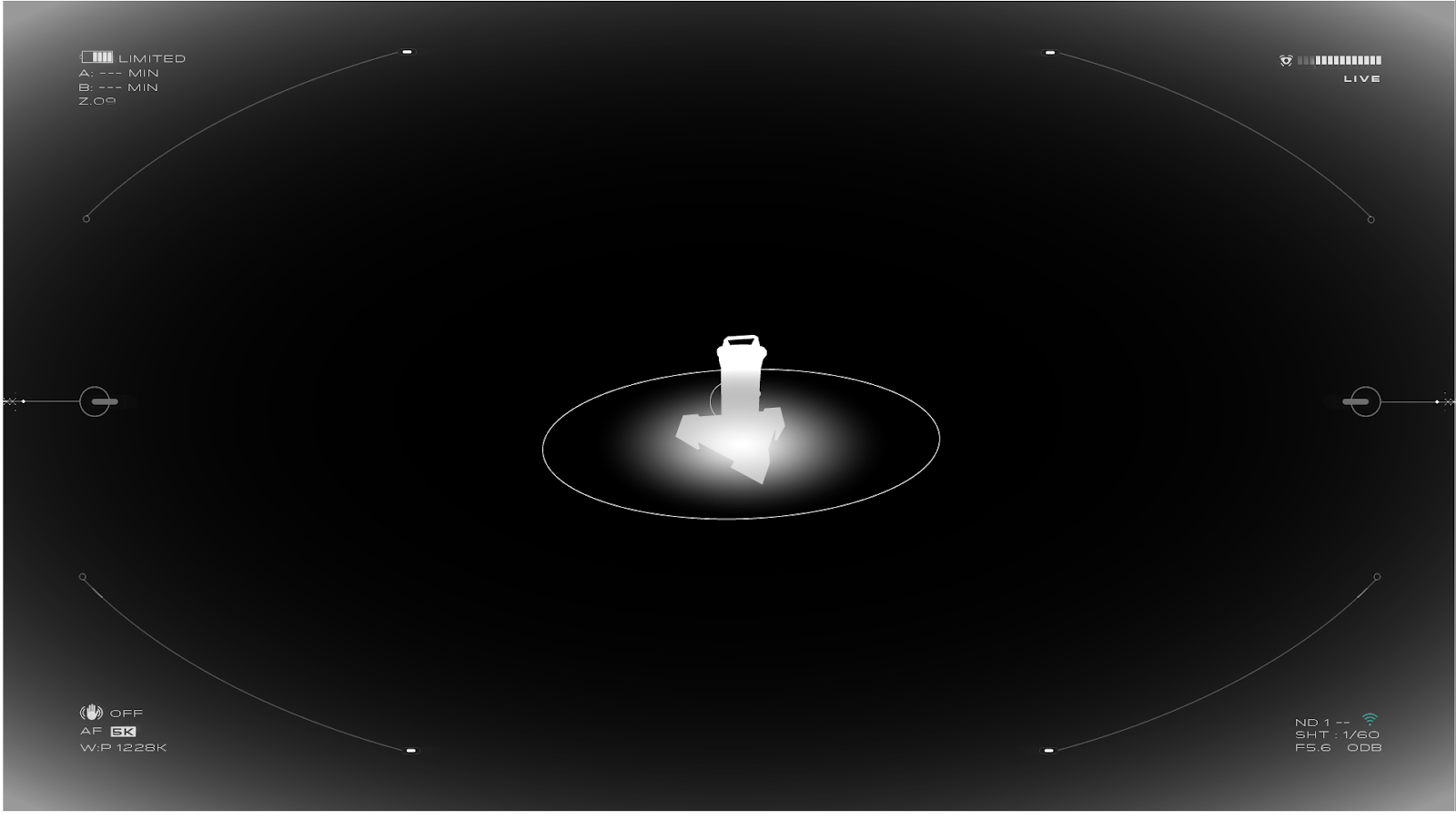
use the spike to represent the game. I also used Cypher's camera to make it
look neat and cool.
fig 1.1 Adding the spike into the content
Music and Storyboard
Before I could get started on the content, I had to look for music that I
was gonna use so I could match the beat and rhythm with the content. After
some thought, I decided to use the theme song of one of the Valorant
agents, Chamber. It is an upbeat music that I think is quite suitable for
the overall feeling that I want to bring out.
fig 1.2
Valorant Chamber Theme Song
Of course, I will cut the part of the song that I don't need, and just
take the necessary one. I'm planning to use minute 1:09 and take around 30
seconds of the song. But there is also a part that is a bit too long in
the middle, that I will cut a bit and hopefully will be able to be joined
with the other slice of the song without sounding too off.
After some more thinking, this is the new storyboard that I made. I
directly made them in Illustrator so I could gather the assets at the same
time, for me, this method worked really well and helped my creative
thinking process because I can think slowly while my hand is fiddling with
the assets, allowing me to always look at the assets I currently have and
also think on what I should add or remove at the same time.
fig 1.3 Channel Ident Storyboard
This is the storyboard animatics/video that I made for a rough context
of the plan:
fig 1.4 Channel Ident Storyboard Animatics
Here is the rough process of what I did:
(I sorted out my files because it was messy and apparently it broke my
original file so I can't show the work file filled with all rainbow
screen)
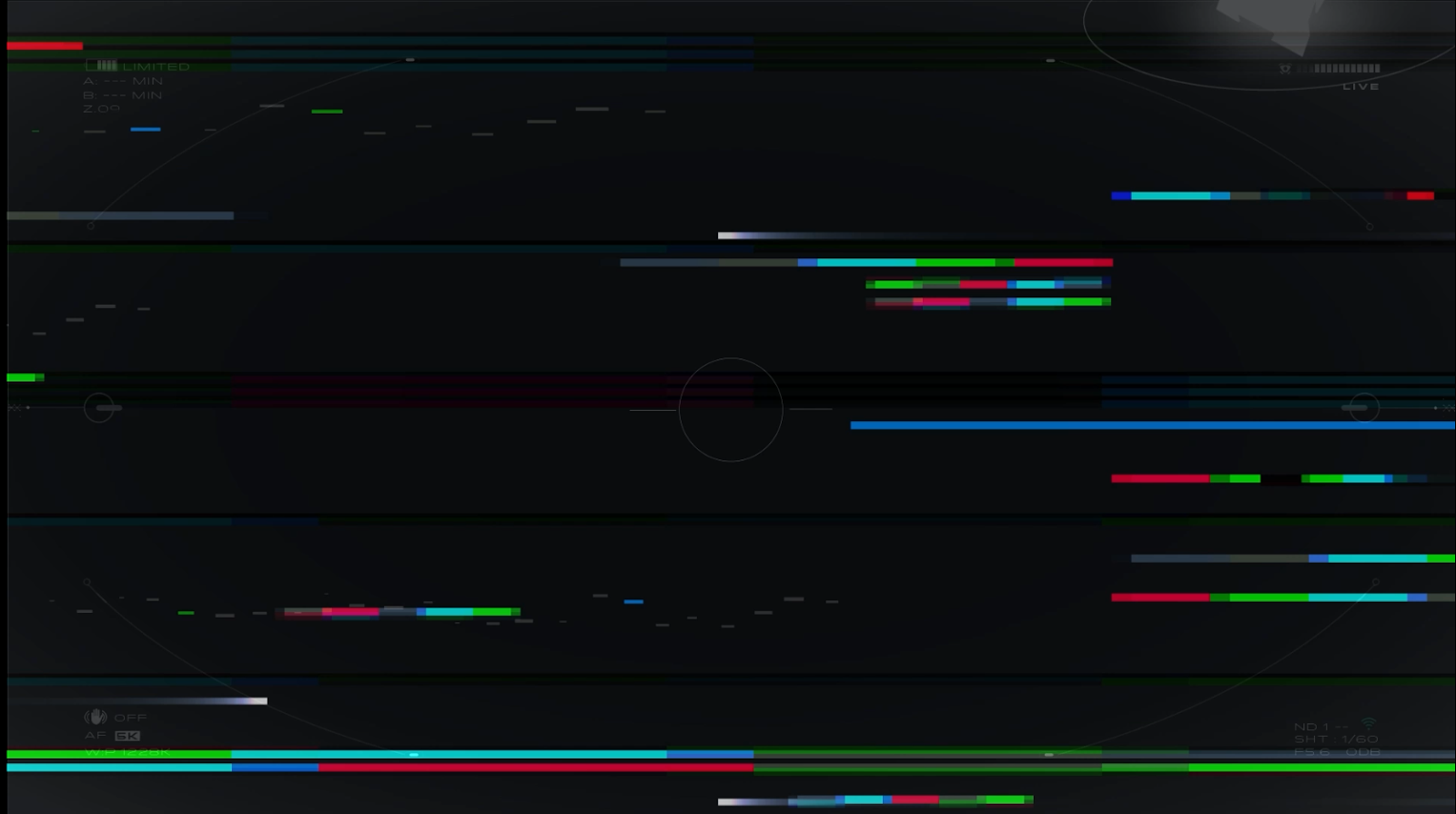
fig 2.1 Glitch effect opening
This is actually a final touch that I made, but since I began the
video with a camera, I tried to give some glitching effect like the
one Cypher has in-game. But since I can't find the exact same one I
worked with what I managed to find.
This glitching effect is actually a static one, so I multiplied the
image several times and manually randomize the placement, making a
pretty decent makeshift glitching effect.
fig 2.2 Camera "finding" the spike
Theoretically, I wanted to make it look like the camera is looking
around and found the spike being planted. But it is a bit hard to
make the natural movement of the camera, but I tried my best to
make it look like it's a random movement. The zooming that I did
at the end of this scene is purposed to help with the impression
that this is a real camera. Of course, as the one making this
motion, it is hard for me to pretend like it is real, and I can't
unsee the method that I did myself. But I think this is quite a
good representation of the action.
fig 2.3 Bullet hole
This is the technique that I used in the bumper last time, and
I think it worked well so I used it again, This time, I used
it as a transition as the "person" shoots the spike and then
it changed into the title of the video.
fig 2.4 Adding some Kinetic Typography
I know that there is a typography lesson in the module, and
I haven't tried it out. But just in case I need to show that
I can make one, I decided to try it here in the title text.
I stretched the letters and make them move into place one by
one. I initially made the starting point the same
until I think it looks weird for the later letters. But
because I don't want to redo everything I decided to change
the starting point midway through the word, and I think it's
not too noticeable and turned out really good. This is a
time-consuming scene to make but I'm glad the result turned
out great, and at least I learnt something new again.
fig 2.5 Card scene
In this scene, I practised again what I learned in the
advanced layering lesson. Since I need to kind of rotate
the card diagonally in so many ways, it was a bit
confusing at first, but I managed to do it in the end and
I am so proud of the result because it looked amazing.


fig 2.6 Class showcase
In this scene, I used advanced layering and spun
them around to play around with the class logo. This
one is kinda spontaneous because I wasn't sure what
to do with all those circles but honestly, this
turned out to be simple yet suits the overall video
and music well.
I genuinely have no idea what the term of this scene is, so for now I'll just say it's an agent speed lol. But anyway, I used them again because not only did they take me a long time to make, they really suited what I was trying to show to the audience, which is all the agents currently existing in Valorant. Plus, they last for quite long and fill a lot of portions in the video.
fig 2.8 Agent class showcase
This part is very similar to the one in the
bumper, except I'm just using the clipping mask
without the bullet, giving a more subtle yet still
natural transition. But the ending part is still
the same. I followed it from a tutorial so I'm
also not sure how to make any advanced changes.
However, I did manage to tweak the duration of the
"tracing" animation into a slower one.
Final Look
Youtube link: https://youtu.be/2DLRb9Susz4
fig 3.1 Final Result
Slides
fig 3.2 Channel Ident slides
REFLECTION
Experience
Since this task in a way continues the one that we made just a while ago, it's quite nice not to have to make the assets from zero again. But the other challenge is how to make the addition to the theme that I've tried to cover as best as I could. It honestly was a really nice experience and I got to experiment on more things while working on the project.
Observation
I saw some of the work done by my teammates and they are very different from mine. I found myself comparing my work with theirs quite often, but at the same time I take pride in what I chose and I know I try my absolute best in each of the processes. Honestly, my own result is also really good so I don't really mind.
That aside, a lot of the work done by my peers is amazing. I don't know how long they took to do them or whether it was hard or easy on them, but they inspired me in doing my own work in my absolute best capability.
Findings
In this task, I learned and found out how to do simple Kinetic Typography like the one I did in the title text. I also learned a bit here and there regarding the tasks that I learned before, especially in the ability to tweak them myself with the knowledge that I have so far. There is still a lot that I don't know how to do, especially since After Effect is so advanced, but I'm glad that I learned quite a lot despite the tight time.


Comments
Post a Comment