Advanced Typography - Task 2: Key Artwork & Collateral
13.9.2023 - 11.10.2023 (Week 3 - Week 7)
Vanessa Kei Kurniadi / 0360525
Bachelor
of Design (Hons) in Creative Media
Advanced Typography - Task 2

LECTURE
Full lecture summary in
Task 1
INSTRUCTION
In this task, we were instructed to use my name, username, pen name, or
whatever (but not initials since they have to make a word) and make our brand
logo out of it.
I have a game username and one of the words is tofu. I like it cause my
friends used it as a term when I'm wobbly because I'm tired, and I'm always
tired. So I figured tofu is a good way to start.
On the other hand, I don't have many ideas in mind on how to create a nice
logo out of a wobbly tofu. I tried to think a lot and here's what I made.


fig 1.1 brainstorming for the idea

fig 1.2 First attempt for the wordmark
It is a bit stiff for my concept but I guess they look kinda fancy as a
logo. Mr Vinod told me that there are still a lot of improvements to be
made, and for me to note that I need to make sure that the details (fine
lines etc) are visible even when you shrink them to a tiny size.
He also told us to look at some references to learn the styles based on
that.
Logo References I found:


Animated GIF
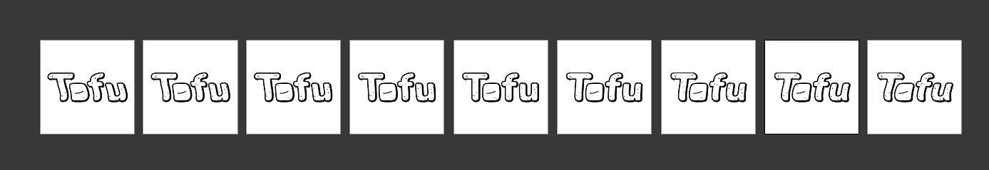


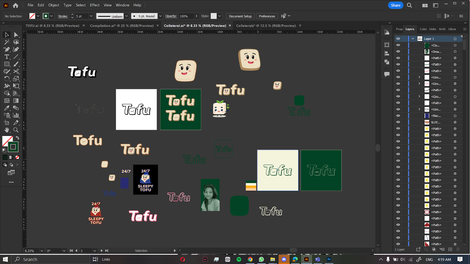


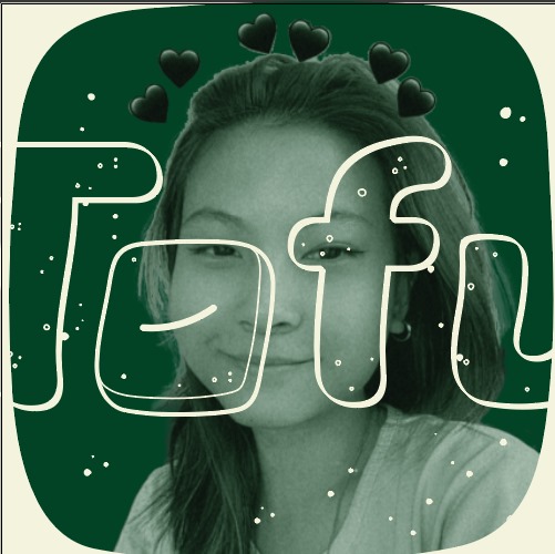


fig 3.11 experimenting with my picture, decided to use the
last one.


fig 1.3 Wordmark references
So I tried to see and observe how I could further improve my logo. But
the more I look at it the more stuck I become, and I start to dislike
what I made. So I tried to give it a different approach, and here's what
I made.
fig 1.4 My second attempt at tofu
On this attempt, Mr Vinod told me to discard the little leaves on the
tofu because they don't have any relation to the tofu itself. And he
also gave me some directions on how I could improve the O of the tofu.

fig 1.5 revision I get for tofu
fig 1.6 Final revision of my tofu key artwork
fig 1.7 My key artwork in my chosen colour palette
For the GIF I plan on simply making a wobbly effect just like the
meaning of my tofu brand. I used the warp-flag effect to achieve this
animation.
fig 2.1 frames

fig 2,2 First GIF
when I see it I feel like it's too slow, so I tried reducing the
frames to make it quicker.
fig 2.3 Second GIF
Collateral
My next task is to create a collateral based on my tofu. My idea is to
make a cute tofu mascot out of the O, and then decorate the rest of
the area of the collateral from there.
fig 3.1 workspace in Illustrator
Here's what I created:
fig 3.2 mascot making

fog 3.3 collaterals compilation
Mr Vinod told me that the mascot is one good way of expanding the key
artwork. But he told me that it's not suggested to make your brand as
food packaging, because it is not my brand identity. he also told me to
use the collateral for what I use on a daily basis (ex. shirt, cap, tote
bag, etc)
So I scratched most of my collaterals and started thinking about new
designs, I tried making the designs into a cap, tote bags, and even
clothes, and I'm a bit surprised to see that they actually work out
pretty well.
fig 3.4 my workspace in Illustrator

fig 3.5 New collateral compilation
Now my job is to put these collaterals on my newly made Instagram
account and create a nice looking home page with it.
Here's what I came up with.

fig 3.6 First attempt at Instagram feeds
It's actually a nice layout for my first try, especially considering
that I never really cared about Instagram layout before. But I feel like
I could do something more than this since it seems a bit too plain.
Mr Vinod also told me that the welcome word at the bottom overpowers the
rest on the top, so either put something similar at the top. or change
it entirely.
So I'm once again trying out a new approach to it, and trying out new
layouts
fig 3.7 second attempt in photoshop
The second one is still too plain, but I added some variations to my
design. But I still need to look for more references to make a good
one.
fig 3.8 Looking for references
The major problem I found is that other clothing brand already has
the physical product at hand, so they could make a photo shoot and
adjust it to their desire. But since I'm relying on mockups and
limited sources, it makes it a bit more challenging.
So I tried to make my Instagram feed by using mockup models and
redoing the layout for a little bit. I also tried out some
collaging on some of the photos to make it a bit more catchy.
Here's what I made in the end:

fig 3.9 workspace in illustrator
fig 3.10 Tofu's Instagram home page
Apparently after looking through my peers work i realized my face
was supposed to be put as a post, not a collateral, so I tried
redesigning it because the one in the tote bag is a bit plain for
a proper expansion.
Since I have to add this to my Instagram feeds, I had to redo
the collages and make a few changes on the layout. The
background for my picture's collateral is quite light compared
to the others, so I just tried out different positions for
each collaterals and grid until I found what seemed to be a
good layout with a nice color balance.
fig 3.12 my workspace on Illustrator
Final Look

fig 4.1 Tofu's key artwork black and white


fig 4.2 Tofu key artwork with colour palette's lightest and darkest
colour

fig 4.3 Tofu GIF Animation

fig 4.4 My Collateral

fig 4.5 Collateral on a hat - green

fig 4.6 Collateral on a hat and sweater - pink

fig 4.7 Collateral on a tote bag - green
fig 4.8 color palette
fig 4.9 Collaterals PDF

fig 4.10 Tofu IG homepage
fig 4.11 Instagram PDF
REFLECTIONS
Experience
This has been quite a challenging task for me, while at the same time, it's
quite a fun challenge. The biggest limitation for making my key artwork is
the fact that you have to make your brand both cool and catchy, not just
initials. It has to be readable but it also has to be cool and interesting.
Took me quite a while to finally get a good one to work on, and took me an
even longer time to figure out what to do with it. My KA itself is different
from the elegant, cool-looking KA the others made. I had a lot of
uncertainty, but luckily my work and my expansions are acceptable and good
to go.
I also never really cared about making an aesthetic Instagram for my own
main Instagram channel, let alone make a whole brand account for it. It took
me a lot of looking for references, asking my friend who does design for
work, and a lot of zoning out while working on the project to finally get
bits of inspiration one bit at a time. Putting aside the stressful times I
had while working on it (both from lack of inspiration and bad time
management because I had to catch the deadlines for other modules that also
took a long time to do), I had a really great time working on it and the
result is actually satisfying.
Observation
I noticed that I took a different approach to my brand than my peers. They
took a more elegant and nice style to their brands while mine looks more
informal and fun looking, which gave me quite a hard time working on the
collaterals. I also had a lot of inspiration looking at my peers' work to
give me a slight idea of what I could do for my own brand which helps me a
lot.
Findings
I find the process of making the key artwork and the collaterals great but
also stressful. I don't know anymore how many times I thought I made a
terrible mistake on how I make my brand because it was so different from
others' work. I found myself in a deep love-hate relationship with my brand.
It was so hard to figure out how to do it, but when I finally knew what to
do, I really loved the result.
FEEDBACK
Week 4
General Feedback - Your Wordmark need to have a balance between the
form and the meaning. A form without meaning is hollow, and a meaning
without a proper form won't make it catchy to the client either.
Specific Feedback - Make the symbol detail noticeable even if you
shrink them to a tiny size. You can try to make the shape of the T and F in
tofu form. Maybe a different shape or different textured tofu. The O and U
need to be at the same bottom line. Make sure the gap of the O with the
surrounding are the same. The details are what matters. And I'm still not
satisfied with the U. There is still a lot of room for improvisation.
Week 5
General Feedback - Make sure your logo is noticeable and has some
power to attract the client. Your logo needs to look both catchy and
professional
Specific Feedback - Make the O in the tofu square-ish like the one
you made last week. And make the u follow the square-ish nature of the O,
and tweak the corner as well. For expansion example, you could use the
little tiny dots you have and do something with it.
Week 6
General Feedback - If you only place your default brand into the
collateral, you are showing the same thing over and over again and
weakening your identity. You could put some typeface and change the
composition every time to create different things.
Specific Feedback - Making the mascot is acceptable. it is still
within your identity and is still essentially the same. But avoid the
connotation of making your brand into food packaging. It is your brand and
identity.
Week 7
General Feedback - You should try attracting the viewer to your
account. Maybe try making cropped images so it will be more interesting and
your viewer will go to your account to see more.
Specific Feedback - The 2 rows on the top are okay, but the one at
the bottom is too different, so maybe you can try to add something like that
at the top too.
FURTHER READING
To aid my project, I did some reading on Google that gave me some tips on how
to do a better layout for my Instagram homepage.

This blog is probably meant to promote an app called Preview, which is an
app that can help you on making contents on Instagram.
In this article, Alexandra explains in a really nice way how to make our
Instagram page more appealing to viewers. Alexandra even attached links on
them so we can either get a more detailed explanation on something, attached
links to some good examples, and of course, links to the Preview app.
To summarise, here are the tips that will help us to make a better feed on
our Instagram page:
- A grid layout is an easy start to make your Instagram page look neater.
- Choose a theme (white, dark, vintage, colourful, etc) and stick to it, to make it pleasing to the viewer's eyes.
- Think about what you want to post about, it can be about your business, or something you like or are passionate about, and explore it. Instagram is a great place to explore and have fun.
- Pick a filter and be consistent about it. It makes your page look nice and neat.
- Make your feed flow. By making a certain pattern, your feed will look like they are flowing nicely. For example, you can make a chess pattern, or repeat some colors in specific order to make a certain pattern.
- Color coordinate. Pick 2-3 colours you will always use in your photos, and arrange them in a way to balance your theme.
- Keep the background on your photos clean. You don't want the background to distract the viewer from the main object.
- Be consistent if you are using borders. Borders are great if you know how to use them well. It gives the photos some space to breathe, and they will create a really big difference. But be mindful if you keep on changing every border without planning, it can make the page look messy.
- Natural lights is your best friend. Take your photos near your window in the morning or at the end of the afternoon. It makes great results.
- High-quality photos are your best friend. A blurry photo can be seen from miles away and won't feel nice to look at.
- Have fun. Instagram is about having fun and exploring your content. There is no right and wrong in creativity.


Comments
Post a Comment