Advanced Typography - Task 3: Type Exploration and Application
25.10.2023 - 29.11.2023 (Week 9 - Week 14)
Vanessa Kei Kurniadi /
0360525
Bachelor of Design (Hons) in Creative Media
Advanced
Typography - Task 3: Type Exploration and Application

LECTURE
Full lecture summary in
Task 1
INSTRUCTION
In this task, we are instructed to make a typeface based on 3 options:
- Make a typeface intended to solve a larger problem or be part of a solution in the area of our interest. End result: a complete generated font (.ttf) with applications.
- Explore the use of existing letterforms in an area of interest, understand its existing relationship, identify areas that could be improved upon, and explore possible solutions or combinations that may add value to the existing letterforms. End result: a complete generated font (.ttf) with applications.
- Experiment. The idea must be novel and unique - working with material that might be 3 - dimensional, digitally augmented, edible, unusual, typographic music video or fine art. End result: defined by the student.
Based on these options, Mr Vinod told us to think about some idea
proposals that we would do for this task. So here are my ideas:


If I look closely, a lot of horror movie posters in general use basic fonts
that don't have a horror characteristic. The designer usually just uses a
simple typeface to make it and sometimes adds a little bit of decorations
that suit the movie. I also took a look at how Indonesian horror movies make
their movie posters, and I realized they mainly use the same or similar
typeface to create their movie title. Meanwhile, Dyako is a pretty good font
that could be a horror/spooky font. Its structure gives a bit of a creepy
yet elegant feeling to it that I can't really explain. However since it
meets the criteria, I can use it to contribute to horror typefaces that are
used in horror movie posters.
Uppercase
I start by making the uppercase letter for Dyako. Making them without having
the building shape like I did in task 1 is actually making this more
challenging than I thought. I tried to be consistent yet not too consistent
with my stroke shapes, and I made some tears here and there without making
it feel "too much". I use whatever shapes I made with the initial Dyako
which is the letters that make the the word itself: D, Y, A, K, and O and
then work my way from there.
I also use the Pramukh Rounded Light typeface which is also the base from
when I make the initial Dyako. They make a really good use of my base shape
and thickness.


fig 2.1 My process of making the uppercase letter (27.10.2023, Week 9)
In the image above you can see that I mostly just used the existing
shapes from previous work and then modified the rest of the shapes from
there whenever I could. For example, the B and F stem is taken from the
letter D, while C and G used the letter O as their base. Under them, you
can also see that there's a pink letter underneath. That is the Pramukh
Rounded Light typeface that I used as a base.

fig 2.2 Struggle when making the typeface (27.10.2023, Week 9)
When I reached these letters I was so lost on what to do. I didn't
have a nice base to take it from, and the stem from B would make it
weird for I or J. I took a long time thinking about how I should work
on them. Then after thinking and just letting whatever thought came to
me, I created these letters. I felt like the M and N is too neat for a
horror typeface, or at least for Dyako. I realised the crooked shape
of the words is most likely a big part of the reason why Dyako feels
spooky. I think the unexpected dents and veins also describe what
horror is, which is mostly the uncertainty of when whatever bad thing
there is in the movie will come out to scare or even harm the
characters.
Here is the result of the uppercase:

fig 2.3 My work on the uppercase (the weird spaces are due to me
being unsure if I will make any more changes to the
letters) (30.10.2023, Week 10)
Lowercase
Now that the uppercase is done, I continued on the lowercase. Mr Vinod
told us to make the lowercase side-by-side with the uppercase so the
thickness will be consistent and we can see if they look good next to
each other.
Making the lowercase was even more challenging for me. I had to create a
lowercase set for Dyako from zero, with no reference or base whatsoever.
So once again, I just let my gut and inspiration take control. I just
kept in mind that their characteristic should match the uppercase so
they would look nice next to each other.
I also still used Pramukh Rounded Light as the base to make sure I was
consistent with my thickness. But then I made some modifications like
sharp and crooked edges, dents here and there, and wiggly lines.
Here is my lowercase work:

fig 2.4 My lowercase letters side by side with the uppercase
letter (31.10.2023, Week 10)
When I was working on the lowercase, I also made some adjustments to my
uppercase. I know some letters like M and N are too plain, they look like
a normal elegant typeface, so I made some squiggly lines to make them more
creepy looking to fit the other letters, thus the changes in some letters.
the reason the Pramukh base doesn't align with the letters is that I moved
some of the letters to the side to make some room for lowercase k. I
somehow forgot to make the lowercase letter so I added it when I was
putting them in a new file for a neater look.
Numerals
Just like the lowercase, I also had to make the numerals with no base from
task 2. So I looked through some existing horror fonts on the internet for
references

fig 2.5 example from internet:
Ghastly panic font

fig 2.6 Examples from the internet:
Who Asks Satan

fig 2.7 Examples from the internet:
Melted Monster
I feel like the numerals follow the thickness and style very close to the rest of the letters, but the shapes themselves could be a bit wild but also depending on how wild your typeface is.
So I tried to implement it to my own typeface and here's what I made:

fig 2.8 Numerals (1.11.2023, Week 10)
Honestly, I don't really know what I'm doing, I just try to make sure the shapes are not too neat to be called a horror typeface, and the shapes should not be too stable but not too destroyed.
There is not much punctuation made in horror typefaces, but the ones I found
on the internet are similar to the numerals, they just follow the
characteristic of the typeface. At this point I got references AND
experience from the uppercase, lowercase, and numerals, so I just try to
create whatever I see fit for the punctuation.
I do know that there are a LOT of punctuations in fontlabs that I can make,
but some of them are also just repeating existing ones. And to make it a bit
easier for myself, I just made every symbol I could find in my keyboard and
recreated them with my Dyako style.
Here is how they turned out:

fig 2.9 Punctuations and Symbols (1.11.2023, Week 10)
Fontlab
Now that everything is made, I realise there are SO many lines on my
documents already, and that is after I deleted some to make the ones
underneath so I won't get the thickness wrong.

fig 2.10 My typeface workspace in Illustrator (4.11.2023, Week 10)
So I made a decision to compile everything on a new document to see if I got everything ready to be copied to FontLab. When everything is ready, I copied them one by one to FontLab and adjusted the default left and right spaces.

fig 2.11 Dyako complete compilation (4.11.2023, Week 10)

fig 2.12 Dyako in Fontlab (7.11.2023, Week 11)
After I put everything on FontLab, I started to go to the metrics tab and did kerning on the letters. I just made a bunch of random sentences and adjusted the spaces between the letters


fig 1.13 Kerning Dyako Typeface (7.11.2023, Week 11)
I originally put the punctuations with 30pt space on the left and right side, but apparently, that is too much, so I changed them to 10pt each. I also try to reduce the spaces between uppercases that have a huge blank space on their sides.

fig 1.14 Kerning H with lowercase letters (8.11.2023, Week 11)
Presentation and Applications
Presentation
For the presentation, I try to make layouts that look nice and cool but also
a bit creepy to show the characteristics of my typeface. I looked through
the PDF Mr Vinod gave us and even though I got the rough idea I was still
not sure what to do with mine.
So I just tried to make a layout by putting whatever comes to mind into the
canvas, and here's what I made:

fig 3.1 Presentation attempt 1 (15.11.2023, Week 12)
I asked Mr Vinod about it, and he said that there is too much on there, so
the viewer isn't able to enjoy the typeface because it's too overwhelming.
He also gave me some examples while explaining it to me, and I worked my
way from there. Here is what I made:

fig 3.2 presentation attempt 2 (22.11.2023, Week 13)
The "highlands" one is actually created by Mr Vinod. While doing it he
commended my typeface. He said that the characteristic of the typeface
is quite visible so I should use it to my advantage in the presentation.
Application
Application is basically us using the typeface for whatever purpose we
were intending it for. And Dyako is meant to contribute as a horror
typeface that could be used for posters and other things that would need
a horror typeface. So here's what I made:


fig 3.3 Font application (21.11.2023, Week 13)
Final Look
Download Dyako Full Regular
HERE

fig 4.1 Dyako Full Regular in FontLab (28.11.2023, Week 14)
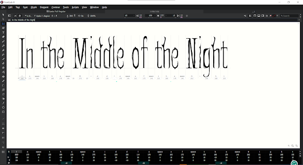
fig 4.2 Dyako Full Regular Metrics Tab (28.11.2023, Week 14)


fig 4.3 Dyako Full Regular Presentation (28.11.2023, Week 14)
fig 4.4 Dyako Full Regular Presentation PDF (28.11.2023, Week 14)


fig 4.5 Dyako Full Regular Application (28.11.2023, Week 14)
fig 4.6 Dyako Full Regular Application PDF (28.11.2023, Week 14)
REFLECTION
Experience
This task was a challenging yet also a fun project for me. I had to think really hard about what form I wanted to make on my typeface and be consistent with the characteristics and thickness. But I am personally really happy with how it turned out to be. Sometimes I still can't believe that I made Dyako from scratch, with nothing but an image of a building from Pinterest, and I couldn't be more proud.
There are times when I forgot tiny details here and there while working on the typeface in the application and presentation process, and I had to go back and forth to FontLab redownload my font and check it again on my current work. But all that hard work paid out and I have made a set of a horror typefaces with my own hands. The feeling of satisfaction is really strong every time I look back at my works for the past weeks.
Observation
I have seen my concept in another person's proposal, but I never really saw how it turned out, I'm quite confident that my typeface is a pretty good one, especially for a newbie like me. I also saw some of my friends' work, and they took a different concept and different approach to their work, and I like how they turned out. It's just really nice to see a different concept with a fresh mind because I don't feel like I have to compete on making the better typeface. After all, I am a bit of a competitive type of person.
Findings
I found that horror typeface doesn't have to be uppercase only. If done correctly, I can create a nice lowercase set with similar characteristics but resulting in a different kind of visual, which is quite fascinating. I also found out how to make a font presentation. Different from the usual layouts, we try to display the look and characteristics of our typeface on the canvas.
FEEDBACK
Week 9
General Feedback: You need to have the concept by this week
Specific Feedback: Horror typeface: Go for it.
Week 10
General Feedback: Remember that when you do your lowercase, do it side by side with the uppercase letter. Most of the time when students isolatedly do it, the letters don't go along well or the thickness is different.
Specific feedback: you can attain both of the typefaces, the one without the additional shapes and the one with them. You are also falling behind so try to finish them today.
Week 11
General Feedback: For next week you will need to make a presentation and application of your typeface. You will need about 4-5 for the presentation section, by presenting all the fonts in 1 sheet, dummy posters, etc. For application, you will use your font for its purpose. You can see the TIC69 for guides in the ms teams.
Specific Feedback: When you're done with the typeface and putting it in FontLab, you can start making the presentation and application. 4-5 artwork each.
Specific Feedback: When you're done with the typeface and putting it in FontLab, you can start making the presentation and application. 4-5 artwork each.
Week 12
General Feedback: If you haven't done the kerning you can see the guide in Ms Teams, you should take at most 30 minutes to do it
Specific Feedback: You can start making the presentation, you can look for the reference I gave in Ms Teams, but you can also make your own
Week 13
General Feedback: Use the reference in the given PDF zip for reference for the presentation, and make sure the canvas size is 1024x1024px
Specific Feedback: Your presentation is too overwhelming, the person who see this won't be able to enjoy the typeface because there is too much going on in there. The typeface doesn't have to make sense, you just need to display the typeface and show its texture for them to see. | Your typeface is actually pretty cool, and you can see the character, so you should show it in your presentation. The stronger the character of the typeface is, the better the presentation is.
FURTHER READING
When I try to do some research regarding scary font, Google usually just recommend existing fonts we can use for our horror-themed design.
But then I found a YouTube video that explains: what makes a font scary?
It is a YouTube video called "What Makes a Font Scary? | Top Scary Fonts for Design" by Creative Crew with Brad Hussey

fig 5.1 "What Makes a Font Scary? | Top Scary Fonts for Design" by Creative Crew with Brad Hussey
So in this video, Brad is going to look into some scary typefonts from The Spookies Typeface in Pop Culture, from "Psycho" to "Suspiria" and analyse what exactly made a scary typeface "scary".
here is the summary:
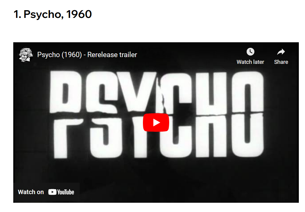
fig 5.2 Psycho, 1960
Psycho, 1960
So this typeface is actually a classic bold, sans-serif typeface. But what makes it scary is the slash and rip that happened on the font, making it look like something bad is going to happen

fig 5.3 Halloween, 1978
Halloween, 1978
This typeface is actually a classic gothic-looking typeface. The reason this typeface looks spooky is helped by the scary pumpkin, glowing effect, dark background, and maybe creepy music. In this era, Halloween is probably already a trend and we all know what it is, but back then they are still trying to introduce the concept to people, so they try to establish the creepy atmosphere. So in this case, we might as well be able to slam any typeface and use the same method to make it more spooky.

fig 5.4 A Nightmare on Elm Street, 2010
A Nightmare on Elm Street, 2010
This is actually a classical Trajan font, which looks kinda sophisticated. But since the 90s, it is actually one of the most overused fonts in horror movies and in cinema in general. There is even a blog on how the Trajan typeface took over movie posters.
There is also some creepy overlaying texture added and some blood splatters that help to create a spooky feeling.

fig 5.5 Stranger Things, 2016
Stranger Things 2016
So this typeface design seems to portray the feeling of being scared in the dark kind of concept, and the scary background movie that is being played in the back also helps a lot to build up the atmosphere. The bright red glowing color on the text also helps to make an intense feeling to the person who sees it. The way the letters are coming in to the screen also makes a sense of mystery in there. But essentially, if this serif typeface is used alone without the dark background, it won't become a scary typeface.
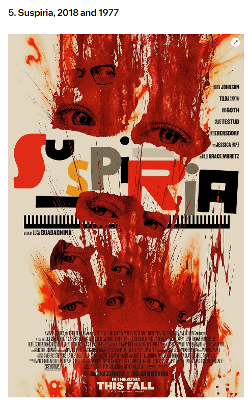
fig 5.6 Suspiria, 2018 and 1977
Suspiria, 2018 and 1977
So the typeface itself is just a fun-looking retro-style 60s typeface, which is apparently inspired by the Bauhaus design. But it is combined with the bloody images of the eyes with suspicious look in their eyes, which together symbolise emotions and chaotic atmosphere.
So what is taken in this one is that it's not the typeface alone that has to make a role in the poster. It's how you set the scene, like the texture, the layouts, the colours, and other elements like blood etc to make something scary.
So do we need to rely on all those things to make a scary typeface? Not necessarily. Now that we have some knowledge on what makes a typeface scary, we can try to implement those characters in the typeface itself. Try to simplify it where you don't have to make so many textures and ornaments into play, but a typeface that can alone make people understand the point we're trying to make.


Comments
Post a Comment